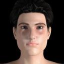
Morph WIP: Christopher Reeve for Genesis
in Art Studio
After the latest round of texturing improvements, I decided to tackle another celebrity look-alike morph for Genesis. The subject this time: the late but great Christopher Reeve. The following is a first draft, and I'll probably be scrutinizing photos of him for at least a few days as I keep tweaking it. Feedback is welcome, be it positive or constructively critical.


Chris.jpg
900 x 900 - 382K


Comments
Looks pretty good! I think maybe his jawline needs to be a bit less rounded and a a tad bit more chiselled. He is definitely recognizable as Christopher Reeves.
Thanks! I thought I was off to a good start, but I couldn't tell if it was just me. Here's 3/4 view of the latest draft.
A few more tweaks have led to this update.
looks like its coming along nicely!
It's been a while, so here's another update! I welcome any further feedback!
Can you put the photos side by side? I can tell you've made changes but they are subtle. I am curious to see if I can tell where but its tough without them being next to each. Looks good!
Old on the left, new on the right. Most of the tweaks involve the brow and nose bridge.
Christopher is comming along so well Gregorius!!! It is sure turning out to look just like him :D
Yes coming along quite nicely!
Thanks! Here's a test of how he looks from a different angle and under different lighting. Does the morph still look as good or better?
He still looks good in my opinion!!
Here are some good reference photos. Hopefully you have ones similar. Try not to use only 3/4 views. You also want shots from above and below.
http://d1g4sq00ps2bp3.cloudfront.net/entertainment/20343.jpg
http://www.capedwonder.com/wp-content/uploads/headers-letters-mcclure.png
https://cdn.cloudpix.co/images/christopher-reeve/recordando-christopher-reeve-el-mejor-superman-original-5576b4c9eec80f3259f1e8f2b6169a23-large-1604314.jpg
Use the photos in your modeling program so you have a way to measure against them. You've got a good start, but are off in some places. I can't see that you've said what progam you're using to make your morphs.
Thanks, Cris, for the references and comments. To answer your question as to the modeling software, I'm basically just spinning dials on Genesis in Poser Pro 11.

Here's another update and another angle. I mainly raised the nose bridge and made his face deeper. The 45-degree shot could be said to approximate this image:
Very close. 1st thing I notice, and it seems typical, is a very small uptick at the corner of his mouth in the photo but that may and probably is a unconscious permanent expression of his in the photo. I know I discovered the same thing in an photo of mine that I created a morph from using FaceGen.
The nose bulb seems slightly rounder in the face morph but that is probably the lighting environment of the likeness render.
Hopefully you can see some of the difference in the angle on the face and where the top of the forehead is and how much longer your lower face is. Don't forget the ears.
didn't want to go off topic, but gotta ask . . how did you do that Cris ?
Here he is after another round of what I hope are refinements.
I took the image of Gregorius' morph into Photoshop with a desaturated image of Chris Reeve. I overlayed one over the other and lowered the opacity so you can see how they line up.
One thing you are missing is the angles of the face. You have a much straighter angle (in red) than is on Reeve's face. Part of the reason the lips seem to be in a jutting position and Reeve's looks relaxed is that angle the seems to push the chin up.
Here are the results of further revisions, with a nod to Cris for his insights.
corrected that for you
Thanks, Clohole! My apologies, Cris.
This sure is coming right along Gregorius the only thing I might add here is maybe bring the size of his nose down a slight bit, if you look on the over layer that Cris did there is like a big time over hang of the nose.
I tweaked the nose as you suggested, and these are the results. To take a break from boring headshots, I decided to include a more dramatically lit and posed render of Christopher in his element.
Wow it is really looking like him now!!!!
I was really studying him and noticed that you superman has a larger forehead tan the original is that intentional?
Do you mean the hairline is higher? If so, that's probably a consequence of the hair prop I'm using. I might be able to morph it down somewhat, but I'm not sure.
Glad to see you continue working on this. Considering you are spinning dials only, you're doing well. If you can start to learn to do morphs in a 3d program, you'll be able to get closer. You might take a look at Blender (yes, Blender) as it's free.
He looks amazing!
coming along quite nicely!