Purgatory - a Dumor3d WIP
 Dumor3D
Posts: 1,316
OK, figured I'd try my hand at a full project of a few going and this one seems to have moved to the front. Once completed, I plan to become a PA somewhere... will most likely look to Daz.
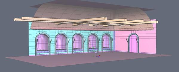
It seems that there is always an area under the castle dug from the bedrock where the bad folks are kept. Here's the start from Hexagon.


Capture.JPG
1828 x 735 - 206K
Post edited by Dumor3D on


Comments
After taking this into Daz, I discovered some of the nuances of the camera view. In order to move the camera back out of the structure, I needed to extend the beams and the floor. One can now get a shot with a standard focal length which includes most of the room. With a bit of wide angle work, I'm sure you could get it all without much distortion.
My mind remembers something like this from a number of movies. The line of 'chambers'. Generally it seems they are left open like this with a raised floor and prisoners are shackled in these areas. I've also added the beams to the main area which allows for a place to hang stuff.
This project sort of started upside down, as I first started work on chains, shackles, weights and a hanging cage. Then I decided I needed a room to put them in.
Here is a render that is getting to where my idea will land. I need to bring the whole obj in again as I've done more work on some of the UVs, but it is getting close.
Any feedback is welcomed!
Nice job so far - I'm just getting my feet wet in Hex myself - I'm not near that handy with it :)
PS: Just saw the render - Really nice!
The above is a Reality render. Here is a out of the box 3Delight render with no lighting. The angle to the rock walls was driving me nuts and as you can see from this render, conflicting with the interiors of some of the chambers. That's the UV work I've repaired, but I have not yet brought the OBJ back in as I'm still playing with texture settings and there are a ton of them!
Thanks CJ!
Here's a wire frame from Hex. You can see that it really is a low poly model. One of the nice things about rocks and wood is bumpmaps, displacement maps or normal maps can give you plenty of relief and a fast loading model. This begs for at least 4 people in the scene and that will work most people's computers a lot.
In fact, if you see the hanging cage above... I would almost bet without looking that it has more polys than the entire room.
FYI... almost all of the work you see on this model started with a cube. The curved part of the roof... a cylinder.
One of the things I'm trying to accomplish is having base settings that work well with 3Delight and Reality. It's hard to get just one of them the way my mind sees it much less getting both working. Some things will need to be tweaked regardless... The torch flames I just keep playing with. Maybe I'll land on something really neat somewhere along the line. I have a Reality render running at the moment which I'll post later.
For now, here is another 3Delight render, again with no lights, but shows a fair amount of the detail for the cage. My idea for this cage and all the metal accessories for that matter, is to have 3 materials for each. This rusty one, an iron one and a chrome/stainless one. The last would make it useful for like a bird cage. Just scale it down. I really like having content that is flexible! If what I can provide with this package is useful in that way, all the better.
If you enjoy photography...
Within the scene above, you can see rock, wood and rusty metal. No, the skeleton is Daz's. :)
1. The rock is a set of textures I picked up with full usage rights. I can take no credit for those.
2. The Rust. This is done from a closeup photograph of one of the sides of an old wood stove sitting on my back porch! The variety of texture on that stove was oddly awe inspiring. The better half thinks differently and sees it as something entirely different.
3. The Wood. This is another shot taken from one of the boards on an old picnic bench. I also have an end grain shot which was used on another part of this product line and will show up later.
4. The Iron. Not yet in the renders anywhere... This was done with a close up shot of just a plain old cinder block. Color it down close to black, make a bumpmap and instance pebbly cast iron look.
What I love about all of this is my increased awareness. I catch myself 'looking' at the shoes on TV, how a shirt flows over a body, the rust on an old wood stove and the texture of a cinder block. It's sort of like being a kid again. My digital camera has been used more in the last few months than it has in likely it's lifetime. Sure is nice having that 'free film'. ;) Shoot shoot shoot.... delete, delete, save, delete, delete, delete, delete, save.... If I get a few good ones, I'm very happy.
For those with Photoshop... making these into seamless textures is pretty easy. There are a ton of ways. The one I like best for these types of textures, fine grain stuff, is to make layer copy of the background image. Use Offset to split it into quadrants. Use the various tools as you like, but if you use the eraser tool, it will erase those seams showing the background underneath. Talk about fast! This greatly accelerated my process.
Anyway, I find it very neat that this world makes me better 'see' the real world around me.
Still struggling with these torches. If anyone has a good idea for this, I'm all ears... well.... eyes.
Here's a Reality render. I'm liking the color of the light from the torches, just not the color of the torch flames themselves.
"And just yesterday I was responsible for keeping the Queen's shoes clean?"
LOL! I experienced the same type of thing when I first started using Bryce - I would be walking through buildings, looking at everything architectural - archways, ceiling beams, light sconces... "Let's see... two cubes, boolean intersect with a cylinder... an inverted pyramid with a radial light source inside..." - I was mentally "modeling" everything I saw :)
The torches - the best way to do small flames is often to do two flat planes at 90 degree angles to each other and intersecting. Then you texture them identically with a transmapped photo of a flame. It's easier to get a realistic fire look from different angles than it is with trying to sculpt a flame (since the edges of actual flames are translucent in a way that's hard to replicate). Please feel free to reverse-engineer [url-http://www.sharecg.com/share.php?upload_section_id=2&upload_type_id=21&upload_id=39216]this torch freebie to get an idea of the method.
Purgatory is spelled with a "u," not an "e." This is such a great set that I'd hate for it to be rejected on the basis of a spelling error. ;)
Edit, forgot to mention: Morguefile.com and CGTextures.com both have good fire resources that can be edited and rereleased commercially, if you need a source for that.
CJ... yes, exactly and the better half is giving me strange looks when I pull out the macro lens to get a picture of a rock. :)
Normals! I only recently discovered the use for 'normals'. And, fortunate for me, Nvidia, the maker of my video cards has a free Photoshop plugin to make 'Normals'. All the ones I have seen have been blue and in tga format. They are like a 3d relief map created from the texture of another image. These give great depth and Daz works just fine with them. :) Actually, they seem to do better than any other method I have tried. I used normals to do the Celtic reliefs at the bottom of the cage shown above. They pop out nicely!
SickleYield! Thanks for dropping in. I have a lot of respect for your work as well as some of it in my content. I suppose I need to grab your Gothic Horror Gown as it would fit into this very nicely! In fact, I'm thinking something like those medieval pants worn off like this gown to where they amount to long ragged shorts. Grungy/dirty stuff. The prisoners need to look as though they are not well cared for. I suppose there is skin dirt out there. That would be the other nice added touch.
Thanks for the spell check! I had the crud last week and wasn't hitting on much. I remember it 'looked' wrong. Turns out spell check doesn't check the thread titles. And looking back, I see I made a lot of typos in my posts. Now I'm wondering if I edit them, do they get resent to those subscribed to this?
Thanks for the flame resources and ideas. I love the light I'm getting in Reality using the method I used, but the flames just don't look good. I do have one more attempt waiting for import. I added a third geometry inside of the two that already exist. Also, adjusted the existing exterior form so they don't all look the same... but this might all go in the trash before I'm done. How many times have I done that? Now the better half will be giving me strange looks as I photograph flames. But, I will at least start with one from a resource you listed. Very nice stuff on those sites! I might have to give it a go on the two planes method as if I can get the lighting out of that, I'd be way ahead of messing around with what I've done.
And, here's another render. I do love the light and shadows I'm getting on the rocks. Sometimes I even surprise myself! This was one of them. Better than I imagined it could be and really, disbelief, but there it is.
This time, we head into the world of vampires. This seems a good dark place to 'keep' them.
I didn't get a renotification, but I can see the fixed title now.
I think I've hit upon a pretty good compromise here. Using the 2 plane method suggested by SickleYield combined with my light bulb, I have landed upon this.
The first is a no lights 3Delight render and the second a Reality render. If you look at each, you will see a small light bulb so to speak just inside the base. It is set to something like 50% opacity, so it doesn't show much in the 3Delight render. It does seem to add a bit of fill that is nice.
The flame on the left is a torch flame. The one on the right a candle flame. I like the torch flame. It's interesting the the OpenGL version of the candle as displayed within Daz, look better than the 3Delight render. You can't see the intersection of the planes.
I like the coloration in the 3Delight render, but I like the lighting of the Reality render. Any feedback on this is welcomed.
Good job, they're looking nice. :)
Looks great! I'm like you - I'd like to see something kinda in-between the two. Of the two, I would prefer the 3Delight render.
Definitely the torch light, though - looks more realistic than the candle light.
Some more work done. Seems the 'crud' got in the way and my head just wasn't working very well.
Any and all critiques are welcome!
At this point, I think the room needs a couple or few more decorative items which I have in mind and I think it will be good. I have my torch lights in place and am pretty happy with both the 3Delight render, which is attached to this post and with the Reality render, which is still baking along and I'll post that when it gets good enough.
Again, comments are welcomed.
Here's the Reality render.
Good progress! I'll be interested to see the accessories.
Thanks SickleYield!
I think I need just a bit hanging on the wall by the door. Spare constraints basically. I'm thinking it needs something that could used in the middle of the room... table, bench or combo of those. A rack comes to mind, but I don't want to tread on other toes.
As for the rest of the accessories, like I said before, that's actually where this all started. There are fully rigged chains of various lengths, locks, weights, wall mount rings (anchors) which I actually used scaled up for the door handles. The cage was displayed in an earlier image. Shackles... Basically the stuff that gets used to keep people in place in here. :) That group is getting rather large with various materials and poses. I don't know what might be suggested by whoever accepts this for a PA item, but I'm thinking it might be two packages. Neither would rely on the other but compliment each other.
And now I have a Robinson Caruso raggedy pants/shorts and feed sack shirt in mind. Too many ideas, too little time. HAH!!
The only thing that jumps out at me right now is the floor is too even/clean. I need to do something to add some variety to that. Might try using a specular map or something. Not sure I can get what I want without it showing as an obvious pattern.