Happy with pic, but know it can be better - suggestions please
 spswafford
Posts: 179
spswafford
Posts: 179
This isn't the first pic I've done without tutorials, but it's the closest one to complete. I like the pics, but not happy with the render. It seems like it could be better.
One thing that surprised me and made me think something is not right was it rendered in less than 3 minutes. Some of the other pics I've been working on took at least 15 to 20 minutes to render.
Thanks,
Stefan
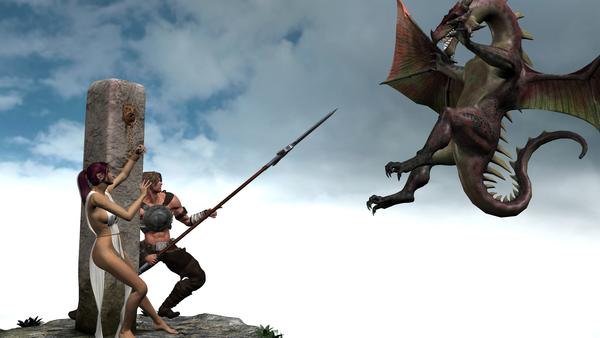
sacrifice.jpg
1920 x 1080 - 743K
Daz 3D is part of 
Connect
DAZ Productions, Inc.
7533 S Center View Ct #4664
West Jordan, UT 84084
Licensing Agreement | Terms of Service | Privacy Policy | EULA
© 2025 Daz Productions Inc. All Rights Reserved.
Comments
Hi, Stefan! There are a lot of things I like about your render, but I agree that there is room for improvement. In terms of composition, there is a lot of white space, and parts of the dragon and the woman's foot are cut off. I don't think either is necessarily a bad thing by itself, but since they're both happening in the same image, I think the composition could probably use some work. The first few posts of this thread have some good tips as far as composition is concerned.
Lighting: I think lighting probably accounts for the difference in render time you are seeing. I'm guessing that some of your previous renders used UberEnvironment2 (UE2) lights (perhaps the Fiery Genesis light preset?) and this one just uses basic distant lights (and possibly spotlights or point lights). Uber lighting can take a while to render, but it does yield nice results. It also can take some effort to set up properly if you're not using ready-made light presets. This thread contains a wealth of information on UE2, and this wiki is a good brief resource.
Posing and expressions: Personally I think the humans' poses and expressions are great. I might like to see a little more tension in the woman, if you can do that, but that's nitpicking. I'm not totally convinced by the dragon's pose, though. Is it coming after her/them with its talons or head-first? If talons, its feet should be bent up and the talons outstretched like in this photograph of an eagle: http://www.flickr.com/photos/danihernanz/976379526/ Then again, maybe it sees the spear and is hesitating rather than attacking. In that case, you could experiment with twisting its neck and/or body a bit to show its fear or reluctance. I think I'd rather be the warrior in this scenario (or even the woman, assuming that the warrior is a nice guy) than the dragon. If you wish for the dragon to be more menacing, think about the pose, and maybe also increase its size (scale).
Overall, this is a great start and I'm looking forward to seeing where you go with it!
One more thing: while there's nothing wrong with posting this in the New User Forum, keep in mind that there's also an Art Studio forum which is a great place to post your renders and get feedback. New Users are welcome there too...no experience necessary. ;-)
Adding to that, check on the basic rule of thirds for image composition
http://en.wikipedia.org/wiki/Rule_of_thirds
I can see this image using the the three point system. That is a version of rule of thirds. Three points of focus all on the proper lines of sight but only ONE main focus.
Thanks for the responses.
I thought I should have clarified after my post, but it may have been better that I didn’t after reading your responses. To clarify, I was wondering how to get more detail. I do not like how most of the items seem to be low detail.
Here is a list of the items I’m using in this pic.
http://www.daz3d.com/echoes-of-andromeda - I look at the sample pics and the base and column look rough and the plants more real, mine look smooth and fake.
V4 with http://www.daz3d.com/amaterasu injection - would like her to look more “real”. I found a post by Raw about SSS settings, may give that a try.
M5 with http://www.daz3d.com/percy-for-genesis and http://www.daz3d.com/spears-of-destiny - I think he is alright, but Spears of Destiny appears to be for Gen 4 characters. The Spears pose came out awkward for him. I think I just need to pose him manually.
http://www.daz3d.com/millennium-subdragon with http://www.daz3d.com/millennium-subdragon-poses and http://www.daz3d.com/subdragon-textures - While I have been able to get him looking better, still not as close to the sample pics as I would like.
As stated before, it may be for the better that I failed to include this in the original post. The things you guys mention had not even crossed my mind.
I did not know about the Art Studio Forum. I was thinking about posting this in the Member Forum, but thought whatever responses were posted would be helpful to other noobs, like myself.
I did the cutoff because it looked more interesting to me and because I wanted to be closer (and still see as much as possible). Somehow I missed the sticky at the top for General Art Help, but I glanced at a couple of the articles while at work (while on break, of course) and read some interesting things. So I have some more reading to do (composition included).
For lighting, you are correct; I have 3 basic distant lights. One high above, slightly back to the right of the camera at 100% intensity. One to the left of the camera about mid level at 50% intensity. The third is on the backside of the subjects, low and at 50% intensity. When it was just the high one, there was too many shadows so I added the other two. As for the other pics I referred to, there are more objects in the background so I’m guessing that is contributing to the render time. Not sure if UE2 is used. I will checkout the links for lighting.
I have http://www.daz3d.com/animations-poses/expressions/expressive-for-genesis and used that on M5 and fairly happy with it. For the girl, the expressions I have tried all seem to make her look like she is saying “ooooo”. Besides Expressive I also have http://www.daz3d.com/animations-poses/expressions/genesis-evolution-expressions and some free expressions I found at MostDigitalCreations.com, but the results are the same.
For the poses, here is a little of what is happening in this pic (in my head at least).
The dragon is out flying around; minding his own business when he notices somebody has put out a tasty treat for him. At the same time the hero is out minding his business when he notices that somebody has chained some poor hottie to the column. Then he sees the dragon. Before the dragon can kill the poor girl, he rushes in to save her (and maybe get lucky). The dragon was swooping in for some free food (what normal dragon wouldn’t?) when this other treat come rushing in with this pointy pole. So this pic is the dragon trying not to meet the business end of the spear and the reactions of the people. By the way, I scaled the dragon to 150%.
I’ll have to see what I can find on the three point system. I found stuff about the Rule of Thirds in the General Art Help sticky. I’ll check out the wiki too.
One of the other things I like about the pic is how the cloud behind the dragon is darker. I have two other cameras, but want to improve the detail before I render with those. One of the is set over the dragon’s shoulder and uses Depth of Field (I think that is the one) to focus on the people and blur the dragon.
Thanks again.