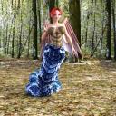
Looking for some feedback.
in Art Studio
Hi everyone,
I don't post on here much...actually, I believe this may be my first post.
I have been playing around with DAZ for a while now, about a year, trying to teach myself as much as possible. I have a number of finished renders, but this one I rather enjoy. Was looking for some possible feedback.
Thanks you all.


Merry.jpg
700 x 700 - 577K


Comments
Are you using Iray or 3Delight? I'm off to bed but will check back tomorrow
I use Iray, I find it tends to give better shadows.
She is rather cute! So composition wise, you might want to move her a bit to the right or a bit to the left, using the rule of thirds. This way she will not be so centered and it will be a more interesting to look at. Your lighting is not bad at all, but I still suck at lighting so I am going to defer to people who are better at it. I depend rather heavily on premade light sets (although I do know how to do it manually, and I do tweak the premades to get what I want, I just don't LIKE to do it manually lol). Have you considered checking out the New Users Contest? I spent my first year joining in every month and it really sped up my learning curve exponentially. Everyone is super nice and extremely helpful in the WIP threads. If you aren't quite comfortable jumping in, its still worth going through the older threads as there is a huge amount of information each month as well as links to tutorials etc. I have been here about a year and a half and I am absolutly positive that that thread was instrumental in my being able to use Daz Studio more effectively more quickly.
And of course you should keep posting here in your own thread whenever you have questions or just want to show off something you are proud of.
Thank you for the great advice! I will take that in account with my renders from now on. As for the lighting, it was real easy. I set a skydome, changed the exposure value under tone mapping in render settings to 0 and let it render. Skydomes are awesome!
I would also turn her a bit as well to show off a bit of her snakish good looks and maybe unfold just a bit more of her wings.
Thank you Saphirewild! Yeah, her serpentine beauty should be shown off in full.
Going to take the advice and run with it, I will post a new render when it is done.
Looking forward to seeing what else you come up with!
A new render I came up with, hope you all like it.
Still newbie myself. But, what was mentioned about rule of 3rds is a good thing. Plus, in this case I would rotate model more to her right so you can see the rattles. If this is also millennium environment, add some additional items in the image that will help lead eye lead to the girl.
I don't know if you've noticed or spotted the Iray Advanced Render Settings.duf. But, I've noticed after starting to utilize that in renders my renders started improving. Along with standard placement of lights, key, fill etc. I've also been experimenting with the time of day settings. It has helped thus far to create cool shadows. My latest post used 8:30PM.
A very handy tool for the golden rules is Jaderail's Golden Rules Camera Overlay here - http://www.sharecg.com/v/67783/related/21/DAZ-Studio/Golden-Rules-Camera-Prop-v1.5
Thank you for the advice, I started utilizing it last night, when I first started the render and saw how splotchy it was, I was a little dissapointed, but I let it finish and boy am I glad I did, it looked beautiful. Though I was not able to find the time of day dial. But beside that ToD Dial, everything looks perfect. So Thank you again!
A new Render, I have been messing around with Iray Real Lights as well as changing the appearance of things (teddy bear and clothing). Also been messing around with focal points. I like the way this one came out.
I like the glowing eyes on the teddy, nice job!
Thank you!
Just a character I have been working on, spent most of a day fiddling with dials and getting her look just the way I want it. The plan is to use her in a bunch of short comic style adventures. Not sure if I can do that, but that is why they made research!
Anyway Meet Deedee, she is a lovely young lady, who isn't quite aware of her affect on others. Smart, but naive, and with a huge imagination. Her main rivals are a Shark, that shows up in the strangest of places, censor bars and a co worker who is as narcissistic as he is clueless.
If you purchased the stuff you used for her from Daz you can indeed use her in comic book illustrations and any other kind of art that you would like.
She's kinda cute, and that personality definitely comes through in this render!
Thank you, I have been trying to get the right look for her for a couple years now, and just never could hit on it. I guess she was just made for 3D lol.
Might as well use this thread for some works in progress. Here is my latest one, I made it more pg, as When I test, I don't usually put clothing on the figures (figured it would save on memory and render time.) In this one I used a shader from the Vengful Spirits Set and lowered the cutout opacity by 50%