Looking for feeback
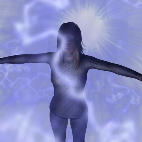
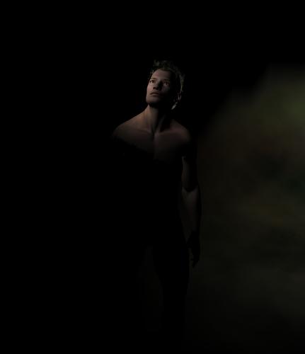
Hi, I have been dabbling a bit with Daz since I got the idea for my new book (the attachment with the 4 characters). Have attached what I'm working on as a cover. I have mastered the art of manipulating skin maps for what I need, but have been trying out light settings for atmosphere but not really getting great results. Not really sure why on some pictures the girls look realistic and then others the boys. Sorry it's not as fantastical as of your cool fantasy pictures... any lighting or render tips would be greatly appreciated. I pick things up pretty quickly but be gentle with me on the professional terms... I am but an author :vampire:


Addy_electric.png
618 x 618 - 471K


joestill.jpg
725 x 842 - 59K


photo1.jpg
878 x 842 - 316K


Comments
Lighting can make or break a scene. The UberEnvironment is a good way to add ambient lighting to a scene as well as giving that soft shadowed look (called Occlusion) to add more dimension. Additional to this is the UberAreaLight, which is another shader-based lighting solution that can be aimed and positioned, so you get that soft shadows where you want it rather than across the entire scene. Both of which can be used with image based lighting, which is a sort of colour overlay that tints the light to mimic the reflected light from the surrounding area. The result is a very realistic and natural light, but as with anything, it will take practice to master.
Use of spotlights to highlight certain areas is a good way to bring focus to parts of the image, such as the characters, and you can use soft shadowing on that to break up the outline, so it appears less harsh. Another tip is to have a direct light, minus raytracing. pointed up THROUGH the floor at a slight angle. This will mimic the effect of bounced light from the ground, and add extra realism to the image.
With all of the above though, the trick is to balance the amount of light given off by each lamp. Changing the intensity makes the effect dimmer. If you're using multiple lights, this is essential as too much light can leave colours washed out, and too little can leave dark patches in your scene. If you need help setting up a specific scene, I'm sure either myself or others can point you in a good starting direction.
I like the poses and expressions in the first image. I do think the lighting could use some work. HeraldOfFire has already provided some great advice, and I agree that either UberEnvironment or UberArea lights would add a great deal of realism to this image. On the other hand, the character in your second image is really nicely lit, but the scene feels a bit empty to me.
This thread contains a wealth of great information on UberEnvironment2, but it can get a bit technical. My advice to get started would either be:
1. Start with what Totte has done here: http://www.daz3d.com/forums/viewreply/243933/
2. Or, find/purchase a light set that you like the look of and see how the presets are put together. Check to see how many individual lights are included in the preset and look at the settings (in the Parameters pane) to see what each one of the lights is doing.
For UberArea lights, Szark has put together a really helpful tutorial here: http://www.daz3d.com/forums/discussion/14536/
That having been said, if you find the whole Uber light thing a bit daunting, it is possible to get nice results from basic lights alone. Dreamlight has a good video tutorial available for free in the store: http://www.daz3d.com/great-art-now-step-5-lights in addition to his more advanced training products he sells.
On your question of why some characters look more realistic than others: that has to do with the skin textures used and how they were put together, the settings found on the Surfaces tab (including which shader is being used), and of course the lighting. Obviously this can get rather technical too, but the forum is a good resource if you want to try to maximize the realism of your characters' skin. Here are a couple of threads on the subject:
http://www.daz3d.com/forums/discussion/10835/
http://www.daz3d.com/forums/discussion/2172/
My basic advice for realistic-looking skin, if you don't want to delve into the details of all the different settings yet:
1. Choose a nice-looking texture with a high resolution (like 4000x4000) and built-in advanced shader settings. By "advanced shader settings" I mean UberSurface presets or Elite Human Surface Shader (otherwise known as HumanSurface, EHSS, or HSS) presets. If you're shopping in the store here, you'll find this information on the product page, if you click on "What's Included and Features." When you load the character, make sure you load the appropriate materials.
2. Lighting appropriate to the scene, ideally including UberEnvironment or UberArea lights. Note that some characters (including certain characters by Morris, 3D Universe, and ARTCollaborations, among others) come with their own light sets, which often look great when used with other characters too.
3. On the "Render Settings" pane, make sure you're rendering with 3Delight (quality level 4). Your shading rate should probably be somewhere between 2.00 and 0.10. Probably 95% of my renders use a shading rate of either 1.00 (test renders) or somewhere in the 0.20-0.30 range (for good quality renders).
One more point of advice, from a fellow writer...if writing is important to you, make sure to keep up with it...don't spend all your free time on 3D stuff (like me...). ;-)
Keep up the good work, and let us know if (when) you have questions! :)