Realistic Skin and Eyes - Feedback Please
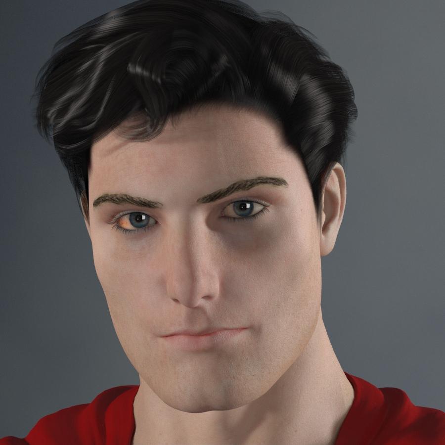
I was wondering if I could get some feedback on my skin and eye shaders, since I've been tinkering quite a bit with them recently in hopes of making them more photo-realistic. Superman will be my lab rat for now.

These shaders have been subject to a new round of revisions lately, mostly because, when I specifically asked at Renderosity and FanArtReview for comments on how photo-realistic my renders were, one thing that seemed relatively consistent is that the skin "tone" looks a bit off and/or the skin looks slightly "plastic" or doll-like. Now, I could never quite determine what exactly they meant by "tone" (hue, saturation, etc), but I figured that the "plastic" bit was due to the SSS being too weak, the specularity being too strong, or a little bit of both. So I spent some time tinkering with higher values for the former and softer values for the latter. The latest results seem to have improved things, but I've gotten at least a couple of conflicting responses. One person shifted his/her attention to the eyes in my latest test render (the one I'm sharing here), advising against the mild bloodshot redness in the corner of one eye. Another said that the same imperfection lends a more human feel to it. The second person, however, mentioned the "tone" again, while the first person no longer had any critiques about the skin (or at least, none that he/she felt warranted sharing with me).
Another technique I've been experimenting with is to come up with what I suspect is a more professional separation between diffuse color maps and bump maps. I toyed around in Photoshop until I found a way to isolate (reasonably well at least) all the fine and subtle 3D details that are usually baked into the main texture map (e.g. pores and tiny wrinkles), extract them into a bump map, and leave the diffuse map with just the color information (including subtle gradient variations). The results seem to work, but I'd like some more eyes on this to really see how it holds up.
Thanks in advance for any comments!


Comments
Well you seem to be doing this in 3DL since you say SSS and I know nothing of how that works but I am learning how to do this in PBR/iRay so here is what I think.
The eyebrows way too thin and plucked looking.
I think that the skin color is fine but it does look oddly flat matte. And there seems to be blotches of tan scattered in the peach of the skin here and there.
The eye lashes bleed together at the eyelids it looks like.
The eyes are the best - I like them better than many DAZ model eyes but I would still weaken the bloodshot part but not get rid of it entirely. It's hard to see the irises but they look like they need more of those 'bicycle spoke' details.
You need an HD morph set or a normal map to put slight creases in on the eye lids, crows feet, and around the mouth and on the forehead. You can adjust the stregnth to make him look younger or older.
I think the pores are too uniform and evenly distributed, Most people will have larger pores on portions of the cheek and nose and the distribution pattern of the pores will follow definite different patterns on the face.
Then you need to make a specular map so his face doesn't appear so matte. It should pretty much be similar to the normal map you make for the pores and creases of his face but not quite - typically around the nose and cheeks are the oilyest and no coincidence that that is where the pores are the biggest. Around the mouth seems to be dry and flakey often so expect smaller pores.
I would try to find the highest resolution color photo of Christopher Reeeves face you can were he isn't wearing movie makeup (which will make his face matte and not so oily) and base your future texture off that if you can find one. If not search for any adult male that has brunette hair and very pale skin and get the biggest resolution picture you can of them.
the highlights in the eyes where the bounce off the cornea -
at the other side of the eye on the iris , there should be a faint illumination
because those highlights beams will shine through the cornea (transparent) and hit the iris (mainly opaque)
otherwise the eyes look pretty good - a bit red maybe, you could also think about purkinjie images /reflections of the different optical surface but that's probably foig a bit far
from here http://www.opt.indiana.edu/v665/CD/CD_Version/CH4/CH4.HTM
Thanks! I'm actually working with SuperFly in Poser Pro 11, but these comments are still very useful. I'll tackle the eyebrows later. For now, does this skin look better?
