Now Available - Carrara Skies Lightdomes 2 [commercial]
 Tim Payne
Posts: 37
Hi folks. :) It's been a while. :)
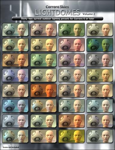
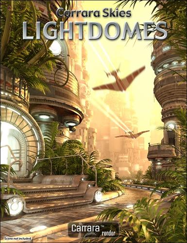
I'm getting back into content creation, and I'm really happy to finally be presenting Carrara Skies Lightdomes 2 - all the great features of the first volume, but with a much wider range of lighting colors. Whether you're rendering alien worlds, ancient adventures, future dystopias, or portraits of your favorite characters, CSLD2 makes it really easy to get great lighting results.
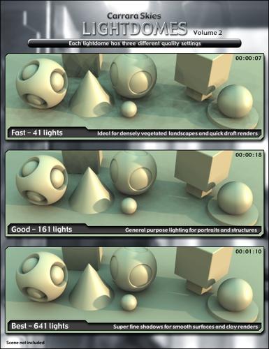
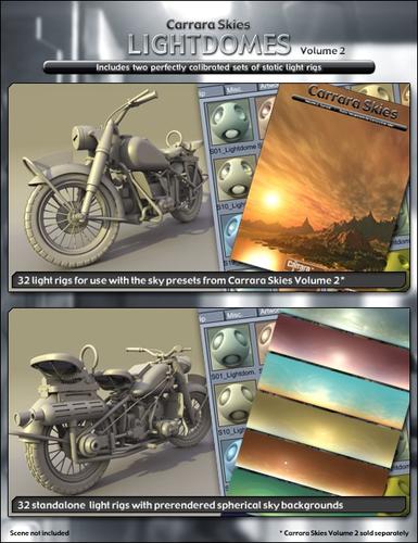
Carrara Skies Lightdomes 2 includes two perfectly matched sets of light rigs - one for use with, and the other without, Carrara Skies Volume 2. Two sets of light rigs are necessary because an atmosphere dims and tints far away lights. Each light rig has three lightdome quality options so you can pick the ideal balance of speed and quality for your scene.
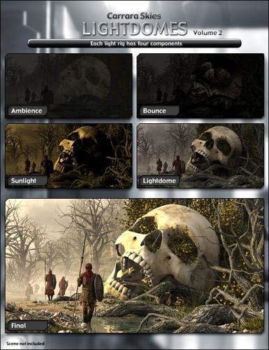
The colors of these lightdomes are far more natural than the Skylight GI produced by Carrara's Realistic Sky, and with the light rigs' bounce and ambient components you get results that look similar to Indirect Lighting, but in a fraction of the time.
For complex scenes, these lightdomes can render faster than comparable Skylight global illumination, and they use less memory too. They won't always be faster - it really depends on what kind of objects and shaders are in the scene - but in many cases they will be.
Another really cool advantage of these lightdomes over conventional global illumination is that they produce specular reflections. The colors and intensities of the individual lights in the dome is controlled by the actual colors of the sky, and this provides a subtle and very realistic approximation of blurry environment reflections on shaders with high specularity. Renders won't look flat like they so often do when rendered with IBL or HDRI.






Comments
More images. Click for full size:
well OK then...!
Looks Great!
I just bought and downloaded them. Since it is almost 4 am, I'll not get to play until (well I was going to say tomorrow) later.
Thanks,
ncamp
Oooooh !
nice :)
thank you
I really like the results I get in Volume 1 so this set is next to purchase! :)
Welcome back! Hope to see more from you soon.
Posted news here too: http://carraracafe.com/
Love the first dome set. I was hoping you'd make one for Skies 2! Yay!
Cha Ching!
So, Tim. When are you coming into the new forum and writing up a cool article or three. Missed you around here.
FYI to all. This happened last year and I went for it. Bought hte whole lot - and it's so freaking worth it. Even his tutorial manual are artistic and well made. Very fine products and second-to-none skies!
It's March Madness, which means that todays the day. Tomorrow the sale's gone!
That being said, I'd like to highlight Tim's great work a bit.
For those new to Carrara, and wondering what the differences are, Allow me to briefly explain:
Tim Payne's Skies products use Carrara's Realistic Sky editor
His Light Dome For Skies 1 & or Skies 2 give you nice Sky background images to use in place of the Realistic Sky feature, and include a set of light domes for use with them, and they also include special light domes for use with the Realistic Sky versions from the Carrara Skies sets. The background Sky images were created using the Carrara Sky products - so they look like you're using those products when you use them.
Realistic Skies vs Background Skies:
The really cool thing about the Realistic Sky editor in Carrara, for me, i the fact that you can go into the editor and change the time of day, simply by dragging the sun around in the provided sky dome illustration within the editor. At night you may opt to show the moon and its position. Quite handy and fun to mess with. The huge benefit of using Carrara Skies Volume 1 Realistic Skies of various Real World Style presets and Carrara Skies Volume 2 Realistic Skies of various Surrealistic Style presets is that you may go in and edit them, change the time of day, mess with the other various settings and lighting characteristics to create saved settings of you own.
The great thing about using Background Images for skies is that they are faster to render and offer a really quick, no-fuss solution when you need to add a background Sky. Used in conjunction with a light dome, especially light domes custom made for that image, is that you still have full control over your lighting, and how sophisticated you want that light to be - since these sets offer several grades of lighting. Since these backgrounds and light domes were made using the Carrara Skies series, they look just like them and work marvelously with any outdoor scene. Carrara Skies Lightdomes 1 are made using the Carrara Skies volume 1 product, and also have lightdomes to work with those skies in addition to the background versions. Carrara Skies Lightdomes 2 New! are made using the Carrara Skies volume 2 product, and also have lightdomes to work with those skies in addition to the background versions.
Within the included information, graciously created at widescreen and very easy to read, you'll get examples and instructions, tips and tricks that help you optimize your scenes. Information that is quite useful beyond the scope of the product. The Light domes packs teach you how to use the Master Light feature in Carrara, amongst other things. These instructions are also quite nice looking.
I know I'm missing something... as I have limited time. But this is a quick idea of the products and their differences. Check out the product pages for more info.
Tim
The new set looks great!
I have the first Lightdome and it gives awesome results.
I also have both of the skies.
.
I wish I could get you to make some light sets for interiors. If I could get the indoor lighting to look as good as your outdoor lighting, I would be extremely happy!
Wow! This really made my shadows look amazing! :)
Right on Tim.
there is something I don't understand: once applied to my scene, the light is too bright... (it's nearly white objects).. So i select the light dome, then master light, thgen I reduce the value... but the scene turn very dark, and stay dark, even if I change the values, via master light... I miss something?.?
Thanks everyone! :)
I really appreciate the writeup explaining the different sets, Dartanbeck. Couldn't have said it better myself. Thanks!
Hi tsarist. Well, past experience should have taught me by now not to say anything about future product plans - everything I've done ends up taking a lot longer than it should to get to market. And now I'll probably jinx myself for saying this... but... for the last few weeks I have been hard at work on just that. The results so far are excellent! And now I'm going to shut up about that. ;)
Hi celmar. It sounds like the "compatibility shadows mode" is enabled in the render room. Unchecking it should solve the problem.
Another possibility is that you aren't disabling the other options in the Master Light. If the maximum light range gets set to 30ft or something, no light will reach the center of the scene. Only the Light Intensity should be changed.
Hope this helps. :)
Forgot to post this image last night:
Yep. I finally got around to playing with some of Tim's light domes last year and came up with this image. Whether or not you like the picture, I think you'll agree that the lighting on the figure is impressive. Gorgeous lighting as a one-click operation? I can go for that.
So I didn't need much persuasion to buy this year's set.
Yep. I finally got around to playing with some of Tim's light domes last year and came up with this image. Whether or not you like the picture, I think you'll agree that the lighting on the figure is impressive. Gorgeous lighting as a one-click operation? I can go for that.
So I didn't need much persuasion to buy this year's set.You did that on purpose, 'cause you knew that I loved that image! lol
Thanks! I'll look at it again - heck, I would even save it as a wallpaper if I knew Rosie wouldn't get worried over such a thing!
Yeah. One click solution, and I also love the technique used to create the domes. I still like playing around with realistic sky editor, so I'm grateful to have the whole line-up. Besides, I like to support great artists in their efforts so they make more yummy stuff for me! ;)
Yo Tim!
Look forward to your updated articles.
I'm a bit overwhelmed with my new products as well. We don't want to release them to Daz until they're absolutely perfect and well-tested, right? My biggie right now, Carrara Enviro Kit - Woodlands has really been taxing me. I'm actually building scene-creation advice right into the interface with an alarming amount of presets.
As explained in that first post, but names left out for fairness, although I have different presets for different times of day, I left the skies alone, for the most part - because I'm a big fan of Sky products available at Daz3d. So far, your presets have covered my every need for a sky - using the RSE or one of your backgrounds.
You ARE a pro 3d artist! Thanks for taking the extra time to demonstrate that in your awesome instructions manuals!
Hey Dartanbeck. I just checked out your WIP thread. That's a great concept for scene building, and it looks like it's going to be a really nice product series! :)