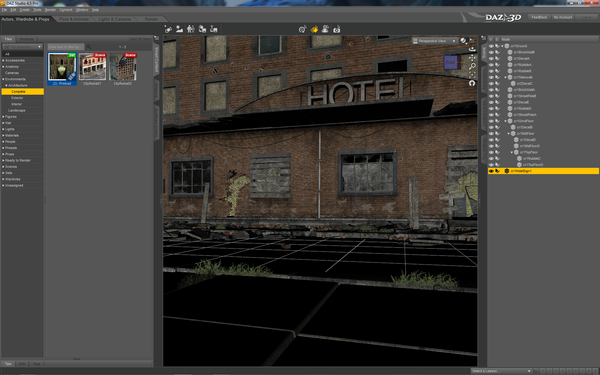
Unable to delete Hotel sign from Stonemason's City Ruins 02 scene
I'm attempting to delete the sign from Stonemason's City Ruins 02 full scene, but am unsuccessful. I expand the node tree in the drop down, unparent and try to delete. The node word "cr1HotelSign1" deletes but the sign in the scene stays put. It also won't let me right click on the sign and delete from the scene. Any suggestions?


hotel.png
1920 x 1200 - 2M


Comments
I don't have that set ... but yes, one can rename items that why it's letting you delete the word. Click on something else on the Scene Tab, then one click back on the Sign ... delete via the keyboard ... should work AFAIK.
The hotel Sign you selected is the SIGN on the EDGE of the building as Shown below. The Front sign is part of the MESH and can not be removed with a select and Delete combo. To do that you will need to Load the cr1GrndFloor into HEX and Delete just that part of the mesh.
Wouldn't it be easier to surface select the sign and drop the opacity to zero? That way you'd effectively 'remove' the sign, but you wouldn't have to worry about fiddling around with deleting chunks of geometry. If you're using Luxus or Reality, set it to a null material so it doesn't use the surface for any calculations. Dropping it to zero opacity, while having the same effect, will still affect render times. By setting it to null you effectively tell Luxrender to ignore it completely.
Yep as HeraldOfFire suggested if the sign has it's own material zone then set the Opacity to 0% if it doesn't have a mat zone of its own then make one http://www.daz3d.com/forums/discussion/14824/#215496
It looks like editing the mesh is my only option for the sign in the front. I'll attempt it tonight after work.
It does share a material. I'll give it a new one and see if this is a better work-around.
You don't need to edit the mesh just the mats zones. Download that zip I linked to and you will see how easy it is to do inside Daz Studio. Don't make life hard for yourself. :)
Thanks to everyone who jumped in. Lowering of the opacity of the sign is the way to go. You guys are awesome! Thanks again.