My renders
 Aakanoyoru_71b8a3b724
Posts: 12
A place to dump my renders and stuff and have them torn apart by criticism XD
In the following render's I've tried various postwork methods, using only free content (some of which were free as part of a promotion).
Time to stop lurking and come out of the dark...

winmech.jpg
1465 x 2000 - 549K

Art_002_1small.jpg
1000 x 1180 - 419K

workies.jpg
1465 x 2000 - 602K


Comments
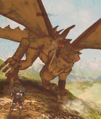
number two is to muddy .
like the others .
The muddiness was intentional :o)
I came up with a concept to a character (below) who's been kicking around in my head for about a year. A cat girl warrior who (unlike many cat girls in the genre) is quite serious and deadly. Story was that she ends up meeting a battle mage who retired to be a blacksmith, and the two end up going on adventures together with a similar tone to "Spice and Wolf"... don't know if I'll ever get around to making that story or not.
I didn't bother fixing all the poke-through, as I just wanted to test my workflow. It takes less than 5 minutes of postwork to go from render to half-toned beastie. Maybe I'll make a tutorial about it...
Another render, this time using google sketchup for backgrounds. Original pic is much larger, but may have some content that may not conform to community standards, so I played it safe ^^;
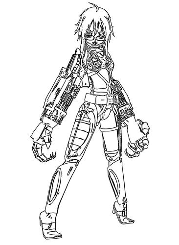
Combined Akatora's Deco (face) with Sixis 1 Media's Cyber Her (limbs) and Reiko's cyber parts (torso). In the background we can see the last cyborg attempt was... unsuccessful.
Amazing what one can make with $0, isn't it?
I like your muddy :)
I would suggest moving your character over, and not align her with the foot. Perhaps put her against more contrast. My red circle is where I would have put her, not that it's "correct"- just an opinion. The colors are too similar where she's currently placed. Imagine sliding her over to the red circle- look at the background colors- she would stand out more.
Welcome to the Art Studio, looking forward to seeing more!
Thanks for the criticism. She does kinda get lost in there, doesn't she? I need to keep an eye out for those incongruous elements.
So I got The Schell's Gunhead mech, and had some fun modifying it. I loaded the model in Daz about 5 different times, changing the visibility of the figures and parenting them to various places, making it look more mecha-like. I also added a pilot :3
I liked the number two...
Did some rendering (and postwork) for the background. I think I went a little overboard on the character's fuzziness :3
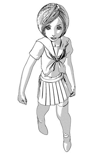
Working on some comic-book style stuff. Did the background render in DAZ using some models I got from the google3d warehouse. Postwork was adjusting the brightness and contrast on the render and putting the character in the foreground. Unfortunately her chin looks a little strange, but all well.
Very interesting work you have going on over here.....enjoyed looking...Trish