Lux render for beginners
 Hera
Posts: 1,957
Hera
Posts: 1,957
Hello!
So I just did a very first lux render of a work.
And what I found was that the light is working better, it looks more like being outdoors on a sunny day than with the 3Delight. That is, the render behaves like a photolense, thus it does give the feel of looking at a photo rather than looking with your own eyes upon a scenery. Probably because it gets less sharp and probably because I have a too high strenght of the light as it is now. I generally found that the lux makes it all so much brighter than the 3Delight.
But then there's the materials. While I think surfaces like glass, and stone and concrete work looks rather well, and the human skin look excellent, I have quite a bit harder with the metals and the more glossy areas like leather and nature's stuff, like leaves and fruit surfaces. (oranges in this case) - it all becomes very matte. And some of the textiles looks really strange too.
Then I can't get bump and displacement maps to work.
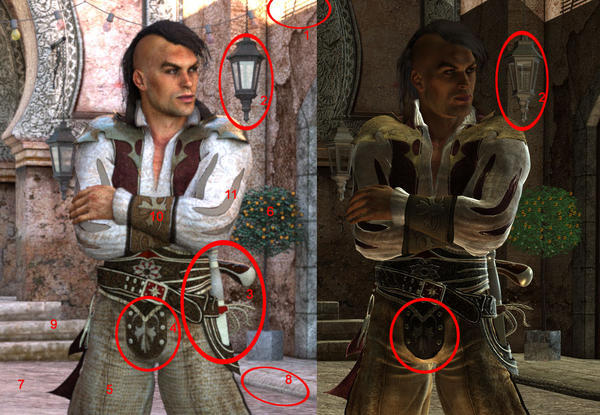
Here are some things I'd love to get some help with. The one to the left is lux the one to the right is 3delight
1. In this page I like the 'whitened-out' shadows, gives the thing character, but is there a way of not having them?
2. How do I make the metal looking a bit more shiny like in this lamp?
3. Same with the sword and the gun, they look like matte plastic in the lux render
4. The studs here are matte as well and there's no depht to them
5. What happened to the textile of the man's pants? They look quite different. Not all bad, just softer and wider over the tights
6. The oranges on the tree look flat as well (I've exaggerated those in the 3Dlight render to show the difference)
7. The ground is dull a well. Almost no texture
8. There's a strange white line where the pavement ends.
9. I added displacement to the stairs, it's impossible to see in the Lux image.
10. The'res no bump in those bracers
11. Finally, what happened to the bracers on the arms. They have become gray and lacking of depth a well.
Sorry, that got long and some of these q's are probably answered earlier, then please just add a link ;) I'm ever thankful for all help I can get.
Daz 3D is part of 
Connect
DAZ Productions, Inc.
7533 S Center View Ct #4664
West Jordan, UT 84084
Licensing Agreement | Terms of Service | Privacy Policy | EULA
© 2024 Daz Productions Inc. All Rights Reserved.
Comments
How are you porting to Lux Render, Luxus or Reality or another?
Some comments in no particular order:
For metal bits, consider switching them to LuxRender's metal material. Then adjust roughness ("Polish" if you're using Reality) to determine how shiny the metal is.
For glossy materials, the shine will be a combination of the roughness (glossiness) and specularity of the glossy material. Most stuff in Poser and Studio has glossiness and specularity values that are not appropriate for LuxRender, and will often require tweaking to get best effect in Lux.
Bump maps made for Poser/Studio generally need their bump strength turned up considerably to have a similar looking result in Lux. You will get better results using something like ShaderMap 2 to convert the bump maps to normal maps and use those in Lux.
Displacement requires geometry to displace. The stairs you point out I would not be surprised if they are very low in poly count -- possibly even a single quad for each of the front and top part of each stair. For displacement to show, you need to either 1) use subdivision to increase the amount of vertexes so that the displacement has something to actually push around, or 2) use microfacet displacement. Subdivision increases the memory usage for Lux, due to the additional geometry generated. Microfacet does not increase memory, but is ORDERS OF MAGNITUDE slower to render. Like 15-20x slower for a similar levels of displacement (microfacet levels are a different scale from subdivision -- 500 microfacet levels is about roughly equal to 9 levels of subdivision).
For lighting issues, you need to think like a photographer in the real world. The burned out bits at the top of the image are because there is too much light reaching them vs light on the subject. So do like a photographer in the real world would do and put in a diffuser to control the light hitting the buildings in the background. The easiest way to make a diffuser is to create a plane primitive, set it to a matte, and adjust its opacity to control how strong the diffuser effect is.
You have addressed so many issues at once here, it is hard to decide where to begin. Aside from cwichura's suggestions, I could add a few. It would help to know if you are using Reality or Luxus to port your scenes into LuxRender. I only have Luxus, so I can't speak for any Reality settings.
Just off the bat, your displacement issue can be addressed by turning on LuxRender Mesh - SubD Level (if using Luxus). It is at the very bottom of the mesh section of your LuxRender material. It defaults to zero even if you copy studio parameters when converting to Lux materials. Change it to "1". I have found so far that leaving the Mesh Displacement scale at the default 0.1 works well. At least it has in my case. This should help with #9.
To keep from blowing out your highlights, as in #1 of your pic, you should try not to have any of your light colors set to full white (RGB 255,255,255). Lowering them even a little bit will keep your lights from ever getting to full white, thereby stopping those blowouts. I like to use RGB 220,220,220 which is still nice and white, but not horribly so. This rule applies to textures as well. Absolutely nothing in your scene should have color set to full white, or full black for that matter. What ends up happening is you will get very dark or very bright areas in your render, which kills the textures and reflections. This should help with #1, 5 and 7.
As for the shine on the sword and certain other elements, it depends on whether you are using specularity maps or not. Specularity maps should be used with a grayer version of whatever color you want the highlights to be. Most of the time, sticking with medium to light gray will work, getting closer to white (but not all the way) as you wish to have a more reflective appearance.
Do not use a IOR setting on specular with maps if you wish to be able to control how bright the highlights are. IOR automatically sets the specular color to medium gray (128,128,128) and then treats the specular highlights according to the IOR setting. IOR is index of refraction and, put in the simplest of terms, basically means how the reflected light is scattered back away from the surface. This is not the exact definition, but it is a good way of thinking about it. For example, water (IOR 1.33) would reflect light back to you differently than would skin (IOR 1.45). You can look up the IOR of just about any surface just by searching on the web.
If you do not use IOR, but specular maps alone, or no maps at all, you can then adjust how bright or dull the specular reflections appear by making the specular color darker or lighter. To control how sharp these highlights are (or shiny), adjust the roughness. Roughness of 1 is way too rough and your surface will be dull, dull, dull. .10 is very shiny, like the highlight in an eye or on a glass ball. So, for skin you might want around ..4, for metal you want around the .1 or .2 range. Cloth without specular maps looks good around .5 or 6. These tips should help with #2, 3, 4 and 6.
As for bump maps, I am still learning about the conversion of those in Lux as well, but so far my experience has told me that the automatic conversion from DS mats to Lux mats has the bump entirely too high, which is contrary to what cwichura said, but this has just been my personal experience. Bump set to 1 in Lux is equivalent to bump factor of 1 meter, where pure white in your bump map simulates bumping the surface 1 meter out, which would look extreme if it was displacement but just looks gritty and rough with bump. Your surface will look like sandpaper, or if there is very little contrast in your bump map, it will look like nothing at all except a darkening of your surface. I would start by lower your bump to .001 which is one millimeter. I imagine most things that are bumped do not want to bump out more than 1mm. Just set the strength to match the maximum bump distance that you want. These tips should help with #7, 10, and 11.
Actually, the topics I covered here are applicable to 3delight and other renderers as well, with the exception of the bump and displacement scales. You will have to adjust those according to the defaults of your chosen renderer.
I am not an expert in this. Everything I have said works for me in most cases, with only minor adjustments after initial setup. Just try them out and see if you get better results.