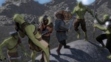
Very flexible. I’d have been zooming out or panning...
Go wide-screen. Epic!
@ RCB_Panzer
Thought sniper scene was fine. Reminded me of playing Arma3 a few years back.
"Squad. Go Prone."
"Gee! I can get a better photo of you guys if I stay standing for just a sec--"
POP!
Ooops... Not a good idea to stand around in a combat zone. : 0 !
To topic:
Tough one if taken from frames. Haven’t tried dForce. Particular frame that might capture the flow of the fabric the best? Am sure they’d understand if you make clear the emphasis was/is learning new physics & what can be done with fabric. Hope they would anyway! : 0 !
@ Noswen
We’re in kind of the same boat since I don’t know if can post renders at more than one topic.
dForm: crunching things, or tweaking hair for a cap might be one thing. Using it for bends like that-- no I don’t think that would be fun!
Nice work though-- can’t tell that anything’s been done to it! Since you can’t tell-- might mention that in final entry. Don’t know how much CVs go by what we write, or just look at the renders.
@ Shinji
Did you change him? I thought he was wearing a boonie hat. They're much different going from a tablet to 4k monitor on desktop though. On this one it looks like the gunfire is clipping off screen a little? Just a heads up if you didn't notice, or maybe all of it is in the picture & top part cropped out on this monitor. Hope that makes sense. : )
---
Latest 3Delight experiment: Messing around with RGB values now & trying for realistic glass. Not working so far. : /
Glass settings kicking my desktop's butt as windows 10 keeps shutting DS down. CPU fan sounds like it's going into melt-down but HWiNFO64 isn't showing any flags. Have to puzzle it out.
Finally found somethign for Aiko 7 to do. Think I picked character up in 'November Madness' sale but haven't used much.
Glass in 3dlight is kind of a hot topic with all the 3DL wizzards, I read on some post from you, that you found the threads which cover that topic already, so there is nothing I could reasonably add to the information over there
Thanks. The grey mesh areas on the figure's skin are part of the image that comes up when hovering over the Base Colour option. I don't actually know the name for that, nor what UVs are, I'm very very much a newbie even after a year .
I have found one strange issue with the D-formers, I'm not sure if this is something I'm doing wrong, they're not intended for this use, or if it's a bug. Before the figure is posed the Field shows up as effecting (the little yellow dots) the portion of the figure it actually covers. However, if I try to place the Field after the figure is posed the yellow dots seem to appear on the figure when the field intersects with where the figure would have been before being posed.
This has made trying to place these much harder than it would otherwise be. I might try to start from scratch and place the fields before posing if it's not simply something I'm doing wrong.
Can you post a screenshot of that thing? I'm not sure I understodd what is going on. I try to do this from memery as I'm in the middle of a huge render. ther is an intrinsic orientation in your figures and that keeps ebing the same however you position or turn the figure. The most plain its is to see in the zero position. so if you ewnat to place your d-former field on a leg when you start out at the hip you go down on the y axis. so ecen in the position your figure has and one would think to move it sidewarts to reach the lg you still need to go on the y-axix.
Is that what you meant?
Can't take the screenshots right now, but this may well be it. The field seems to act on the figure's limb if the field intersects where the limb would be in the default pose, not where it actually is posed.
I'd never run into this intrinsic orientation thing before.
I was asked for a better shot of my Ogre, here it is.
And if I don't post until after the holiday, I hope everyone has a happy and safe one.
Funny thing, that, :D Why not combine it with the render of the guy standing in the green stuff the green glow should be awesome on the metal sides of that thing
Not today, I've got a shift at work to get ready for, but maybe.
Ok, I think this is my final revision for the 'Studio Shoot' image. I listened to all the feedback regarding the fog and also the brightness of the red lights. I made very slight adjustments and this image is right out of Daz3d with only photoshop work being a clone on 3 spots on the leggings of the foremost figure where pokethrough happened. Thanks for all the feedback. I will be placing both of my final entries here for ease of consideration.
Entry 1 Title: Studio Shoot
Software: Daz3d (iRay render):
I listened to the feedback regarding the wing for this entry and tried in a number of ways to show it but I liked this vantage point so well and could'nt find a good way to introduce the other wing that I decided instead to change the aspect ratio and camera angle to get this new view. I am happy with this image now I believe.
Entry 2 Title: Dragon Tower
Software: Daz3d (iRay render):
That studio shoot looks amazing, I like the details you can find there, the lights look good to me
The dragon render has a very nice point of view but I think some changes to the composition could improve the scene eg the tower kind of dominates the scene over the dragon, maybe some DOF would add to it as well to increase the feeling of size
I have altered the view and added DoF for this shot. I also added another character into the fray. This change also allows the dragon's other wing to be viewable, allowing you to see it come out from behind the other side of the tower. Thanks for the feedback.
@linwelly: I have two screen shots to show what I mean now, it probably is the intrinsic orientation you mentioned, but easier if people can see it instead of trying to unserstand the not so clear description I gave.
@Noswen yes, that it is. I had tried it as well some time between renders and yes, that field will follow up and down (y-axis, and the other directions therefore as well) as the figure has it in the zero position no matter what position you put her into.
I think once you know the trick its not that bad anymore, as you can vicualise it with those dots
I'm not sure whether this does look any better or not, but I redid the d-formers by the hip so that the area is no longer working by the figure having half of her leg gone
I gave up in trying to work out how to position the fields by imagining where the figure is and worked out how to save the pose and just switched between that and zero-ing the pose for positioning the fields.
Glass in 3dlight is kind of a hot topic with all the 3DL wizzards, I read on some post from you, that you found the threads which cover that topic already, so there is nothing I could reasonably add to the information over there
Thanks. They have some pretty good advice there even if thier 'shop talk' is beyond me... : 0 !
Nothing this month then. Was fun chatting with people though.
@ everyone
Best wishes on this month's challenge & enjoy new years!
Well, busy month for a retailer. Finally I could work on my picture. :)
Gefeiert wird überall
Software:
DAZ Studio: Posing, Lighting, Rendering
GIMP: Error Removal (Fireflyes, sharp Edges etc.), Some brightness in the Eyes, Overall Glow
This looks very warm and cozy!
I love the DoF you have used and the window looks nicely lit especially where it looks slightly blown out in the upper area where it is brightest.
The only thing I see that looks slightly out of place is how the stockings are all level vs how they would slant hanging from the single push pin in their loops. Obviously this could be explained with more tacs to hold them level but it is the only thing that stands out to me, I think because they are bright enough to draw my eye.
I agree with you. There are some details left, I could work on. But sadly I run out of time. So the picture ends like it is, and I like it nonetheless. :)
Showcased Participants for the December Free Render Challenge
Free to Fantasize - For this showcase we chose the person who created a fantasy image that contained a lot of the elements learned from previous challenges and showed a good overall understanding of previously covered New User Challenge Topics..
For those reasons we have selected Geffeto showcase
Tis the Season - For this showcase we chose the person who created a magical holiday inspired image that showed off the skills learned in previous New User Challenges.
The New User we felt best showed that this month was ricswika
The Gift of Light - This showcase was given to the person that used lighting along with other Challenge Topics to create an image that caught the eye, specifically in regards to how it is lit.
The New User we felt best showed that this month was Tynkere
New User - Welcome
guitardrifter and RinelleGrey
Congratulations to all those spotlighted thing month!
Comments
Glass in 3dlight is kind of a hot topic with all the 3DL wizzards, I read on some post from you, that you found the threads which cover that topic already, so there is nothing I could reasonably add to the information over there
Can you post a screenshot of that thing? I'm not sure I understodd what is going on. I try to do this from memery as I'm in the middle of a huge render. ther is an intrinsic orientation in your figures and that keeps ebing the same however you position or turn the figure. The most plain its is to see in the zero position. so if you ewnat to place your d-former field on a leg when you start out at the hip you go down on the y axis. so ecen in the position your figure has and one would think to move it sidewarts to reach the lg you still need to go on the y-axix.
Is that what you meant?
Can't take the screenshots right now, but this may well be it. The field seems to act on the figure's limb if the field intersects where the limb would be in the default pose, not where it actually is posed.
I'd never run into this intrinsic orientation thing before.
Wow, a lot of great entries since I last checked in. I haven't had a lot of time for rendering lately but changed a few things in the dwarf pic.
Title: Last Stand
Software: Daz Studio, no postwork
Title: Sunset
Software: Daz Studio, no postwork
I was asked for a better shot of my Ogre, here it is.
And if I don't post until after the holiday, I hope everyone has a happy and safe one.
Funny thing, that, :D Why not combine it with the render of the guy standing in the green stuff the green glow should be awesome on the metal sides of that thing
Not today, I've got a shift at work to get ready for, but maybe.
I have altered the view and added DoF for this shot. I also added another character into the fray. This change also allows the dragon's other wing to be viewable, allowing you to see it come out from behind the other side of the tower. Thanks for the feedback.
TITLE: Dragon Tower
SOFTWARE: Daz3d
RENDERER: iRay in Daz3d
@linwelly: I have two screen shots to show what I mean now, it probably is the intrinsic orientation you mentioned, but easier if people can see it instead of trying to unserstand the not so clear description I gave.
@Noswen yes, that it is. I had tried it as well some time between renders and yes, that field will follow up and down (y-axis, and the other directions therefore as well) as the figure has it in the zero position no matter what position you put her into.
I think once you know the trick its not that bad anymore, as you can vicualise it with those dots
I'm not sure whether this does look any better or not, but I redid the d-formers by the hip so that the area is no longer working by the figure having half of her leg gone
I gave up in trying to work out how to position the fields by imagining where the figure is and worked out how to save the pose and just switched between that and zero-ing the pose for positioning the fields.
Remade the background to remove some artifacts that were not wanted, this should be my final change.
Thanks. They have some pretty good advice there even if thier 'shop talk' is beyond me... : 0 !
Nothing this month then. Was fun chatting with people though.
@ everyone
Best wishes on this month's challenge & enjoy new years!
--Bruce
I am throwing my two entries together to tidy up my posts. Happy New Year's to everyone and thanks for all the info and feedback during this month!
TITLE: Studio Shoot
Software/Renderer: Daz3d, iRay (Photoshop only on two spots on leggings where clipping occurred)
TITLE: Dragon Tower
Software/Renderer: Daz3d, iRay (No photoshop - right out of iRay)
Well, busy month for a retailer. Finally I could work on my picture. :)
Gefeiert wird überall
Software:
DAZ Studio: Posing, Lighting, Rendering
GIMP: Error Removal (Fireflyes, sharp Edges etc.), Some brightness in the Eyes, Overall Glow
This looks very warm and cozy!
I love the DoF you have used and the window looks nicely lit especially where it looks slightly blown out in the upper area where it is brightest.
The only thing I see that looks slightly out of place is how the stockings are all level vs how they would slant hanging from the single push pin in their loops. Obviously this could be explained with more tacs to hold them level but it is the only thing that stands out to me, I think because they are bright enough to draw my eye.
Great image!
I agree with you. There are some details left, I could work on. But sadly I run out of time. So the picture ends like it is, and I like it nonetheless. :)
Happy New Year everyone. Here's hoping it's a safe one for all of us.
I wish everybody all the best for 2018!
And with that, this challenge is closed now
December 2017
Showcased Participants for the December Free Render Challenge


Free to Fantasize - For this showcase we chose the person who created a fantasy image that contained a lot of the elements learned from previous challenges and showed a good overall understanding of previously covered New User Challenge Topics..
For those reasons we have selected Geffe to showcase
Tis the Season - For this showcase we chose the person who created a magical holiday inspired image that showed off the skills learned in previous New User Challenges.
The New User we felt best showed that this month was ricswika
The Gift of Light - This showcase was given to the person that used lighting along with other Challenge Topics to create an image that caught the eye, specifically in regards to how it is lit.
The New User we felt best showed that this month was Tynkere
New User - Welcome
guitardrifter and RinelleGrey
Congratulations to all those spotlighted thing month!
Congratulation to all the winner.

congrats to all. Very nice work everybody :D
Thanks and congrats to all the winners! Looking forward to 2018.
Well done to all the winners, and thanks to the volunteers for their time and advice.
Wow! I honestly don’t know what to say. Didn’t think I’d officially entered the challenge. Mainly there just to meet people & learn.
Thank you very much!
Very rewarding because I’m discovering that 3Delight is pretty hard-- esp. with no quick IRay preview.
Congratulations to the other winners, and best wishes to everyone kind enough to chat with me and offer a few pointers!
--Bruce
Congrats, everyone! Some really outstanding renders this month!