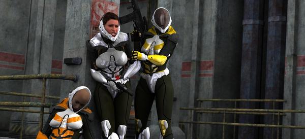
first worthwhile render of mine with people in it! :D
 Noved1
Posts: 160
hello, i usually do landscapes, as you can see here--- http://www.daz3d.com/forums/discussion/21802/
and i almost never put human actors into scenes, because i can never get skin hair or lighting right for them. but i made an attempt anyway, and wanted to show it, so i could get tips and advice on how i could improve it. ex. better lighting setup? skin settings wrong? any advice will help out. i was going for a valkeryie squad type feel. i think it looks ok, particularly in full screen.
P̧̝̹͕͖̠̤͕͓̎̎̀̂̇̉͐̂̚̚͜r̲̟̜̥͕͚͙̹̗̟̆͛̓̍̿̓̐͗̐̉o̞̻̥̰͓̻̣͎̞̓͛͌̈́̒̋̈́͒̎́ͅḑ̟̜̼̜̣̰̭̮͋̿͋̿̈̆͒͑̇͜͝ ̫̰͉̤̹̹͔̪̩͓̓̌̎̔͑̽̿̈̈͠h̰̳̖̬̯͔̺̪̠͈̀̑̌̔̇̉͋̊͝͝ă̖̪͈̱̫̠̙̝̲̝̽̂͗͛̀̽̅̂͠ș̡̯̳͍͎͚̹̱̀̑̓̐͂̒̆̕͘͜͝ ͚͔̻̤̦̦̻͇̼̥̍́͐͂́͛̈́̍̋͝a̖͕͎̠͕͍͖̭̫̖̋̿̀͆̆̑̓̈̋͝ ̜͚̖̳̰͚͓̠̩̫̾̿͌̐̀̅̀̈́́̚p̢͇̗̱̘͖̭̺̣̠̒̅̓͂̔̎͒̃͋̏ļ̢̬̱̝̲͍̫̹̋́́͒̑͗̌̊̄͝ͅǎ͈͙̹̰̳̤̙̞͔̤̔́̑̃̌̈́̾͒͝n̟̮̳̤̟͎̪̺̺̼̓̈̅̑̉͂̔̌͆͠


Comments
I think it's pretty well lit and I don't see anything wrong with the shaders. I don't like middle woman's pose plus expression as well as the others; she looks to me like she needs the restroom (legs together and bent over is the problem).
Edit for PS: I like the slightly tilted camera angle. It adds a sense of danger and movement in a way a flat angle would not.
yeah lol SickleYield, a laser shot to the gut has a tendency to make you do the bathroom dance. this one is set about 5 minutes before the first one..before stuff went down i suppose. i tired out new hair i bought to. thought this one was more of a test. and also, i did alternates with different colors. and thats always fun to see. though with color they start to look like power rangers...
I totally agree, that was my first thought! If it is an abdomen hit, her hands need to go up to the tummy. This angle makes it look like she is holding lower and in the "Gotta go" position. I do like the lighting (not the same old, same old daytime lighting) and the set use. :)
It is really quite good, IMO. I like the expression and her posture. It was obvious to me immediately what had just happened. Great job.