Klooless's WIP Thread
 klooless
Posts: 115
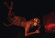
I generally lurk, but am trying to come out of my shell a bit this year. I decided I would start with new images created this year. I began playing with Daz Studio in late 2008. I was looking for an art program for my son-in-law when I discovered Daz Studio. I didn't do much with it for a few years and have always been hesitant to post my images because like everyone else I never felt mine were very good. I'm not a natural artist, more of a wannabe. So I'll post my WIPs and finished images here, hopefully you good folks will be able to provided some good constructive feedback and help me improve. Thanks for looking. Here's my first 2018 render using RawArt's Cat World.
Seems the image is a bit dark on my PC.


Comments
This one was created for the Dual Colors challenge in Val Cameron's FB group.
Looks pretty good to me. There are some DAZ products in the store that are similar but I like your render better.
Thank you very much, nonesuch00!
That's a great take on a feline, klooless! They're both very good.
Thanks Chameo! Here is my latest project. I needed something a little brighter to escape the dreary days of winter. For some reason the site won't let me upload this one een though I made it smaller. Here's the link to the image in my gallery: https://www.daz3d.com/gallery/#images/500681
Being retired has it's advantages, more time to play in Daz Studio. Here is today's project. As always comments and feedback are welcomed.
Like many other Dazaholics, I am a serious pixel hoarder. One of my goals this year is to render at least one image of all the characters I own. This is FWSA Agnes . I also used Fisty & Darc's Jewelry Basics for Genesis 3 Female. Love the shaders in that set. I think it has the best gold color shader available. I even used the shader on the studs on the sandals. I really like the dForce dress by Martesarte linked by @Llynara in her Art Studio thread. It drapes well, my only thought on the dress is that it would have been nice to have some stitching around the hems, other than that it's a great dress and I can see using it a lot!
Lovely image. Not sure if it's the hair style of the dress, but there's something late 1970's about this to me.
Thanks! I agree this does have a retro 70's look to it. I think the hair moreso than the dress though. I had a hairstyle like that during the late 70's although my hair grows so fast that the top would flatten in about 2 weeks making the whole style look bozo the clown had done my hair! LOL
Really like the way her pose echos the silhouette somewhat on this one.
And the girl in the dress looks very natural, and I do agree, retro 70's but in a good way!
Thanks @IceDragonArt! The girl in the dress was one of those that just fell together easily. Come with Me was a little more difficult because I was having a hard time getting the lighting just right without overblowing the oranges in the scene. Still was a fun image to create!
Been in a bit of a slump these last few days. Not super happy with this one, but not unhappy either. Suggestions for improvement?
Nice one! Maybe try some backlight to give her some highlights and to create a stronger sense of depth?
Nice renders...
You might try darkening the entire scene and really focusing the light on her. Doesn't have to be super dark but just a bit more light on her and a bit less on the rest of the image. Right now its all blending together a bit.
Thank you for the advice. I agree she does blend in too much into the background. So I tried using some blending layers and filters to make the girl stand out more from the background. It was okay but I still wasn't happy. So I did another render. This time I changed the camera angle and focused more light on her and then did some layer adjustments in Photoshop.
This one was one of those that you love and hate at the same time. While putting it together, it flowed beautifully and looked like the image in my head, then I tried to render. First render crashed after running all night. Then I went in and deleted all the hidden parts, ran it through the scene optimizer and let it render overnight. Another crash. Today I just let it render while I could monitor it with fingers crossed. It rendered for 6 hours and was still at only 73% when I stopped it. I'm not sure why it was being such a putz about rendering, maybe the hair, maybe the set, not sure. Used Urban Streets of Tomorrow by SFMan via his Deviantart page. Great set, but huge like one of Stonemason's. Mousso's Celestia, Eclipse outfit , Midnight Special hair and STZ's bike and Queen of the Road poses from Rendo were also used. I did a lot of postwork on it so hopefully it doesn't look too grainy.
So glad you started your own thread, you're coming along very nicely!
A couple tips- first, on the composition side- some of the feet are really close to the bottom of the render, so I'd put more space both below the feet, and above the head. (The gal in the red shirt, looking over her shoulder, seems a bit smushed.) Since the emphasis is on a vertical subject, perhaps move her over to our right a bit, so the image isn't so wide, and reduce the width of the render.
Another tip- to avoid light hair washing out, while trying to light everything else (like the face, shoulders, etc) go in to Surfaces after selecting her hair with the Surface tool (those three sheets of paper, above the viewport area) and put the Diffuse color (base color) a slightly darker color. If it's white, do a slightly darker gray. When it's lit, it will still look white but not lose the detail. It's a good thing to do with walls too.
Tip on posing- get the camera angle, or the body, so you don't have black on black unless there's some rim lighting separating the parts. (This is in general, sometimes you may want the body to fade together.) You gal kneeling- her leg under her blends in so it goes to a large black "area" underneath her. Or, you may have wanted her that way, it really depends on what you're going for. :)
For the things I really like- the gal on the motorcycle's hair looks so neat! You have very nice lighting there. The body positioning is good too, nothing coming out of her head from the background, and your crouching gal is nicely placed too, with the head above the balstrade/railing. Her pose looks very fluid. I also like the side lighting on the gal in the red shirt, and her posing. You've got a nice variety and it's fun looking through the renders!
The second remake with the angle change made a big difference and really has her as the focal point. As Novica pointed out her back leg is a bit lost but I think that's probably her cape and leg blending together. Given its night, I'm not sure you need to change that.
The focus on the girl on the bike is really great, her hair and upper body really draw your eye to her. And there isn't any rule that says that you can't stop a render early, I stop mine all the time. As long as it looks the way you want it to, there isn't a real need to let it finish. And sometimes a bit of graininess add to the over all feel of the render.
I agree, composition is one area I need to work on and posing to get the greatest effect. It's only been in the last few months that I've finally (after years of pulling my hair) started getting a handle on lighting. So now it's on to composition and posing,although I don't think I'll have quite as many issues with posing itself. I like my girl on the bike, my problem with that render was it kept crashing at about 50% or so, getting it to 73% was a triumph so I took what I could get there. Still not sure why it was taking so long, especially when I had removed all unnecessary items and optimized the scene. I'm thinking the hair might have been the issue. I did use shaders on it.
Hair can definitely be an issue!
So today, I decided to try following along with @deathbycanon canvases tutorial and I thought it came out very well. Her YouTube video was very clear and easy to follow. I was also trying to show another side to the orc other than the violent, cross sort we are all used to. :) This one uses Josh Crockett's awesome Orc for Genesis 8 Male
Aw, love that Orc. And the soft lighting is perfect.
Thanks, Novica. I think the Orc has become one of my favorites. Here is today's project. I worked on the hair a lot since it seems to be a bit on the thin side in my opinion. Still working on composition. I've noticed I seem to do better with portrait style images.
Still working on improving composition.
You can actually use two sets of the hair to make it thicker. That cuts down on the amount of postwork you need to do. You can also combine two hairstyles. That's a bit trickier as far as the color goes but if you have hair shaders its a great way to change things up and make things not so sparse.
One of these days I will try to use two sets of hair. My laptop doesn't particularly like it when I do that, LOL. When I saw Josh Crockett's new alien, greylien-hd-for-genesis-8-male, this picture popped in my head. It was one of those images that just fell together nicely I thought. I don't normally render with children, but this one called for it.
Over on Dreamlight's facebook page is this month's challenge, What is love, so I thought it would be fun to put together an image showing the summer of love, 1967. I wanted a very old vintage look to the image so lots of filters from the NIK collection went into this.
I love putting unusual characters in unusual situations. When I saw the Dweller and Glumgurgle, I could't resist putting them on the scooters.
Hah! I love it. Don't know why...but the theme song for Netflix's "Strangers Things" series just popped into my head.
Trish