Just showing some of what I do when I'm Bored
 sikotik13
Posts: 36
I started this solely because I have received invaluable and incalculable knowledge from the fine folks of this forum.
I therefore decided it only right to show off any renders I do that I am not ashamed of/dissatisfied with.
I am willing to accept critiquing and perhaps may ask for advice if I get truly stuck on something (after I use that lovely search box, of course!)
Enough chatter! :vampire:
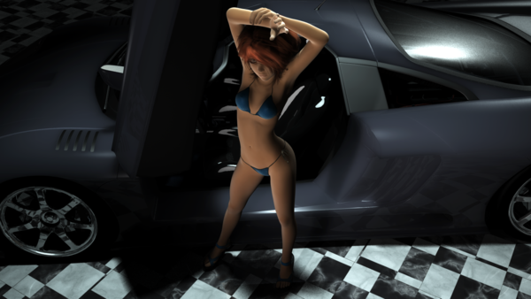
1st image - no postwork.
- Custom genesis mishmash I named Aria, everything on her is SSS shader applied. (Thank you, AoA) ***I forgot, the eyes are DT's EYEris!!!
- Car is one I found in my runtime, no idea where or when I got it, but it cleaned up nicely with some SSS for the paint, and random shaders I had for most of the rest of it.
- Floor is random quick retex of Maclean's Room Creator 2 floor
- 2 distant, 2 spot lights
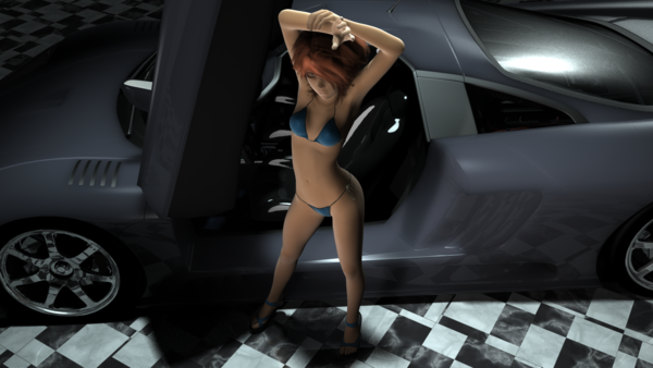
2nd image - light layering, blurring in GIMP



Comments
Welcome to the Art Studio! :)
I love it when artists shoot from different angles and experiment. What I noticed is the nice crisp bluish white light along the top of her upraised arm- really sets it off nicely- and contrasts with the softer feel of the midsection and overall feel of the body. She also looks quite confident and spunky, you conveyed that well.
Continue getting bored, lol!
EDIT: Also the glow on the face. Dang, it's hard to make comments when you forget to keep a duplicate window open to see the image!
Cathie
Thanks! Lol, I was just reading through your thread for beginners, trying to figure out how to make/find/understand geometry shells for some stuff i want to do with transparencies.
I've only done it once, with the Pyrit hair for my Kaetl figure- if I recall, I linked to the thread where Scott-L was helping me. With hair, it's really cool- it does thicken it. Would love to hear how it goes for you when you use it, be sure and post your results :)
Cathie
Novica, when you are posting a reply there is a gray bar at the bottom of your window. It says "Thread Review". You can open that and see the rest of the thread. No need to open a duplicate windows. I found this out by accident one day after having the same issue!
sikotic13 (nice nick, btw): It looks really good. I honestly can't see the difference in the 2 pics, but I just woke up, so...
Thanks Slosh! That will make it SO much easier. So many times I find a lot I like, and half of it doesn't get posted. Take a closer look after you wake up. I'm using the Thread Review like you said- and can see the images- COOOOOL- the leg on the right as you are viewing it and the hip, etc- are much darker in the first image, as is the shadow. The hands lighting is different too- looks like a spotlight or some light was moved further to the right (as you look at it?)
@Slosh, thanks and actually, the difference is really subtle. It's not just you, lol.
@ Novica, The second image is the first one relayered in GIMP, no movement of anything :)
One year, I will have time to sit and render things instead of starting a thousand new ideas...
Character is a placeholder for a character in a story I am writing.
Extensive use of LDP and DoF settings.
Just trying to get a feel for the lighting really, but it came out nice :)
Dug up the ol' Aida character for some new DoF and/or LDP experiments.
Much use of AoA's SSS shader (on Aida and the Yamaki) and much random shader/surface assigning all around!
1 Preview, no postwork
2 Default filtered (much tinkering with layer levels in PS)
3 Cold Filtered (Again, much tinkering with layer levels in PS)
4 Miami Filtered (with even more layer level tinkering, mostly for the sky)
As you can see, you pretty much have to view them full size to even see the clouds.
So, I decided to try one with no LDP finish, just using the layers as is (Image 1)
And one approximating the things I liked from both (inserting the layer of the original.png) a la Image 2.
Couldn't quite find a happy medium, but I got some great ideas in the process for a few other things to try when I have time! :vampire:
GIMME!!!!!!:ahhh:
One suggestion is that I would either lower a point light by her face to give it a slight glow, or do a very dim spotlight, fairly close up. Try something like 8% brightness to 12%. Love the way you've been experimenting- of course, the subject matter isn't my cup of tea, but you've made a lot of other people (AHEM, TRAMP) very, very happy.
@ Tramp - nooooooooo!
@ Novica - indeed, I did consider doing just that. I couldn't find a way to make it look like natural light, despite my trying (and being reasonably good with lighting, i think) for about half an hour. While I find certain aspects of how it turned out disappointing, I do think it overall does, in fact, look quite natural.
Plus, it was mostly just a test bed I could throw together with large surfaces to test shader settings on, lol.