WIP - Saturation of Complementary Colors?
 RA
Posts: 78
in Art Studio
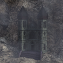
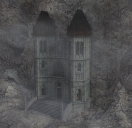
Hello, I recently watched the director cut of the original Blade Runner. Inspired by Ridely Scott's use of complementary tones, I experimented on a current project. Using Castle del Diablo, I added orange tone to the cavern(s), snakes and roof, lavendar tone to the stairs and the mist and green to the Castle. Attached are a couple of renders. In the second one I lowered the lavendar until it almost appears grey, for a more realistic stone.
But since this will become a background in an animation designed to set a mood, I am wondering whether the purple stairs would be effective or distracting.
Any thoughts appreciated.
RA


castlle3wfog.png
2000 x 2000 - 6M


Gcastle2f.png
1900 x 1838 - 7M


Comments
First image, the stairs look off, and un-natural. In reality many buildings like this are made from predominantly the same materials due to locality (using local resources for ease of transport)
Second image looks better.
Depends I guess on anything else you may add to the scene near the building etc. I would personally make teh entire building darker maybe, more like Basalt to lift it from its background and make it seem more imposing.
However that said, I am a portrait man and am not that flash at larger scenes.
Many thanks. I will experiment with darkening the castle.
I actrually like the color tone of the castle given the effect you are going for. I think if you go less than the first one on the stairs and just a tiny bit more than the second one it may work more as you intended.
Thanks. I’ll try somewhere between the two.