Karibou's Den of Indecision
 Karibou
Posts: 1,325
Greetings, all! (I hope it will be an "all." I always fear nobody will read my posts.) Anyway, I can't tell you how many times I've looked at a render and thought... "Hmm, this option or that option?" My husband tries to offer advice, but is generally useless. ("They're both nice, honey." ) So, I thought I'd ask you guys for help! I don't have an Art Studio thread yet. Well, I didn't. I guess I do now!
BTW, feel free to nitpick and offer other suggestions. I should warn you that I frequently make compromises with texture quality and subdivision (and often number of items in a scene) to preserve GPU rendering my aging card. Sigh.
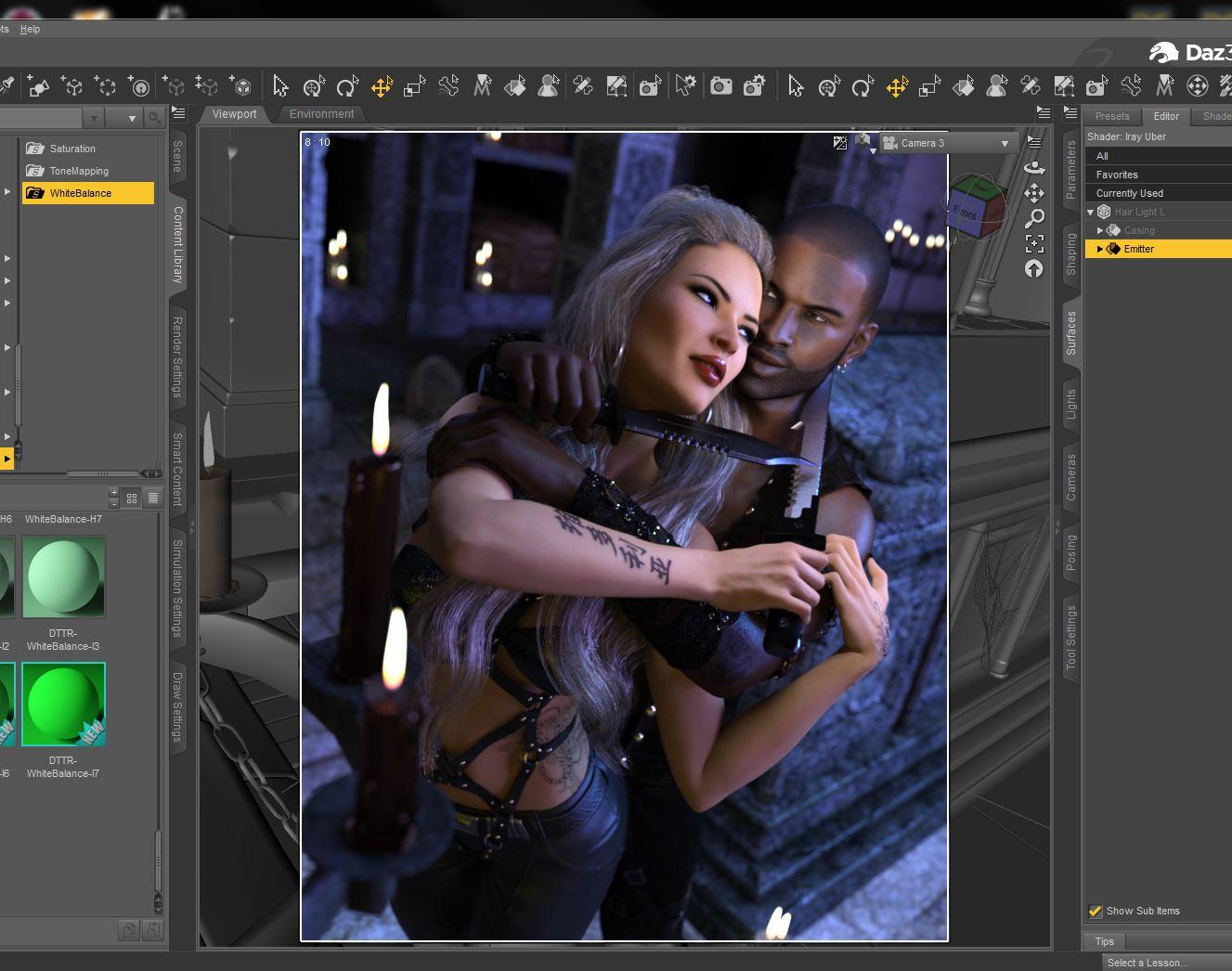
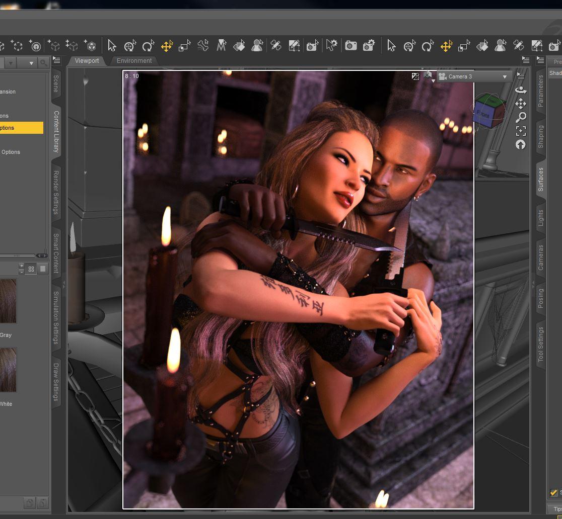
So... Latest WIP. (I have a few OCs rattling around in my brain. These two are "Lara Croft/Indiana Jones" genre treasure hunters who have convinced themselves that they are rivals, not potential romantic partners. But, c'mon. Feel the love there. ANYWAY... Warm? Or Cool? If I went with Cool, I'd postwork the orange flame/glow back in the areas around the candles with some overlay layers in Photoshop. Oh, and I changed her hair color between draws. (I like the darker shade featured in Warm.) Also, I still need to add some backlight and fiddle with highlights/blacks in tonemapping. I'm also still (trying) to add more stuff to the scene, within the limitations of my GPU. (Thank goodness for Scene Optimizer. I literally cannot render 2 people with hi-res maps without it.) Warm shows the lighting as it acually appears in the scene. Cool has had the white point adjusted.
Which do you like? Other advice? I've got a thick skin. So long as you don't throw rotting fruit at me (or fresh fruit, for that matter, as I imagine it would hurt more since it isn't as squishy) I can take it.
Cool:
Warm:




Comments
Welcome!
I like the cool version, but what would a blend of the two make? Perhaps copy the blue piece over the warm and lower the opacity just enough to get some of the warm coloring in some areas?
Think I should selectively reduce opacity so that Warm appears more around the candles? Let me open Photoshop and see what that looks like.
Quick and dirty Photoshop fiddling. Ignore lack of any precision on candle glow effects. They'd look better if I tried.
This is: Cool with candle glow, Warm/Cool blend (60% warm over 100% Cool), and the same blend with candle glow.
Of the two embedded in the last post, I prefer the top one, but they don't look much different to me.
Heya Karibou :)
*tilt head* hm.. of the two in the first post, I liked the cool one better than the warm, the cool just seemed to fit the mood better in my opinion. And I Totally agree with you, one can FEEL the attraction between the two :)
Of the ones in your later post, I'm not entirely sure which I like best. I somewhat leaning towards the first of them, the cool with photoshopped glow. But at the same time I think you might be on to something with blending them too, but perhaps try it the other way around? 100% warm with a 50-60% cool? Or use the 100% cool with only a 40-50% warm over, with photoshopped glow on the candles? Another thing that might work, is if you change the blending mode, instead of "just" changing the opacity of the render on top, you play around with things like Burn etc (not entirely sure what all of the options are in english, somehow I was stupid and took my photoshop in swedish and I've been to lazy to see if I can change it to english lol )
I also hope she's good at first aid, or that he is.. cause her nails is going to make some real damage on his arm (poor guy, but he look like he can take it ;P ) Looking forward to see more of you *happy smile*
That is some great posing work! Great image. Of the original two, I prefer the first (cooler) version. Of the blends, I still prefer the cooler (first) version, which is my over all favorite. However, the difference between it and the second blended version is a lot slighter, so it is very difficult to choose. The first has a slightly more dangerous feel to it.
I have a question about the knives. I'm no knife expert. One knife has the serrated edge toward the neck and the other one has it away from the neck. Is one right and one wrong, or are knives just different in that respect? Which is the sharp edge of a knife like that?
Thanks, all, for your input!! I think I prefer the cooler versions myself. And I've been staring at the blends so long that I'm cross-eyed! I usually putter around in Photoshop until I'm satisfied with the results, so chances are the final version will look lots different than the initial, but I definitely think that the foundation will be the cool-toned one.
Definitely! The final version will undoubtedly include a "screen" of just the rim lights (which I haven't added yet.) Right now, the glow from the candles is actually an orange "overlay" layer with a yellow "lighter color" layer on top. I'll also fiddle a lot with masked adjustment layers -- I can probably modify some of the color temperature that way. I just never know what I should be bringing into Photoshop and I hate rendering more layers than I have to... My GPU makes me sloooooooowwww. Lol!
Thank you! And yay for seeing the fingernail details!
Thank you. I fiddled with that pose FOREVER. It started out as a headlock position. It took a LOT of adjusting. Just getting them looking at each other (as opposed to "off into space" or "eyes rolled back in head" was a nightmare!
That is a darn good question. I think I just went with whichever orientation that the knife appeared when I added the smartprop. (I wonder what kind of government watch list I'll be on when I start googling which way one should hold a knife to a throat...) I need to check this out now.
It would appear the NON-serrated edge should go against the throat. Sigh. I need to fix that. Can't have her losing on a technicality...
Hi @Karibou,
Upon first glance, I prefer the cool one. I see that is mostly the cocensus. I really like the posing and the tension in the scene.
Trish
Well, for better or worse, I'm tired of staring at it.
These two have been yelling at me to finish their darn render for like 2 weeks now. I'm not at all sure where they came from, but they refused to leave me alone until I finished! I'm betting I'll be hearing more from them soon.
Gallery link: https://www.daz3d.com/gallery/#images/575156/
Well well Welcome to the Art Forum @Karibou !!
All I can say is I am so glad they came into your life because what would your life be without them (It would be so dull and boring) *giggles* and sits back waiting for more of your amazing renders to appear on this thread!!!
I really like the fact that you combine the 2 together it really gives it a new feeling of LOVE!!
That's pretty amazing! Put the 'photo' in photorealistic.
If I tried it, render would take 4 hours and *still* have tiny amount of grain in grayish shaded areas.
Only question is probably stupid, but only been at this 6 months. Dark streak on his nose by design, or what would be causing it? Need to learn decals or however they make grunge looking characters.
Anyway, asking questions might be selfish, so will shut up. Hope you find time for RRRR!
--Bruce
Love it Karibou! And so looking forward to see more of them.. *grins*
Now that ended ina wonderfull blend of the two original versions. Beautiful work, keep them coming. :D
They're BAAAACK.
Still have no idea what they're doing. Except not getting murdered. Yet.
Components for the new PC are on order and it's a beast!! Hopefully I'll be able to render whatever they're fighting as soon as it's built!
I like the attention to detail regarding the head tilt- the fact he is so much closer and needs to manuever more to see whatever is to our right. Her posing shows alertness and both show determination. Very nicely done!