Adding to Cart…

Licensing Agreement | Terms of Service | Privacy Policy | EULA
© 2025 Daz Productions Inc. All Rights Reserved.You currently have no notifications.

Licensing Agreement | Terms of Service | Privacy Policy | EULA
© 2025 Daz Productions Inc. All Rights Reserved.
Comments
Version E here. Made a slight change to the pose of the guard firing at the shadowruners so that his rounds weren't going into the floor, resulting in the spellcaster almost getting winged. (Close enough to feel the heat as the rounds fly by.) Also did a little bit of texture work in the main room.
You have alot of characters interacting. Not an easy thing to do.
My first suggestion would be to pull the camera back slightly so the purse being carried by the "dame", Lucky Eddie's foot and that piece of "garbage" are not cut off by the edge of the image.
If you have any more props you can add to the background of the scene to clutter it up ( a garbage can if you have one, newspaper debris on the ground, etc ).
Wilmap is wonderful for offering various clothing and accessories.
The extra characters makes this a more dynamic scene and upped the danger. It really changes the story.
Is the left foot of the middle shooter intersecting with the wall?
The angle of those tracers ( is that right? ) makes more sense now. Definitely upping the danger to all involved.
This is my first attempt at a battle scene. I used urban city, genesis 3 characters, dragon and Ron's brushes. I rendered this 4 times for each layer in daz studio and did the post work in Photoshop.
Sorry about the number of pictures. I am new and don't know how to delete or size the picture.
.
click on attachment thumbnail to bring the image up full size
Right click on full size image and then select "copy image location"
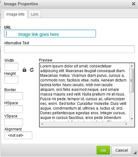
Select edit using the gear icon at the right side. Select image insertion tool
Paste the Link location here
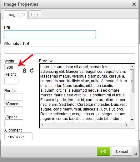
For the forum view limit the width here
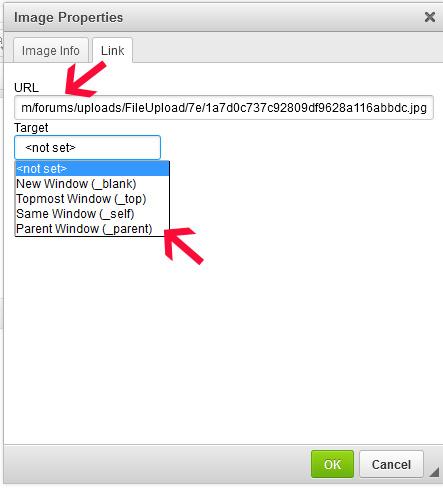
on the 2nd tab, the one that says link add the image location URL here
I always set it to new window and then anyone clicking on your resized image can bring it up to full size if they wish to.
Remember that it is thw width that controls the image qualities, just make sure the padlock is on, so it keeps the original scale.
Thanks so much for the information. Can I do this to the ones that I have posted?
Yes, although I have already resized them for you. If you want only one copy then just click edit (from the gear Icon and then click to delete the unwanted copies.
.
.
This is a really good start @Tangled up with Ink.
My suggestion would be to move your camera back slightly so you are not cutting off the feet of the female character facing off with the dragon.
Even though this is not a portrait image I find this cropping tool a handy resource.
Your fly is coming along quite nicely. He should make a suitable target when the time comes.
.
This is the second attempt. I tried to make the changes that you suggested.
OUTPOST 22
DAZ Studio for rendering the outpost
a third party greeble plugin in a very famous / infamous 3d app
Pixelmator for FX
@Selina Wow, very ambitious. Not only your first entry into the new user challenge but also modeling your own render subjects. I'm impressed. I've been wanting to get into modeling but I've been procrastinating. Anyway, keep at it, I am very interested to see how it turns out.
@HighElf I like the setting and the concept. If I were that Barbarian I would have gone right back through that door and slammed it shut, lol. Of course, it's possible there is something worse in the room behind him. My thoughts on the image are that it's hard to see the Barbarian. I know, it's no simple task to get the ligthing to highlight him, but I would like to see a way to distinguish him from the background. Also, I know you're quite attached to the camera angle, but it would be interesting to see how the feeling of the scene would change if you got in closer to the snake and maybe positioned the camera closer to the ground looking up at the barbarian. I think getting closer to the snake would give some perspective and create an ominous atmosphere. Don't be afraid to try out different camera angles. You can always stay with your original, but it doesn't hurt anything to create a new camera and experiment. I know it will turn out great no matter what dirction you choose.
@dstuffle Already a big improvement over the first draft, I'm really enjoying this image. I always had a softspot for Vietnam era war movies and documentaries. I can almost hear the "Tour of Duty" theme song playing in the background. The only thing that is missing is a red blood mist on the wounded VC soldior, but that may be a little too graphic for this forum. You're probably better off keeping the violence level at PG.
I've run through a few drafts of the scene and tried to put all the suggested improvements in (plus a few more people doing other things).
From the top view, her foot is just a bit inside the wall. I'll add it to the ToDo: List for the next edit.
Tangled up with Ink you can just edit the first posting and put the render in that.
I really love your render and postwork the only thing I would suggest is to have the dragon looking right at the woman aiming her gun at him.
Put a tree or bush ()off screen) to cast a shadow on the GI. Added to my ToDo: list
Thanks.
Initial concept picture from me for the month, just to get the idea down and started, no real work done on it yet.
The amount of texture memory this scene is consuming with just two figures and an environment is horrifying!
My First Daz Statue (Gameprint) Original character Nzinga by me ! :

is this DAZ Studio?
just a guess... maybe the memory footprint is unusually high because of normalmaps, bumpmaps or extensive geometry subdivisions and smoothing ?
I like the idea , but the scene still look not right to me.
Even when you render the scene in 4 or 5 separate passages, it will be very helpful to position all props in one scene, that helps, to hold the propotions.
I think the big problem in your scene is the background. Look at the windows and then to your heli... you see it? The heli look much to small. He should be much bigger, because he is in front of the building and deffinitely bigger than a window. ;)
Yeah, i know. If you make him bigger, he wont fit right in. So the background should be make smaler
Another problem for me is the Depth of Fields. I think you let the DoF go from the middle (sharp) to the outside (blured). This let the soldiers look a little cut off from the whole scene.
Btw. the soldier to her left is really cut off on the left side.
Ok, that sounds very grumpy and I beg your pardon. Don't get me wrong, I like what you have done and I hope that I have not disappointed you with all the things I criticised.
Second swing at this. I pulled the camera back and added some more stuff as advised. I found a news paper I could edit in Photoshop and some pigeons and a few rats for flavor. I did buy a couple things at the store and had to use them, lol. So one gangster got new pants. The mom pulling her child along in the back ground sorta torpedoed me though. I worked on them separately then merged them. Evidently a bad idea the way I did it as it goofed up all my settings and the light washed out most of the detail after the merge. I had to reset almost everything that had to do with lighting. Still wondering why that happened?
I was thinking of adding some graffiti on the back wall with Photoshop but sorta on the fence on that idea?