PA arts
I am very happy with what I've just done, so I wanted to share with part of the people who inadvertently helped make it possible :) I've been in a gigantic art slump for the last couple of years, so I'm *stoked* right now!
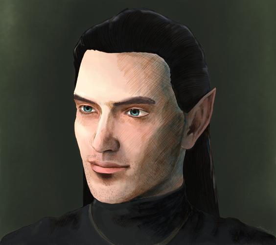
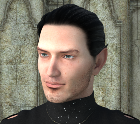
Attached is the initial render with LuxRender via Luxus and, *ahem*, the "postwork" in Painter 12 -- if any of the original render pixels are left, I would be surprised.


melluxdraw.jpg
1754 x 1554 - 1M


mellux2.png
877 x 777 - 1M


Comments
I don't use either of those programs so don't really know what it's like to render in them, but regardless, your character comes across very nicely! I did notice the change in the ear shape- was that deliberate? The first had more of a point to it.
Looks like you will be having fun! Which one of the two images do you like best?
Kewl. Like the long haired version. NICE.
Novica, the change in the ear point was deliberate--I don't have a morph for Genesis that can extend ears as much as I wanted. So when I started painting and drawing in Painter, I just...extended it :) I like the first the best; much more hands on. I'm a traditional artist, and even though it is digital, Painter feels very traditional. Creating references to draw was one thing I wanted to use Daz for, and I think it worked out well!
SereneNight, thank you :)
I am having fun with Daz. I will post more when I have something else to show; mostly I've just played with Genesis and tried to figure out lights.
I have been learning how to work with lights and diffuse colors and such-like. I wanted to make a winter fey, but just have human skins, so I decided to experiment with the diffuse colors to see what would happen. Initial results were sort of eh, but I am thinking that with good lighting it might just be OK.
This uses UberEnvironment lights with Winter Forest HDRI from here: http://www.hdrlabs.com/sibl/archive.html . I'm not even sure I used it right--I put the .hdr texture on the light and it came out icy cold, but I am sure I am missing something. Not very happy with the background; I didn't really have anything for it, so I just put some cone primitives in, set them to translucent glass (I think?) and a light blue diffuse, and watched them take *way* too long to render for little result. I do like the light though; it is very, very cold!