Introducing...Bolt
 Kyricus
Posts: 44
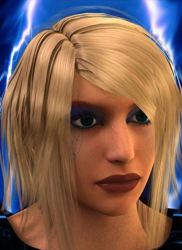
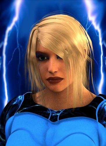
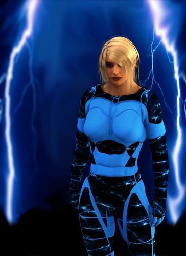
This is something I put together for s superhero themed thingy I was thinking of doing. I call her Bolt.
It's the first character render I'm actually not ashamed to post.
You'll notice on the third image - the very closeup- the remanents of another tattoo I couldn't quite figure out how to remove. I left it because when skin colored it looks like scarring. I guess superhero's can get hurt too eh? Any ideas on how I can remove it? Once on, it appears removing is out of the question using Rainbow of Makeup. I may just recreate with a fresh face, but, the scar effect isn't too bad.
Genesis, genesis supersuit, Instant Rainbow of Makeup. I did a little postwork in PSP 5
Thoughts?

Introducing._._.Bolt_upclose2_.jpg
649 x 892 - 104K

Introducing._._.Bolt_upclose_.jpg
649 x 892 - 94K

Introducing._._.Bolt_.jpg
649 x 892 - 79K


Comments
This character should met my Wrath character. My first post to my Art thread. Looking good.
One thing that occurs to me, with the lightning behind her you might want to add a couple of spot or distant lights in matching colours shining from those directions to cast strong light on the edges of the figure.
@Jaderail Thanks
@Richard Good Idea about the distant light. I actually did try the spot lights but didn't like the way they looked; the edges were way to harsh. I didn't think about the distant lighting, I'll have to give that a try. Thanks for the suggestion.
There's always point lights, lower them next to the area you want lit.
Really nice character! Love the color scheme too- and the name ROCKS! If she disappears from here, I'll know she left to meet Jaderail's dude.
Very nice.
Just one (minor) thing. I think you should give her more of an expression, just to add a bit of life. Maybe a narrowing of the eyes, or mouth, perhaps a hint of a frown or smile. It doesn't have to be an extreme expression, it can be subtle, but I think it's better than a "blank" face. I see a lot of pictures using DS/poser that seem to concentrate on everything else (the clothes and lights and so on), but leave the faces impassive and lifeless (I've done it myself, in fact).