My WIP enviorment, "showcase room"
 no nose
Posts: 310
in Art Studio
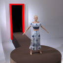
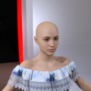
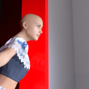
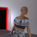
So for the last few days, I decided to try and work on a room that would showcase any figures pretty well. It's a bit low poly, lacking textures, and needs a ton of improvments. (especially in the lighting, my goal is to be able to put a figure anywhere without having to edit lighting to much)
But so far i'm pretty happy with it, so i'm posting here to get as much feedback as possible.

2.png
500 x 500 - 367K

1.png
500 x 500 - 385K

3.png
500 x 500 - 357K

4.png
500 x 500 - 374K
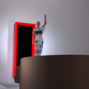

5.png
500 x 500 - 343K
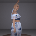

6.png
500 x 500 - 403K
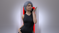

7 (c).png
1920 x 1080 - 3M


Comments
ok so I messed with some shaders, a little hard to tell in some areas but I think it's helping my idea
Watching with interest
Thanks, was starting to worry it might get drowned in the infinite seas of threads
Looking interesting, nice idea.
Well while Im making the room with Genesis 8 in mind, it seems to be looking pretty good with Gen 3. I just need to figure out a way to make smooth shadow edges without having black squares in a big enough image
Its definitely improving! I would suggest changing picking a different color for the frame of the door (unless you actually want to use it as a frame) , as it completely makes it the focus of the image as I am viewing it. A more subdued color would work better I believe and bring focus on the model.
Is blue better?
Yup way better! Lots more synergy in the coloring going on now.
great, so now I just need to figure out how to fix shadows and what to put in the back of the room.
What kind of lighting are you using now? Whats wrong with the shadows?
spot lights, lots and lots of spotlights. The issue I'm having is that in some areas where shadows start their to sharp, I'm not sure how to fix that without having black boxes in the renders.
Check your spotlights under Parameters> Light. The default is Point, which isn't great for soft shadows. Try changing them to disc or rectangle and increasing the Height/Width. Larger = softer shadows. About 50/50 is a good start.
The other option would be to not use any lights, but make the walls emissive. But that has the disadvantage that they don't show in the preview, so you have to render. But it might be worthwhile making say, the ceiling emissive to soften everything up.
Edit - For a faster check, remember that you can select all the lights at once and change all parameters together. I *think* you need to have Consolidate Properties checked in the Parameters menu to do it.
tried that, while normally does work, it isn't this time. The Emissive trick doesnt seem to work either
Slightly off topic, but I just made what is probs one of the few normal sitting poses that anyone has ever made. No clue what I should do with it
not sure how useful this, but I made each partof the room a seperate object. So if you want to hide parts of it you can now.
Well I decided to completely redo the lighting, it's probs a bit to dark now. But the shadow issue has been dealt with
Looking a lot better, good progress. The light is a lot more balanced and easier on the eye.
Yeah now i'm wondering if it's ready to release or if there's anything more I could / should do.