Criticism Required
in Art Studio
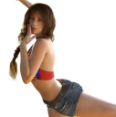
I've just been feeling that my results are missing something major but I just can't put my finger on it. Any criticism would be greatly appreciated for the attached piece


ZZa1.png
2800 x 2821 - 6M


Comments
You have made an interesting start. with a complex pose and a nice light setting. I guess the main question you need to ask yourself to get better is, what do you want to achieve. Do you want some sort of pinup or modelling image or do you want to tell a story with a portrait. Once you know what you want to show you can start experimenting with accessoires, background camera angle etc.
A good place to learn more and get feedback is the new user challenge. for this month its next to done but a new one will start in September. here is a link to the current:
https://www.daz3d.com/forums/discussion/268176/august-2018-daz-3d-new-user-challenge-free-month#latest
edit for making it readable ;)
I guess it matters what it is you're going after. I'd say there's a definite lack of physical plausibility, so our brains doesn't accept the "reality" of the picture. This applies even in drawings. It's why a Vermeer looks so realistic, even though we know good old Johannes painted it with some greasy oils he mixed. Like Linwelly says, it's a complex pose and (at least cropped) it makes no physical sense. It looks like she's leapinjg but then why have her hands near her face? That's not what people do when they're leaping about, so our brain refuses to accept the pose.
Or maybe shje's not leaping and it's clear what she's doing in the full image, in which case please post the full picture. Imaging judging the Mona Lisa just by cropping her mouth. Yeah, it's an important part of the picture, but it works because of the whole.
Rather that pick the nits, I would only suggest that you start with a more traditional pose. A three-quarters portrait is good because you can concentrate on the face and expression (FAR more important than the pose), which conveys the character. Work on breaking some light into the face. You've added a nice side light but her face is underlit for the rest of the scene, so we tend to want to ignore it.
REALLY good advice here! I'll just say that I've shot lots of pinups (in the seventies; don't do it now) and I'd try to tell a story with those. Is she demure? Bold? Looking to conquer the world? The personality, at least on camera, of the model often led to a particular line of shots. Peter Gowland taught me that. (No, I didn't work directly for him, but one of his proteges.)
Well you render is as good as most that make the most favorited in the DAZ Gallery at the scrolling top gallery. You'd just need to add a background that goes well with your render.
As far as the technical qualities you've got DAZ Studio & the products you've used at their limits for realism and you're not going to improve on those results without learning alot yourself in order to make modeling and shader materials inprovements to the products yourself.
Your critique is much appreciated
Edited: I was getting more criticism for the vocabulary than for the art
The new user challenge seems like a nice place to start
It's critque rather that critcism
noun: critique; plural noun: critiques
1.
a detailed analysis and assessment of something, especially a literary, philosophical, or political theory.
"a critique of Marxist historicism"
criticism
ˈkrɪtɪsɪz(ə)m/
noun
noun: criticism; plural noun: criticisms
1.
the expression of disapproval of someone or something on the basis of perceived faults or mistakes.
"he received a lot of criticism"
As others have noted, her pose makes no sense. I'd reposition her left leg and right arm.
And add a background, even if it's just a plain surface. The shadows on it will give the scene more depth.
Good luck!
@Chohole you want to go through my post as well, there is a ton of typos... LOL I wonder how anybody could make head and tails out of what I wrote.. I go for an edit now.
noun: critique; plural noun: critiques
1.
a detailed analysis and assessment of something, especially a literary, philosophical, or artistic endeavor.
Make a hundred images. Then look back at your first ones. You will have grown as an artist.
Fair enough. Although in my defence I was half asleep for those.
good thing we aren't computers then. We don't throw up a bugsplat every time we deviate from the established paradigms
Well, sometimes the forum's spellcheck crashes my Chrome browser page. So I always try to copy the text to the clipboard before I run it.
It's either that or TONS of typos. lol
Welcome the the Studio.
It's a great start, though I'll leave the critique to others who know what they're talking about.
@FirstBastion: Good advice, but it can definitely feel painful doing it
Thank you. It's good to be here.
It shoud actually be a fun time hobby. No doubt, Art is hard work. And, Art is challenging. And there is a learning curve. But there's a learning curve with any endeavour worth pursuing and practicing. We all learn by doing.
I don't think any character poses like that unelss they've been possed by some maelevolent being and begin crawilng up a wall backward. On tip toes. If that was what you were going for the you nailed it because she looks as if she/IT is getting ready to do something deliciously evil.
Something with a background and a neuteral pose then
Second times the charm
Light. I see a forest for the woman. Is your aim a render of the trees or the figure?
Anyway the skin looks okay. The hair seems fine. I'd look into getting a corrective morph set for arm and leg bends, but other than that the basic mechanics are there. It's just a little hard to tell tgese detauks because she's in shadow.
So at what normalized lumens are we supposed to judge an image's brightness setting
This is supposed to be art. It's whatever looks good. Add a light or three and play around with their placements. Generally we want to adequatelty light a subject's face as that's where the emotion comes from, and being emotional humans it's what we respond most to. If there are lighter things in the scene, our eyes naturally gravitate toward it light. I'm just guessing that's not what you want with this picture.
As for lumens forget about them. Use whatever setting looks good. (The lumens settings are bound to confuse you anyway because they don't behave the way most people expect them to.)
Your 2nd picture looks more natural, but it's still not entirely clear what's going on.
It's a pin-up pose, but the background is more brightly lit than the figure, which is an odd choice for a pin-up.
Also, it might make more sense for her to look directly at the camera. I liked that about your first picture.
Also also, don't hack off her toes. Either show the entire figure, or crop more artfully.
Already better, it suggests a story, your subject lost in thought in the forest. If the figure was turned slightly to have some of the natural light hit her face. Always consider where the light is coming from and how it interaacts with your subject.
Seem to have trouble with multiple lights in the scene. HDRis are easier to manage. Any tips of trying to integrate HDRIs with other lights
This one's quite lovely! Nice, dramatic light!
Again, I wouldn't cut off her feet; and the background looks pretty low-res.
The lighting is much better on the last one. You are doing quite well for just getting started. First Bastion is right though, the more you do it, the more you play with it the better it will get (and a bit easier too) I frequently look at my first render to remind me that the hard work has paid off lol. But don't treat it too much like work, this should be fun. Although I will admit to the temptation to chuck my computer out the window once or twice lol. I definitley recommend the newbie contest, they focus on one aspect of studio each month, and you get a ton of good feedback along the way. It was one of the best things I've ever done and shortened my learning curve by more than half without a doubt.
Thank you for the tip. Yes I believe that was a 612x612 tile. So admittedly not the best selection.
Definitely looking better with that one, and going to echo that the new user challenge is a good thing to take part in.
For integrating both HDRIs and other lights first thing to do is make sure that in the Render Settings > Environment tab the Environment Mode is set to Dome and Scene, otherwise one of the two just won't be turned on for the render. The next thing is that your lights will probably need to have the brightness turned up a LOT. I generally start out by setting them to 50,000 or so and adjusting from there.