Newbie Q: Why is the color missing on this clothing?
I'm using Poser Pro 2014 with V4 and the Karate Gi sold here on DAZ: http://www.daz3d.com/karate-gi-for-v4
Things look fine in preview, but rendering gives me grey on the karate outfit. I can't figure out why. No issues with anything else.
There's a MAT in poses to select a particular color (different options) and I did apply it with the jacket and then the pants selected.
The product docs don't really give any advice: http://docs.daz3d.com/doku.php/artzone/azproduct/7922
I have a feeling there's something I'm not doing right...any ideas?
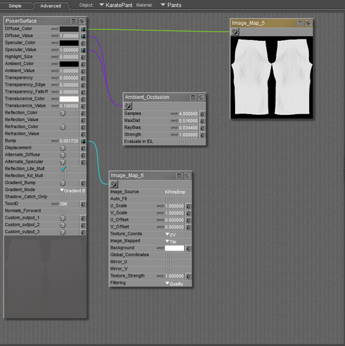

karate_prob3.png
838 x 840 - 221K
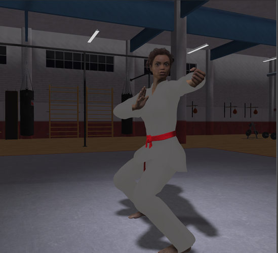

karate_prob2.png
846 x 770 - 413K
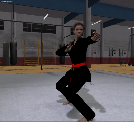

karate_prob1.png
840 x 768 - 452K


Comments
How about removing the ambient occlusion connections and render again ?
The translucence colour is set to white. Either set the translucence value to Zero (gis are often heavy cotton), or set the translucence colour to the same as the diffuse colour. Attached render is the latter for the jacket...
I read up a bit on translucency and as it's implemented in Poser, it depends on the normal direction relative to the light source, so I'm not sure why it is even used in this garment. If you want to give it a light look like a silk gi, dial in a little transparency; here it is at 0.05...
Thanks so much WandW - that fixed the color problem, though it still looks like a kind of big blob of black color rather than cloth-like. However, when I switch to a white gi, everything looks good, so I think that the bump map doesn't make the folds, etc. distinctive enough if the cloth is black...alternatively, my lighting skills need some honing to show that detail.
Again, many thanks!
It could be the lighting, or your monitor calibration. This render looks pretty good on my end; it is a close up of the previous one. I used a Gamma of 2.2 in render settings, and adjusted the Gamma of the bump maps to 1.0 using the changeGamma script under MaterialMods...
Edit: looking at the posted version, it would likely look even better if I had set the texture filtering on the maps to Crisp