My latest work with Carrara 8.5 Pro beta
 Chris Fox Art
Posts: 380
So while the Carrara 8.5Pro Serial still doesnt work i was thinking about making the final Version of my newest pictures.
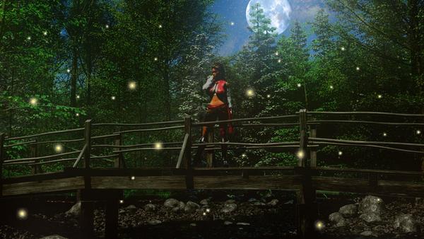
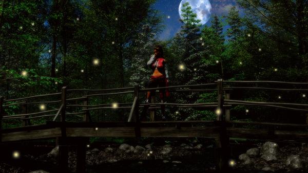
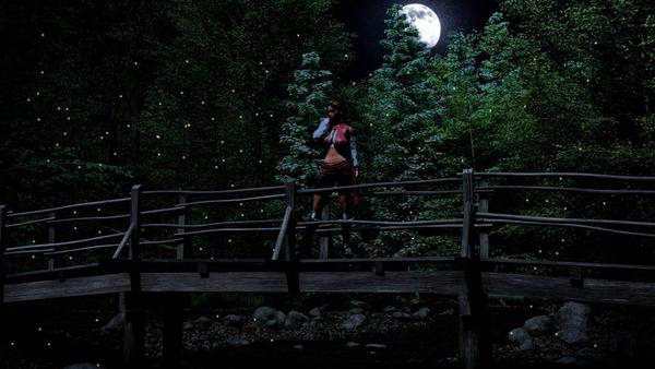
So the idea was to create a night scene in the forest with a Gypsy Lady and with some good informations from PhilW i think that i was able to create a pretty nice scene that was rendered with a day light.
Post workout was to darken the full image, added moon, stars and fireflies to the scene but i still think about adding a shooting star but i right now i will let it how it is.
So here was the first version i have ever created but i was unhappy with the fireflies in the picture as the looked like they was just sticked on the top.
The second and third picture gots a lot of more depth as i used 4 different layers with different size for the fireflies, two for the foreground and two for the backgrund behind the bridge (i was rendering the picture twice, one just the womn with bridge and one just the complete scene without the woman and bridge).
So hope you'll like it :)
btw. he name of the woman is Luana :)
(just to add this, the picture in the middle was the first version i did)




Comments
I like the bottom one the best. Great job on the atmosphere. I think that if you add a shooting star it may become too distracting. You have the woman on the bridge, the full moon, the forest and the fireflies. Anymore and you'll lose the focus I think.
BTW, if you haven't seen it yet, they fixed the serial number. Look at your account page to get the new one.
cool, thanks a lot for the information, i will check hat out in a few mins :)
maybe you are right with the shooting star, the problem also is that there is not enough space left for the shooting star so i should put it behind the trees but behind them is like no shooting star.
Only think i am still thinking is some kind of moon halo
For my tastes I like the middle one the best, for the lighting and mood which seems more 'night' to me than the other two, though they are all pretty good. But I don't like the fireflies on the middle one as well as the fireflies on the other two, I prefer the fireflies on the bottom one.
Good work!
Good work chiisuchianu.
I agree completely.
Any chance that you could redo the middle one with the bigger fireflies. I would really like to see how that would come out.
I like both bottom ones ....nice lighting and mood for scene. Good job and thanks for sharing.
rich
Those are some excellent renders! Love the concept!
thx a lot for all the Feedback! :)
i still have all the original renders on my pc where i created that scene also all the psd files but not the final psd file from my first render as i just saved it as jpg but i think i could do that darkness again.
the problem could might be the lightning filter i am using that makes the picture looking a lot brighter at the end but i will try out to get a darkness like in the middle picture with the fireflies from the first end third one and i also will use the sky and moon from the first and third but will make them all a bit darker.