How to avoid texture lines with elite Carrara shaders and FastMipMap
 Boojum the brown bunny
Posts: 348
Hi folks,
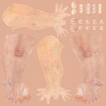
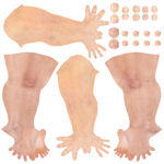
I decided that this fix was important enough that it deserved it's own thread. After running in circles trying to find settings in Carrara Shaders that used FastMipMap filtering for the Texture Map I found a solution. I suspect that FastMapMap combines nearby pixels in the texture map and, since the background of the Elite Texture Maps are white, this results in lines everywhere one UVmap abuts another. This is particularly bad across the thighs. The solution is to make the background of the Elite Texture Maps pink instead of white. I used my eyedropper tool to select the color, and then flood fill it through all the white areas.
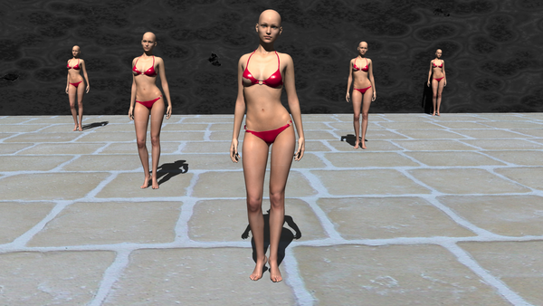
Below, you will see two renders. All the settings are the same except the first render has white background on the Gabi Texture, and the second has pink background on the Gabi texture. I have also included two thumbnails of the limbs texture map so you can all see what change I made. Click on the renders to see them in full resolution.
Boojum the brown bunny





Comments
Boojum, this is a brilliant and quick solution. Thank you, and I agree, this needed it's own thread.
I agree with Jonstark that it is a brillant find. However I think it is more of a work-around then it is a solution.
I think it brings another issue to the table - why don't they align correctly when using Fast Mip Map and why didn't anyone at DAZ (who forced this Fast Mip Map default upon us) realize this? I am also wondering what kind of problems this may cause with textures for animals, clothing, buildings, and so on.
Again, I do not think the implementation (at least as it pertains to C8.5) was well thought out at all.
I don't think that it is misaligned, now that I have had a chance to think about it. I think that the size of the texture map is reduced the farther from the camera that it is. Thus, rather than having a 2048 x 2048 texturemap you might only have a 512x512 texturemap... reduced on the fly for speed of rendering. But if you reduce the number of pizels in the texture map like that, then around the edges you are blending the white of the background with the pink of the skin. Thus you get a band of lightness near the edge of the texture map. I think the map is correctly placed, but because of how they blend it it is lighter.
Boojum the brown bunny