Some Vietnam War related renders...
 RangerJimK
Posts: 0
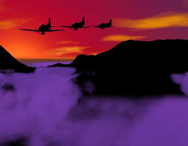
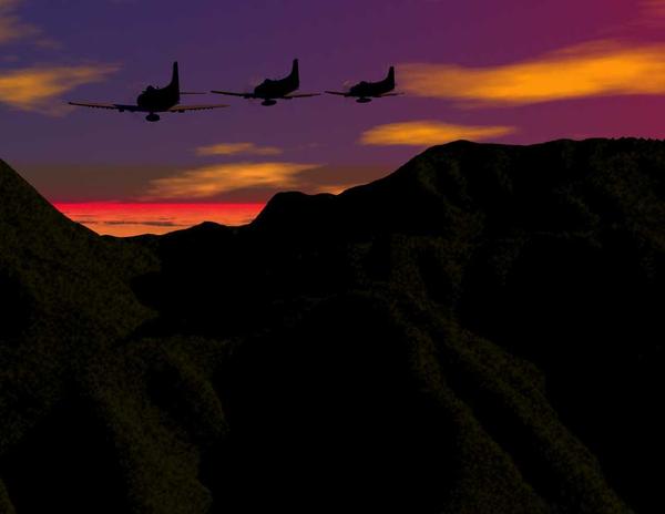
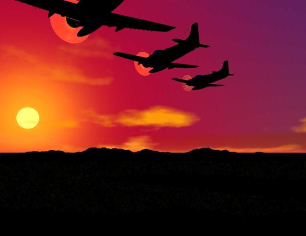
The working title for these is "Back to base". The scene shows a flight of A-1H/J Skyraiders of an Air Force Special Operations Squadron headed back to their base in Thailand after a hard day searching for and assisting in the rescue of US pilots shot down in the northern part of South Vietnam, the southern part of North Vietnam, and Laos.
The Skyraiders are by NeilV and the landscapes are: for #2, done in Bryce, and the others use David Brinnen's Big Sur landscape, and represent the rountain range running down the Annamite Cordilla (aka the "backbone of Vietnam"). I have a couple other versions, but they're simply variations on a theme, so to speak.
To be honest, I'm in the stage known to all artists, "Well, it's pretty good as it is, but it really needs some tweaking...." But I think that they're good enough put them out for other artists to take a look at and give me their opinion.
Incidently, I obviously am doing the wrong thing when trying to post an in-line image, so I'll just try to attach the files. Wish me luck...! ;)
Thanks for y'all's patience.
Jim
[edited to try to correct spelling]




Comments
Well, the renders are out of order and dont show their number, but at least I did get them posted, neh?
Jimk
I'd try more horizontal crop and less saturation, for myself, I would probably go greyscale.
But whats not to like about a big ugly ol Spad. :) OT.. we have a quiet, unassuming guy here in my small town who was a PJ. He loved Spads. Interesting stories if you can get him to tell them :)
I would also try and replicate this effect on your primative on the rotors and propellers of your stuff.
the motion on rotors and props is a real important part in the whole image...
what you might do is image search the net to see what the guys selling commercially do...
not to copy, but how do they handle props etc reflections on the planes...
-----
try to get a feel for what they do to create the atmosphere that people like
see what they do that you like and what they do that you don't like...
-----
it might even be fun to see who close you could come to one of their's
-_------
I'll attach a parody of a very well-known painting...
----
I build all the buildings in daz just using primitives...
is it a perfect match for the original --- no
among the things I learned was artists can play with perspective...
----
and I used cats not people...
but I learned more about using daz in this one project than in many other hours....
----
and I'll throw on a plane too... it's the old daz/carrara biplane with new paint but it's using the supplied motion for the prop
I rather like the surreal feel of the images, and sunsets (even real ones) have something of a surreal feel to them.
I agree with the comments regarding the props but it is probably only the middle image where it is a noticeable problem.
I also find the lack of ambient light in the middle shot to be a bit distracting. While taking a shot including the sun will reduce the exposure of everything else, with the sun still reasonably high in the sky there would still be a lot of light bouncing around.......I love the light on the leading edge of the wing though.
I agree with Standfast's comment in respect of cropping (rule of thirds and all that) and also in respect of saturation. The images might stand more degradation generally. "Considering the lighting (and available film stock) they would have perhaps been shot open at a relatively slow shutter speed. While the focal length wouldn't perhaps introduce a great deal of depth of field reduction the slow shutter speed would have resulted in some camera shake particularly if taken from another plane.
All that said, they are nice pictures and could easily be seen on a book cover, wall, poster etc. so perhaps while not photo real they are very striking and pleasing art........which is what it's all about. :-)