"Apache Dawn"
 RangerJimK
Posts: 0
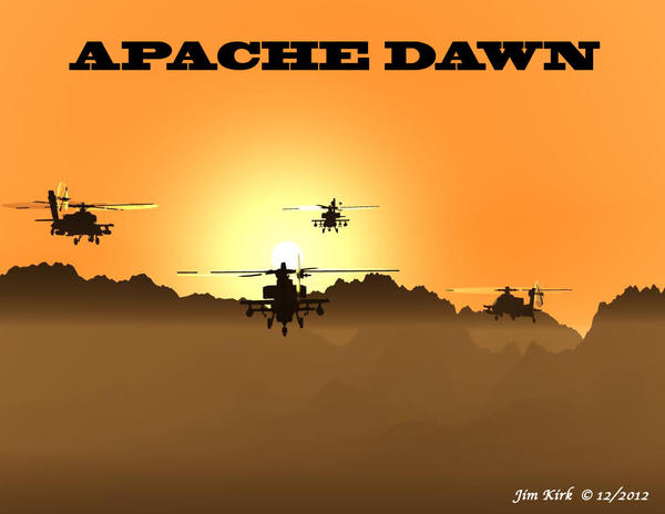
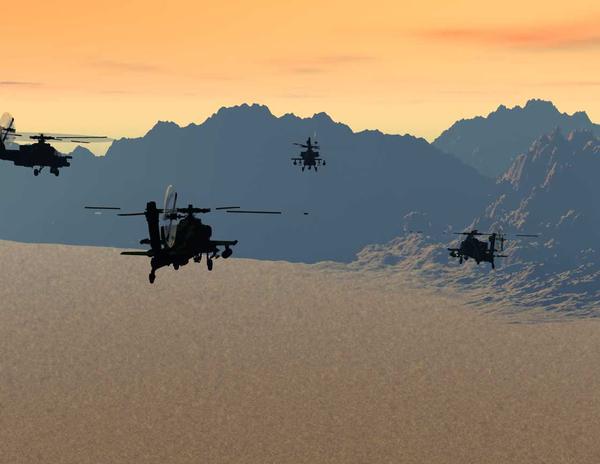
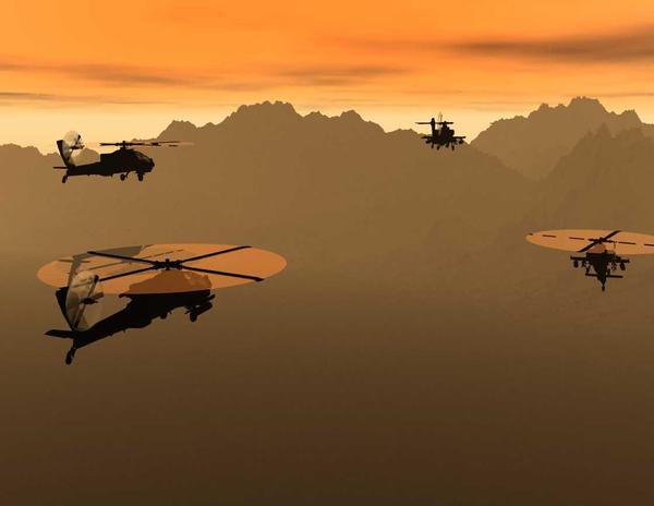
A team of AH-64 Apache helicopter gunshlps headed out on a dawn patrol somewhere downrange in the sandbox (as some of us call it...
Again, I'm looking for cnstructive criticism, starting with which render do y'all like best (and why, it you will).
Thanks,
Jim

Apache_Dawn.jpg
1120 x 866 - 100K

Apache_Dawn_3far.jpg
1120 x 866 - 51K

Apache_Dawn_3.jpg
1120 x 866 - 31K
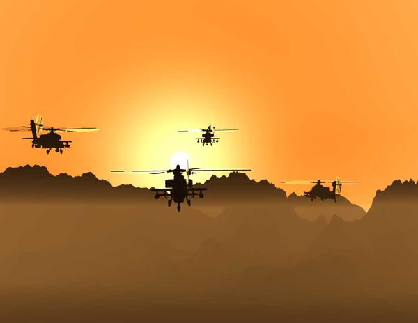

Apache_Dawn_1.jpg
1120 x 866 - 28K


Comments
I think all the images work.
You could get a better advantage out of the composition though.
Here is a Google search about the rule of thirds:
https://www.google.nl/search?q=rule+of+thirds+art&client=firefox-a&hs=07i&rls=org.mozilla:nl:official&channel=fflb&source=lnms&tbm=isch&sa=X&ei=9CVMUumFEsrYtQauq4GIDQ&ved=0CAcQ_AUoAQ&biw=1920&bih=949&dpr=1
As you can see, all the images follow this rule and it makes it more appealing for the eye to look at.
I would also recommend (according to this same rule) to work with 3, not 4 helicopters and see how that works out.
Good luck and happy rendering ^^
I prefer #1 over #2. #1 gives the iconic Apache silhouette, while #2 has a view of the rotor which looks somewhat unrealistic.
You could try to add some reddish color to the lights, but that's just a thought, and certainly not essential.
I prefer image 1, with the sun.
I have a bit of a problem liking the "plastic disc" effect of the rotors in image 2.
Image 3 just lost the dramatic light, but is possibly more realistic, My son has been there, I have not.
I think all of the images could possibly use horizontal cropping, there is a lot of dead space in the square format.
Re The "rule" of thirds, look it up, it's a tool. Not a "rule". If you start pasting grids and composing to them.. you need to throw it away. When I see a comment like "great use of the rule of thirds" I ask myself just what is being measured.. image or technique. I've seen fantastic images and terrible ones.. both using rule of thirds precisely.
Symmetry is another thing to think about. I think the symmetry of the 4 helicopters in image 2 throws it off, in that image you could lose the 4th, right side helicopter and it would possibly improve. Symmetry is not "rule of thirds", it is something you consider. Some images NEED to be symmetrical.. if that is what the artist is showing.
Lots of crits here, but I like the images. If you want inspiration, look at the works of William S Phillips.
Forgive me for the butchery done to your image, Just illustrating "my" take. My take is no more valid than yours.