Kharma's Korner
 Kharma
Posts: 3,214
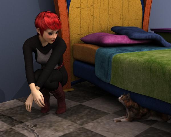
So this is my very first render where I actually put something together and added some kind of lights . I have been playing with AOA's new Advanced Ambient light and altho I don't really have the hang of it this is what I have accomplished so far. Please feel free to offer and critiquing as I appreciate any feedback negative or positive.


cat_found4.jpg
1280 x 1024 - 666K


Comments
Adorable. I love the expression and the pose with kitty! No critique really, just think its cool.
Good work
five stars!.... love the colors and the lighting
Oh that kitty! So typical, slinking out from under something, ready for the big kitty stretch.
No critique, looks like something went funky with bump or displacement on the linoleum in the left corner.,
Go Kharma! Totally tickled that you started your own art studio thread!!!!
You nailed the kitty's laziness perfectly- the "I'll THINK about coming out." The shadows are soft and help set the stage, the entire mood is just relaxed companionship.
I like the lighting on the pillows too, makes them look really soft.
And your new Avatar is really nice kiddo!
Cathie
Kharma-
The only tiny suggestion I might have- and correct me if I'm wrong- the light on her face is coming from our right, but the light on her hands is strong from our left. Was the hands light to light the cat's face? If so, you can do two things- turn down the lighting on her hands (they are a bit bright) and add a second spotlight or even a point light directly by the cat's face. Not much, or won't be realistic, he is under the bed and blocked from the lightsource on our right. But the hands seem a bit bright.
EDIT: - after looking at the shadow on the hand closest to our left, the light must still be the one on our right?
Anyway, I'd still dumb down the light on the hands a bit- and you can do that by even adding another spotlight with DARK light on just the hands, so you can keep the rest of the room the same.
Thank you SereneNight and mrPoser, its a simple pic but was fun to do, I think lighting is my enemy...lol
@standfast: thank you, I have no idea what is wrong with the floor in the corner, looks like its been spilled upon, it was like that in every render I did, don't know how to fix it
@Novica: thanks for your comments, the advanced ambient light I have no idea how to position it yet, apparently it has direction if you use something called falloff...no clue yet. the spotlight I added comes across the bed towards the girl and no matter how I adjusted it still the hands seemed overly bright, I will try the darker spotlight on just hands and see how that works
This is your first set, and there is waaaaay more right than "wrong".
Again, the kitty pose is priceless. showing off the textures on the bed, wow. lots of nice stuff :)
thank you so much for your kind comments standfast :)
Really like it, especially your use of colour. Great pose too. Nicely composed!
thanks Jindi! I appreciate your comments :)
Avery cute first scene and very well done! Only suggestion I have is that you might wanna play with the shadow bias and / or the light samples to get rid of the slightly grainy look., which could have also been caused by the render settings btw... but then this is only me being picky because you asked for critiques. :)
Cute and colourful. How did I miss this? As I am only a newbie and bad at unwilling to squint until I find something wrong with it, I'll leave it at this :)
@Mavrosh..thank you for the comments, I haven't quite figured out the numbers between the light settings and the render settings for a nice smooth render. I will continue adjusting till I get one that looks good :)
@mori_mann thanks so much for commenting, its still a work in progress :)
Just a little something I was working on prior to uninstalling and reinstalling everything. I hope it will still load when I get everything reinstalled at some point. This was just one render I saved, trying to get it to look like the moon was shining in through the opening in the back wall
I like the shadows from the tree limbs :)
thanks Novica...its still definitely a wip. The lighting is still way too dark in the front corner on the left, I was hoping to enter in one of the contests but with computer glitches it didn't happen.
Kharma-
Going to take a stab at that last render- if I had that same lighting issue, here's what I would think about-
First, what can I move?
1.the lights
2. the character
3. the scene
Save your scene so all this is temporary.
ROTATE your scene so the window is in a different place
Turn down that light coming through the window
Move your character into the light
OR...
Keep your character in the same place, in your Perspective camera view, go down to her waist level, in front, shoot slightly up. Don't go under her chin, get her face and neck and half her upper torso, we're going for a gradient fade out effect. Go to Create Spotlight, using Perspective view. Let's name it SpotFace. Play with the intensity, try 30% or less. Turn shadows on a 70% or more.
Now, while in SpotFace view (not perspective) go to Create Camera, create Spotlight, name it SpotFace2, select the Spotface view, and you've got a second spotlight on top of your first one. Use Y translation (ONLY) and move that spotlight down. Whatever you did for the first spotlight, knock off at least 10 or 15. If you had it at an intensity of 30, make the second one 15. BARELY OVERLAP THEM. Do it again with a third spotlight, and make that one VERY dim. Doing this will highlight your figure from the front as a fill light. Make it a soft blue for moonlight.
Over her shoulder (depending on where you have moved her) put a dim spotlight that hits only ONE of the shoulders and the side and/or top of her head to give it some "pop."
Or not. :) It's just what I would try.
You can also add a point light by her neck to radiate some light up under her chin/onto her throat. VERY dim.
Kharma, have you used any of those conversion products? We're stuck over on another thread and I believe you had done some conversions of some nature? This is the thread if you have any advice. I'm lost and don't have a clue what to do with those products that just came out. Appears I am not the only one :) Or anyone else who can help. (post there, not here, I don't want to hijack her lovely thread)
http://www.daz3d.com/forums/discussion/32674/
Thanks for the lighting tips, once I get everything reinstalled for that render I will try your suggestions :)
Something new I am working on with lighting...this is Josie with AoA advanced ambient lights.
and the whole scene so far
What a cute pose- like she is inviting us along into mischief! Good job :)
this is Jepe's Nathan with genesis pepper hair in shaded haven. Still trying to figure out AOA ambient light...it never seems to do what I think it should...lol. Oh well I'll keep trying...I think long hair suits Nathan :)
Nathan and Danika...any pointers with the lighting? So far just 2 ambient lights, one in front of Nathan's face and one in front of Danikas face. Changed the color of each light. Danika's skin is very light and seems kinda blotchy to me. Danikas hand leaving Nathans was a little tricky to pose the fingers, maybe needs a little work yet.
Nice lighting. The skin looks real and the shadows are soft.
Nice render Kharma! I like Pepper hair on a guy. =-)
thanks starionwolf and SereneNight. I was just finishing adding 2 AoA spotlights and about to save and DS crashed just when it was actually looking good too! Guess I will start over tomorrow.
Sorry to hear that you had a crash, it was looking good with the poses! I've been busy (Thanksgiving) and working on a problem child of my own, my studio is acting up. One of my renders, the face is snow white, rendered it again without any changes and it was back to normal. Sheesh. But mine didn't crash. I'll check back to see what you've re-done.
Same picture, new camera angle, also new distant spotlight...lighting still isn't quite there I think
I really like the way the plant goes in front of him to give added depth- nice touch- and the lighting is very soothing. You could add a spotlight with a very pale gold to create a bit of pop, but that might not be what you're going for. I would probably turn down the shadows just a touch to make them soft like the mood of the render. The poses are very touching- really gets the feeling of the characters across.
What exactly do you WANT to do with the lighting?