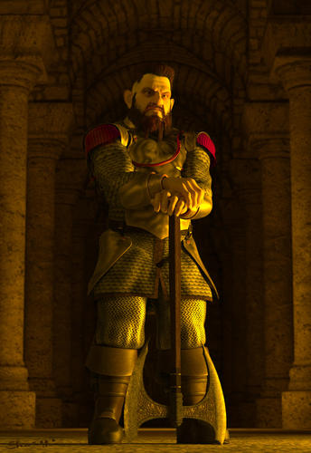
Dwarf
Hi.
This image of the king of Moria. Who reading Tolkien know.
Everything from beginning to end made in Daz Studio.
I would like to hear about this work.
I appreciate any feedback, negative or positive.
PS: sorry for my English, I write with a translator.


2.jpg
1377 x 2000 - 556K


Comments
Very nice. Well done.
Very nice indeed. Always room for more Dwarves.
Marta approves :)
Thanks for the feedback.
But I would like to hear more precisely.
What YOU liked.
But that did not like where errors. ( these comments are particularly important )
Ok. I liked the shape, character, strength of his face. The morphs. I like the hair, which accented the facial strengths.
I liked his pose, the armor choice, and of course, the axe as weapon.
the scene and framing is nice, centered, but ok on a portrait.
what I did not care for is the overall yellow scheme. yellow skin, yellow armor, yellow stone,
I think a grayer,deeper stone with more shadow would pop the King even more as the center of the scene. Light orange/red, very light, to put some health and contrast to his skin. I think the golden armor will take care of itself if you changed up some lighting.
He is a powerful figure in a good setting. My only complaint is the abundance of yellows.
Ok.
Yellow gamma due to the fact that this dungeon and the light is coming from the great fire (lower right corner), and the color temperature of 1700 -1800 K ( yellow color ).
Now I think it cost to show the source of light. That would explain the yellow tint.
Thank you for your comments.
The human brain is a clever thing in that it auto white balances. If you are in a room where the predominant light color is yellow your brain will see that color as white. It is only through un corrected color photos and theatre settings (blue light means night etc.) that we associate such strong colour casts.
However, because (for example) yellow colors look white under sodium (yellow light ) if we see something which we know to be yellow we then see more yellow in the light.
A good illustration of this is The National Exhibition Center Birmingham (England). The lighting in the exhibition halls is quite yellow. While you might be aware of this yellowness initially you quickly start to see the yellow light as white. You might only be aware of how yellow it is if you take any non colour corrected photographs.
In summary, when it comes to color casts, unless there are multiple different colored light sources in the scene, less is more.
The armour didn't have enough depth of texture (bump/displacement) either and looks too flat. The character is really good though.
Thank You, John Sims
About the armor. The volume of plate armor depend on the settings of the card Displasement. In Daz Studio was all good. I used LuxRender through Luxus. The volume of the disappeared. LuxRender cursed map Displasement. I have yet to fully figured out all the settings. Can tell me.
Advance grateful.
I find Lux to be a pain in the bum. It takes far too long to render to an acceptable standard and I get completely fed up with having repair almost every material before rendering. Materials with transparency tend to be problematic and materials don't always double side. Eyes are almost always an issue. I have given up on it.
The new AoA Advanced Ambient light is very good in DAZ as are Omni... lights. You don't get the same level of accuracy and material reflection bleed that you get from LUX, Mental Ray or VRay. If I need absolute photo accuracy I tend to export to 3DS Max. It still takes a lot of time to convert as only ambient material settings come across as an FBX but it is worth the effort in the long run.
Once you have a material library set up for your favourite characters skin/hair/garments etc. in 3DS Max it is quicker than having to muck about in Lux.
With good multiple lighting environments in DAZ seldom can you tell the difference between that and a LUX render. I quite like doing it in DAZ because you have to think about how the light works in order to get a realistic result.
John Sims. Thanks for the tips and comments
PS: But what about the Light Dome PRO - R
Very nice! I particularly like the pose and expression. The hair I think looks great, although it's not what I would expect of a "Tolkien dwarf."
The lighting I think is fine, and I don't think the yellow is a big problem. Perhaps it would look better if it were slightly more orange or more white...I don't know. With Luxus, the materials settings are very important too...you could experiment a bit with them, especially on the skin.
I agree with what John Sims said about the Advanced Ambient Light and omnifreaker lights...you could try those as an alternative to using Luxus. I do like Luxus but it can be challenging to get everything set up properly. Once you do, the results are worth it, though!
This is a great example of what can be done with this sort of software, and I think the lighting is good as it is, especially on his face.
Many thanks to all!!!: coolsmile: