Chamfer - so having more edges or divisions to work with makes for a nicer effect
 Roman_K2
Posts: 1,252
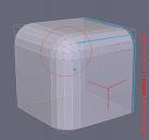
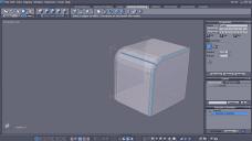
Aha, so I selected three edges of a simple cube (stemming from the closes point to the camera) and I gave them a bit of chamfering - see results circled with a dotted line in the screenshot.
Moving on to the right side of the partly chamfered cube, I noticed that the increase in the number of available edges from the first chamfering made Chamfer #2 a lot more detailed and subtle!
This made me realize -- finally -- that you kind of want to have more edges or divisions in the part of the model or object that you want to chamfer.
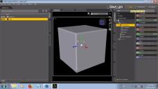
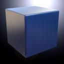
For Chamfer #3, I created a cube in Daz Studio (not Hexagon) and I gave it 20 divisions. I then sent the new cube to Hexagon where I chamfered the edges a bit... bingo, really nice blue cube! Like dice!!
It's taken me a long time to this figure out. 
P.S. I actually held back a bit on chamfering the 20-division cube; I neglected a couple of edges towards the bottom on purpose... just to see what would happen. Aha, a the very least interesting anomalies or imperfections in the surface are created, when you do that intentionally or otherwise... now the trick is to try and figure out what this phenomenom is good for, and how to make it dance to my tune.
Thanks, Roman





Comments
Now, is this actually surprising you or is it, in hindsight, something you should have expected?
I have a spatial problem due to a long-ago head injury. No worries - in case of TEOTWAKI if I go off into the woods I can usually bring back something edible, but flat computer screens give me the willies sometimes. I have been on several (30 or so) trips in a Cessna airplane say, but I usually get out in mid-flight (!) so I have almost no experience with landing. So if the plane lands successfully I will hit my head on the overhead wing as I'm getting out of the pasenger seat... every time, without fail. No spatial sense.
Within the past 18 months or so someone clued me in about the general value of more edges or divisions, like for using with the Bend function but... it's taking a long time to sink in.
You have to admit though, that tweaking vertices often gives surprising results once you've lit and rendered something.
I would say that, generally speaking my renders are getting better but even with the blue cube above - I would not be able to imagine the final appearance on my own. Everything, just about, is still a surprise more or less.
Given the number of questions we've seen about chamfering here, I think that pointing out that giving the tool more vertices will provide better, smoother results is worthwhile. Thank you for sharing the results of your tests and including the steps you used to do it so someone else can replicate if they'd like to.
it makes me want to run some tests in Hex and show precisely how different subdivision levels affect the final outcome.
I wanted to make some packaged food say - that is one area (the edges of the cardboard box) where you want some chamfering. By chance I looked at the box of crackers in Maclean's Everyday Groceries set and son-of-a-gon (pardon mah pon!) he's got it all chamfered right from the get-go. Attaboy Maclean!
Unfortunately all of my modelling seems to be affected by lighting issues at this time. I try to have simple lighting setups but in a word I'm getting too much light and I can't seem to control it no matter what I do!
For example when I rendered the box of crackers I got this rogue bit of light going in at the area of the box top (see red arrow and question mark). Worse, when I did my own texture file -- a BLACK package design as it turns out, just a whim on my part -- and I rendered the box exactly the same way the weird effect is duplicated with a sort of a bit of BLACK GLOW (??!) in the corresponding area of the lid of the box! Arrrrghhh!!
So I don't know what's going on with that but it seems to me that Maclean gave the lid of the box some THICKNESS, which is good... maybe when you get down to brass tacks the lid isn't flush with the height of the box or something? Anyway... just another little occurrence where some small quirk (real or imagined) is messing with me.
Roman. if you send me the HXN file (or OBJ) via PM I will have a look at it for you - cannot promise anything but I'll try to find a solution :)
Check that all polygon normals are unified pointing outward.
Go to the surface tab and lower the smoothing angle until the effect disappears. It's not as if this such a novel or unusual effect. Lowpoly geometry combined with high angles and you see such things at the default settings.
This is from a commercial product. Distribution is not permitted.
Sorry Ascania, I read it that Roman used Maclean's box for inspiration and was having problems modeling it. The picture does not show if there is any thickness, at least not the way I would expect to see it in the wire view.
Roman, if the box is yours, my offer still stands but if Ascania is correct I'll have to decline - Sorry.
His first screenshot shows Maclean's cracker box (compare the images in the store). The wireframe view shows Maclean's actual geometry. If you look closely you see row of very long thin vertical polygons connecting the horizontal ones of the lid, simulating the two flaps of the lid overlaying each other in a real-world box. That thickness. You will also notice a pole at the corner of the box. Just a bit of unfortunate low-poly geometry as far as shading is concerned
I made my own version, not so low poly as the original. Roman, as you can see I added extra tesselations to get rid of the dark patches (this also helps with smoothing and texture stretching). This is probably what is giving you problems in DAZ Studio.
The location of the patches may have something to do with the way Hex is lighting things (showing you the model is not quite right).
Thanks for clarifying things Ascania.
Edge creasing will fix that kind of shader problem.