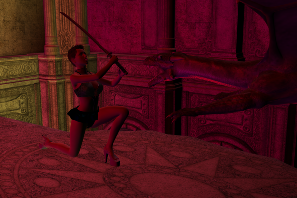
I made a thing! (Or my first render)
I got Daz yesterday. My first real render is a cloriously unbelievable piece of chainmail bikini that I almost feel bad about posting next to so many serious, and awesome works. Almost.
Very cursory look at expressions and lighting, but everything else I'm pretty happy with. The character is supposed to be coming out of a roll, but I'm not sure if that comes across or not. Does it?


second_image.5_.png
2000 x 1333 - 3M
Post edited by iminal on


Comments
Your first full scene is a really fun feeling.
Action movement is kind of tricky. To really trick the eye into believing it, you have to kind of show the char "off balance" in some way.
Look at the stock action poses included to get an idea. Some of them have that "out of balance" thing, the running one is a good example. Our brain processes "movement" since that is the only way the pose could be maintained. For walking, it can be nothing more than an overflexed heel/toe instead of flat feet.
This is a really rush example. I moved and flexed knees, ankles to imply movement. It is a pose no one can hold static really, as opposed to kneeling, so it implies moving forward. It needs tweaked, but maybe gives you some ideas. I didn't do much with the upper body, lots could be done with that.
I hope you don't mind.
Not bad for a first render. the action pose on the girl is a little weak though. A good rule of thumb when it comes to action shots, such as throwing a punch, kick, or swinging a sword, is to show either the very start of the action or the follow-through, not the mid-swing action. Mid-swing is the weakest shot visually.
I like the way you have the dragon coming from out of our view and into the picture- we can feel the threat.
The other folks covered the pose, let me mention about the lighting-
Here's a thought if you want to try it- try placing three distant lights all around, with one stronger than the other two, to get started. Her face needs to be lit so we can feel she is involved in the scene. Put all the distant lights at about 30%, try a dull peach/ red if you like that color, and put the shadow intensity about 40%. That gives you a fairly neutral lighting and then you can dramatically increase one light and it's shadows. I'd put one light slightly behind and over her shoulder but make sure it shines on top of her head, one on that SAME side but in front so it lights her face, and a weaker "fill" light on the other side, also more in front. By having one light coming from behind, you are creating contrast. The lights would be at 11 o'clock (behind), 4 o'clock, 7 o'clock roughly. This is an easy setup for beginners if you want to try it. Or just ignore me and do your own thing, lol.
I'm glad you started a thread, looking forward to seeing more. :)
Cathie
@Teofa: Interesting. I think I made the posture too stable. Particularly by having the back leg go straight down then back, making more of a kneeling pose.
@Tramp Graphics: It actually is supposed to be the beginning of the movement, but I agree it is weak. I discovered that that motion looks (and is!) weak in general, but I pulled the sword back further to try to compansate.
@Novica: That sounds useful for creating realistic lighting and I'll try it when I want to do that. But I had already decided to do a more symbolic lighting for this one.
Thanks to all of you for taking the time to comment. Here's the second iteration. Of the scene
A bit better, but still weak. It's not just the sword that needs to be brought back, it's the arms. They should be up high, holding the sword up and back, blade-tip down, ready for a powerful blow to smite the oncoming dragon. At the same time, her head should just forward, towards the dragon, as if she's on a collision course with it, not pulled back away from it. Granted, in real combat, that'd be blatant telegraphing of the swing, but in comics and art, it's necessary to create a sense of drama and dynamic action.
For example, take a look at the attached piece below. See how the hero is crouched low his arms extended fully out and back with both blades swept fully behind him at the completion of his swing, having killed two Yakuza thugs while the rest of his body is drawn forwards towards his foes. All motion is forward, aggressive, not passive. Look at the two remaining Yakuza thugs. The Yakuza on the left is in a defensive stance, his right arm held high, The one on the left is more tentative, and defensive, but even here, see how his body arches, his left arm stretched out in front, while his right arm is high, ready to parry or strike as the opportunity arises. The thug on the right is even more dynamic with his left arm drawn fully back and ready to deliver a potentially devastating blow. That's what you want on your action scene—strong, dynamic poses the characters about to explode into action, or having the followed through the completion thereof.
I know what you mean. I'm just saying I can't get the arms like that from this pose without them ending up looking like spagetti. So I played around with the lights a little instead. Think I'm going to leave it as is for now and try to make something else.
If my last pick had had a story this would have been the villain. Much less ambitious in terms of pose and so on than the last one. No hair because I haven't found any I like yet.
Having got the time now and a bit of a break by working on that other image I went back and experimented a heck of a lot with the arm controls. I also was a bit more ambitious reversing the grip on the sword (the odd grip was making it very difficult to get a real stance) and also adjusting the rest of the torso to add to the swing. I'm very happy with the result, but I should probably take the time at some point to redo the lighting based on the new stance.
Nice renders. I like the red and yellow lights. They look better than my renders of the chasm. I should upload my render soon. Thanks for posting.
I really like the lighting
Thanks! That's very nice of you to say.
Here's the result of fighting a dragon with only a tiny little sword. And also a version of the first picture with slightly updated lighting
New picture today. Someone ought to watch their prisoner better
You have some cool ideas here. I agree with Novica, distant lights in a "3 point light setup" are a good place to start. The alchemy chasm has a light setup that you can load which might be a good starting point. Remember that distant lights have no position, only rotation. You can turn shadows on or leave them off if you wish to use one to highlight an outline on a figure(s) in order to separate them from the background. Also you can render the scene one light on at a time and then blend them in Photoshop or Gimp as separate layers using screen mode. Dreamlight has some great lighting and posing training and even has one specifically for fantasy images.