Sharing my custom layout for Daz Studio 4.6
Hi gang!
One of the first things I did when I started with Daz Studio was to change the layout, or workspace. My dilemma was simple; I really liked the Hollywood Blvd layout in general, but it was a bit too extensive for me. Too much overhead so to say.
But if you then selected a more advanced layout such as Self Service or City Limits then it was a bit too sparse for my liking.
So I ended up rolling my own. Also because there were several (small) annoyances in the default layouts, like the icon toolbars which would sometimes move around or simply not provide me with the options I was after.
I made several versions, but now I've finally reached a point where I consider the layout to be somewhat finished: "Catslair boulevard".
It's fully aimed at providing a modelling environment, and totally ignores animations. I've trimmed the workspaces down to 3:
Layout description
Actors & Props
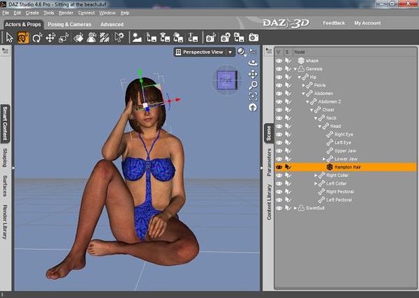
This is the section which I use to build my sceneries and do some pre-mature posing. You have the smart content pane on your left, together with the shaping and surfaces panes. At the bottom sits the render library. On the left you got the scenes, parameters and content library pane (this selection is used in every available workspace).
The icon toolbar provides access to a common selection of the viewport tools (node selection, universal tool, scale tool, surface selection, etc.), it allows you to select a backdrop for your scene, or to save (parts) of the current scene. Finally you also have some render options (like spot render, render settings, the option to save those settings and to start rendering).
Posing & Cameras
This section is aimed at providing more detailed posing controls, as well as providing options to actually build your scene. The main difference on the right side is the addition of the tool settings pane, the rest of the panes remain as they were in 'Actors & Props'.
On the left you can now find PowerPose; ideal for fine-grained posing controls, Posing, Cameras, Lights, Align and the Render album.
The icon toolbar has also changed; you get a different sub-set of the viewport tools (selection, universal, rotate, translate and activepose), controls to save (parts) of the scene and specific controls for camera and light controls. Adding a camera, light source or toggling the lighting preview is now done with one simple mouseclick instead of doing this in the pane itself.
You also get some minor viewport controls (the option to provide one window or a split window) as well as the render controls.
Advanced
As the name says this is where you can do more fine grain tuning and controlling. The panes on the right are the same as those in Actors & Props, on the left you now got the Shader builder, RSL editor, DForm, Figure setup and the powerful Script IDE.
The icon toolbar now shows all the viewport controls, allows for easily adding new camera and lights as well as options to save (parts) of the scene. And it also provides you with the always present render options.
You'll easily recognize the advanced section through use of a dark grey backdrop.
Shortcuts
I've changed some keyboard shortcuts, though don't quite remember all of them ;)
The things I know to have changed is the option to select the spot render tool: control-alt-R. That's because you'll get the render settings using control-shift-R, so this seemed like a logical approach to me. Note that the render settings pane is no longer permanently visible (either collapsed or expanded) in the layout.
That's because my main focus was set on modelling. And also because it's easy to click control-shift-R after which the settings window will appear.
I've attached a preview below, of course with a cute model (Riley) which is wearing some swimwear; that's the only way to promote things like these ;-)
Getting the goodies
I've created 2 archive files (ZIP and RAR) which are both hosted on my server, just follow the appropriate link:
DS4-catslair_boulevard_layout.zip (approx. 115 kB)
DS4-catslair_boulevard_layout.rar (approx. 100 kB)
Why both zip and rar?
Because I'm a big fan of the (Win)RAR archiver, I've been using it almost as soon as it got out (back in the good old BBS days), even have several licenses for it (both commercial as well as private). That and because the RAR file is smaller and has a signature on it which shows you that I'm the one who made it.
But because not everyone uses RAR I've also provided the ZIP format.
How does it work?
On Windows 7:
Extract the archive to the AppData\Roaming\DAZ 3D\Studio4\user layouts folder (or extract it somewhere else and copy the contents).
On Windows XP:
Extract the archive to the Application Data\DAZ 3D\Studio4\user layouts folder.
The folder can be found inside your own "home directory" or default "user folder".
After you extracted (or copied) all the files and directories you simply start Daz Studio, select the Window pulldown menu and then go to: Workspace -> Select Layout.
When everything is in place you should see an entry called "Catslair Boulevard" in the pulldown menu, with a short description at the bottom. Simply select it and see if you like these settings.
To preserve your own settings:
Its a good idea to save your own settings first before trying mine, especially if you made changes yourself.
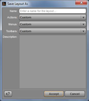
It's simple: before loading my preset start by saving yours. This can be easily done by pressing F4 while making sure that you select "Custom" for the actions, menus and toolbars (see 2nd preview below).
If you don't like my layout or wish to merge your settings in mine (or the other way around) you can then simply select your layout from the same pulldown menu which I described above.
Hope some of you may find this useful!





Comments
;-) I am going to try your lay out as I also dont like the stock one's,mix and match the best of all world's.
thanks
I'm a fan of the Custom to my choice layout I use. I went with the DS3A style with all the DS4+ toolbars. Never thought of sharing a layout before, cool idea.
I was just searching for where to find my style and layout ... Thnaks for the file locations!