Thermal video camera with mini-screen
Hi all,
This is my first (well, the first non-trash-like) experience in 3D, and now I'm stuck. I've been trying to create a video camera from the real prototype. Now the result is looking quite realistic to me, but after some many a lot of googol fails in the traditional art I understand that I can't trust my eyes. So I need your help. To finish or not to finish this stuff, that is the question. And also "to sell or not to sell", I think. All of us want to be rich, yes.
I highlighted one obvious problem with the screen. It looks completely unrealistic, and I could not find a suitable parameters for Iray Emission shader. I put the real photo as a texture image, just to look how it will be, but the final render is ugly.
So, the questions are:
1) How close this model seems good enough to sell (maybe with some poses), if you don't notice the screen? If not, how I can improve it?
2) How can I solve the problem with the screen? The result should be like a phone screen, you know.
Thank you.
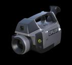

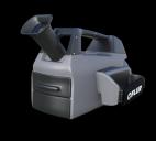

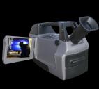


Comments
Your modeling skills are pretty good... I usually don’t critique other people’s work, but nobody has responded in several days and I don’t want you to think people here are rude.
You can think I’m rude, because I’m actually pretty rude, smelly and I have terrible grammar... if you can get past that, then... Hello!
Anyway... A few years ago I made a similar kind of mini-cam model, so I’m kinda familiar with the subject... also I have a terrible memory, so if you trust that I actually remember anything, good luck... but anyway, the model I made was a quickie for a request someone on the forums made and I took it as a challenge to try and model it as freebie as quick as possible before everyone lost interest and moved on... so that model is a very simple Poser Prop with a few moving parts and such and is not optimized for iRay or anything (DS didn’t have PBJ yet)... (wait, that’s peanut butter and jelly... I meant “PBR”... which is “Photon Base Raccoons” or something)... anyway... It’s in my collection at ShareCG (the banner link should be at the bottom of this bizarre post) if you want to check out how lousy it is or compare it or just laugh about it...
So like I said before, it’s a pretty good model...
Test renders are hard to judge things from... a lot of things I’ve made look great to me when I’m modeling it, but when I render it it looks lifeless... mainly because I suck at rendering... So one thing you might want to consider is at least in the beginning of your foray into commercial modeling, is to hook yourself up with a couple of trustworthy testers... I’m assuming people do it for free because you give them the model for free to test... I’m also sure there is a lot more to this so I won’t make more speculations on how it works, but the good thing about it is they will find stuff you may have missed because you’ve been staring at your model for days... or hours... or whatever... another option is to make some of your models freebies and ask people to show you renders using your model... the downside of that is nobody really does that... for every couple of hundred downloads, you’ll get one shared render or link to one... still, the few I’ve gotten have made me feel better about the model used, because they were way better and more interesting than my renders... to me that was encouraging... but then again I pet stray zoo animals foaming at the mouth because I’m optimistic they may have just brushed their teeth and forgotten to rinse.
Anyway...
The model...
It could use a few more buttons... I have one of these video cams in real life and it’s stupid with buttons... I think it might have a “make coffee” feature, but I can’t be sure if I’m misinterpreting the icon... most of these kind of buttons are located in the recess the screen folds into... but that’s probably not important.
The eye-piece... it looks a little long... most real world devices like that are either very short or they telescope in and out... I’m going to assume it’s in the extended position.
The screen... I’m not sure what you dislike about it... were you shooting for more of an emissive effect, so it has a glow?... I tried to figure that out a while ago and I didn’t really get any answers that matched what I was trying to do, but I figured it out, sorta on my own, but I don’t know if my solution is correct for how iRay is supposed to look/work... or if this solution works in the current version of DAZ Studio... here is the thread if you are curious... https://www.daz3d.com/forums/discussion/57336/emissions-mask-map-or-something-like-that-solved#latest
You might want to make the screen image look a little more like an LCD screen... the image on your screen is too “perfect”... I don’t know if you have Filter Forge, but I think there is an LCD screen filter or something similar... if you want I could look through my FF library and render out some kind of PNG you could use as an overlay... let me know.
Also minicam screens have lots of icons and info displayed on them... stuff like battery life and whatnot...
That also leads me to another thing you might want to consider... options.
Most commercial models, especially ones sold at DAZ, have a few options included with the model... in this case a video camera by itself might not sell well... you might want to include batteries, memory cards, extra lenses or other accessories to give the model added value... since your model has a screen that a customer might want to show recording something particular to their render, you might want to include a couple of PNG overlay images they could use to customize the screen for their own purposes.
At this point you are probably regretting having started this thread, so I’ll try and wrap it up...
The only other suggestion I have is not so much particular to this model, but as a general suggestion for entering into commercial model making... you might want to offer some of your early models as freebies... a lot of Published Artists here started out that way... when you find somewhere to host the model (ShareCG is a good place) make a thread for it (with a link to it) in the freebies section and ask for comments and suggestions on how to make it better or for general observations... it’s easier for people to make informed suggestions and comments if they have the actual model to check out.
If you go that route, don’t be discouraged by negative, seemingly ungrateful comments or people suggesting overly ambitious additions to the subject... most people will be trying to be helpful, so stay engaged and use the thread to learn what people want and need vs what you are willing to incorporate or are interested in working towards.
So, that’s the best suggestions or commentary I can give/add/make... Hopefully someone more informative will join in here and make better suggestions or whatever... Well, good luck and sorry if this was long winded, boring and filled with unnecessary attempts at humor.
Hi McGyver!
You don't have to worry about grammar, AEnglisc is not my native language, so I think my skills is ever worse.
Thanks for your responding! Last days I was thinking something like "hey, what I did wrong?" -) Now I calmed down.
The problem of the screen is: it looks too different. It looks like, you know, like if I cut a piece of paper and stuck it on the main body of camera. Thats is the main point to frustrate me, not just unrealistic appearance. Other materials are glass/plastic, and they looks good, but this one is not.
I understood your advices, they looks pretty logical. I'll try to add some features and post this model on ShareCG (heh, just need to sort out about this).
Thanks!