Need More Eyes! Shape Oversaturation!
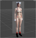
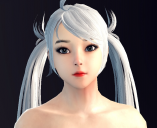
Yep, its what I'm calling "shape oversaturation"! After working on the same character for so long, I would imagine it happens to most when working without a reference shape within the viewport. When browsing through my render library the other day, some of the previous characters I shaped & rendered has me scratching my head wondering if something wasn't wrong with my eyes. So I'm wondering if anyone out there can give me a general idea of how this character's proportions are in general, specifically the head vs. the body(i.e. is the head too big or too small?), arms vs. legs(length), etc. The eyes may seem to be a little big due to the Vindictus character reference I used for the facial feature shapes.
This time around the thing I tried when shaping the overall proportions(arms, legs, shoulders, hips, head, etc.) of the character was I loaded the G8 female base in the scene at the same x & z position of the character I was shaping and adjusted the y coordinate as needed depending on which area of the character I was working on. Hence the reason why I need eyes that are unbiased and different from my own to take a look at it: Goon or Gal? heh. I've provided a spot render(face shaping wasn't fully completed yet, but hard to tell since its a smaller render), a resized(-50%) full render of the character, and the character I used as a general reference for the face.
PS: I'm still working on the Marie Rose one from DoA. For some reason I'm finding the hardest part to get right are the lower cheeks to the left and right of the mouth. She seems to have a kind of roundish-flat-heart-shaped face. The only pictures I seem to be able to find for a reference are either almost dead-center from the front or odd angles that don't help much for giving an idea of the face shape from the side or an inferior/superior angle view.





Comments
Trying to recreate a game character can be tough, especially if you are attempting to create a realistically-proportioned version of that character. Game characters often tend to have disproportionate features and body proportions compared to real life - for example, they will often have overly large eyes, tiny mouths and stylized face shapes. The DoA characters tend to have quite long legs and relatively short torsos, etc. All of this makes creating a facsimile with realistic proportions and features that still retains the "look" of the original character difficult. And that doesn't take into account the fact that the characters themselves can change over time through different versions of the game.
Anyway, if it helps, here are three views of the character's head:
Thanks! The side view will definitely be a big help!
I'm not concerned with shaping the exact likeness of the characters from head to toe. That would be too much and would either require a lot of image references or acquiring the character's base model & importing it into Daz(beyond my capabilities at this time). One of my stumbling blocks is dealing with shaping proportions. Getting "a shape" right isn't that hard. However, getting the "collective shapes" together in the proper proportions is a challenge(at least for me).
The thing about Marie Rose(and probably most of the other female characters), is the child-like face. I have a pretty good idea of how to age it more by various morphing without resorting to just using the single "older" dial morph(which isn't always reliable). Looking at the side-shot view, I can already see I may have the overall facial contour completely wrong, which might mean starting from scratch again.
Ok, update on the WIP for the Vindictus character. Started over with the character head/face using a different base, and only copied the body morphs & skin over from the other one I ditched. Two of the areas that were giving me problems on the original character was the chin depth & the forehead conformation with the rest of the face. I was able to get it much closer using this base. It looks like I still need some slight adjustments to the cheekbone region on the sides of the face below the temples, and maybe a 5-8% reduction in the size of the eyes.
First image is one of the references I used for comparison and can be compared with the second image, which is a camera spot render of the face(100% completion). The third image is a full render to 75% completion(reduced size by 50% & cropped). The skin is a bit shiny and the color seems a little off from what I was trying to achieve, but I wanted to leave the Fresnel settings on it because I'm still playing around with the Real Drops product, geoshells, and normal maps.
The fourth image is the same character in earlier stages prior to switching skin bases and numerous facial morphs. It has Real Drops & a Water-Thin geoshell that uses a rainy surface normal map. Still came out underwhelming and need to experiment more. The whole problem is I can't seem to get the effect to show up enough using Water-Thin shader on the geoshell, and using the other Water(not the dispersive one) just makes a mess of the skin. It also doesn't seem to be a good idea to have part of the character submerged in water when trying to use these surface effects on the whole character.