My beginning: A wip
Well, been dabbling with Daz for quite a while and decided to finally get a bit more serious so going to start doing that by putting things out there for people to see. Any comments, critiques, pointers, tips or anything at all will be appreciated and wanted.
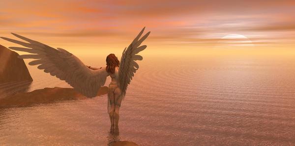
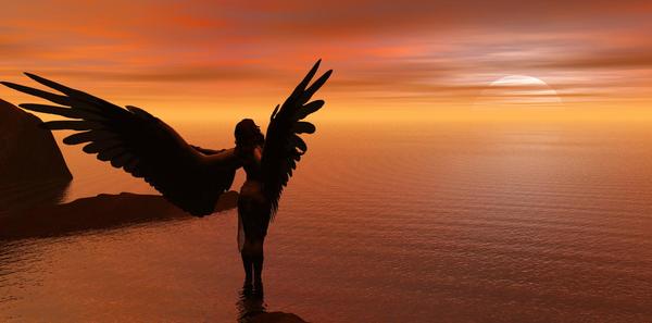
So, with little further ado, my first public display as well as done with my first real foray into Bryce. It is actually two, same picture, different settings in the render, second one I think is much too washed out.
Greeting the Sun.


greetingthesun2.jpg
1754 x 867 - 186K


greetingthesun.jpg
1754 x 867 - 154K
Post edited by Kat_Kat on


Comments
Both pretty cool renders and very calming.
Being super critical, I find the rock/land in the front middle distracting and more so in the way it joins up with the reflection of the figure. Also I'm not convinced by the lighting. While the sun is setting there is still enough above the horizon to cast a shadow and yet there doesn't seem to be a shadow in line with the sun.
That said, in many respects, the nature of the image is such that it doesn't really matter.
I agree with both observations :) I am still figuring out the details of working with lights in Bryce, just started using it yesterday morning lol. Lights coming from the direction of the sun, but not really in line with it and the shadows issue :).
I was on the fence with the foreground land, but you are right, it clutters the image. the background is fine, but the one in front is a distraction.
I am going to have to work on colors and sky composition as you are right it is much more sunset than sunrise. Sunrise was my intention :)
Thank you though, the intent was a simple calm image, that much was accomplished.
Play on pinks and yellows to get a sunrise feel
Remember that when all the light is coming from the sun as it rises then the figure will appear to be much more in silhouette, especially as your sun is only just appearing over the horizon.
I won't spam you thread with an image, but this is one I did with the sun coming more from the East of the picture, and a lot of haze built in to give an early morning feel. THere are another couple of early morning images in my gallery, if you are interested.
No extra lights, just the default bryce sun.
Remember you can dial the sunlight up, it doesn't have to be left at 100
http://www.daz3d.com/gallery/#images/5873
Thank you. I took the advice and have started and stopped several renders, the latest has been cooking for quite a while and I am much more pleased. Also found out the value of linking objects when I rotated my character and she exploded lol. The render will be done...Soon
Ok, changed the scene, the sun, the setting, the angles rendered and stopped and fiddled and read and rendered and stopped and fiddled and stopped and did it again for two days and came up with these two.
OOoooo I like them! I've never worked with bryce (It's on my list of things to do) so I really wouldn't know were to critique. I find the bottom one with the haze to be the most visually appealing. Out of curiosity, how long did the renders take? Good job.
Actually, about ten minutes trying to get the one I like the most. then going to tweak the setting and let it render to a higher amount, some detail is a bit soft still.
Also forgot to put this one into the mix. Mostly working on the subject angle, may tweak the mist and fog settings a touch more as was pointed out earlier to give more of the morning feeling.
Bryce seems extremely daunting when you first load it. So does the manual. But have a look at some of the basic tutorials and it gets clearer pretty fast to jump in and get some basic things happening pretty quickly.
And thank you :) I'm pretty happy with them so far
Cool!
Oh I like that one too. I love how detailed the water is, and the reflection of the angel. >.> I may dust off Bryce and play with it here soon. :P
Just a couple more, one I did for a PC contest themed "Hello and goodbye" and a different lighting render of it and another take of the same theme. Last one I never finished, still had work to be done.
All titled "Goodbye to all they knew"
Love the lighting and the title is very fitting for the poses!