Captivity Captive
 RexRed
Posts: 1,374
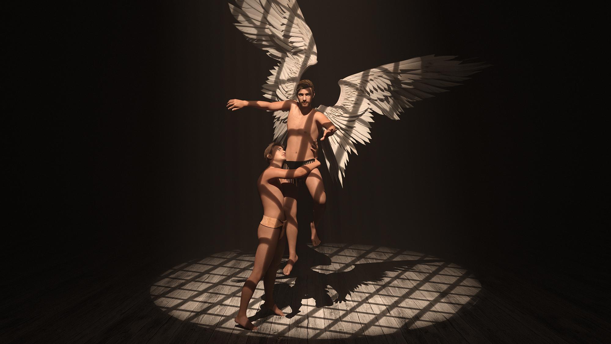
Hello DAZ peeps! This artwork I have titled, "Captivity Captive". I am sure having fun with this!
Please leave comments and suggestions.
Best Regards
RexRed


Captivity Captive 2 small.jpg
2000 x 1125 - 1M
Post edited by RexRed on


Comments
I like your lighting and shadows, very nice!
Don't really understand why the winged dude is lookig into the camera... I feel he should be either looking down at the other dude or up towards the light.
Cheers!
Thanks for the like on the lighting and shadows Hylas, I originally had the angel looking up but I changed it. My reasoning was having him look at the camera involves the viewer in the "captivity" also. The viewer becomes the captor, jailer or an active observer of this captivity, the angel is aware of the viewer. Also, the angel is not struggling too hard to get away, I did not put anguish poses on their faces. The angel is a semi-willing slave to love and is not afraid to show it. The look into the camera is defiance and self-love. :)
This one I titled, "Threshold"...
Comments and criticism welcome.
Holding his upper body like that should show much more tension in his abs. Unless his superpower in floating in midair.
Thanks for the comment Ascania, I will give him more definition in his abs, great suggestion! :)
This one I have titled, "Honeymoon"...
This is my latest render, I call this one, "Truce".
New render by RexRed titled, "Minstrel Angel"
New render by RexRed titled, "Two Men in a Tub".
Hello DAZ Studio peeps! I got all of my actors together for this one. I have titled this, "Tribe". Please support our community by purchasing the artwork (what a beast this was to render at 10000 x 10000...)
Love and kisses, RexRed
Can you guess who is who? :)
I am not an expert at lighting and shadows and I might understand it from an artistic point of view but shouldn't the shadows on the ground from the grates be the same as the shadow from the dudes? The much more powerful shadow of the dudes suggests a very powerful light under the grates which I don't think is what is meant in the render.
Alex, that is a good question, There is no light source under the grate. I used a trick that I learned in a YouTube video from the creator of the light pack "Render Studio 2.0 Volumetric Plus". The light source above the grate is angled slightly in front of the character so as to light their faces not requiring a second light.
So, it is like the sun is shining into the grate but the sun is not directly above, the grate is also at a 90 degree angle facing the source light. When the grate was directly above them you could not distinguish any facial features. The light above is "pointing at" their feet and translated in front of them as is also the grate with it. This way the light source creates a beautiful cascade of lillumination down the front side of the figures yet they still remain within the light cone. I think I moved the light point at their feet slightly behind them to keep them in the light cone and provide room for the shadows on the ground behind them.
Thanks for the comment Alex.
This one I have titled, "Heaven's Gate" (Rodrigo figure)
Interesting technique.
Very beautiful render. I like the lighting in this a lot.
Only thing I would change, if you know how to do this is make the candles a little emittive so the left wing is a little lit with a warm light from them.
Hello beautiful DAZ peeps! This image I have titled, "Fate and Love". I will be placing this image on items in my merchandise store today and after approval you may purchase them in about a day. This image was rendered at 10000 x 10000 pixels so the detail is very fine for large items like wall prints, tapestries and posters but it is also available on coffee cups, clothing and phone cases etc...Your support is appreciated very much! This is Roy on the left and Rodrigo on the right. Love always, Search for RexRed on Teespring
Hello Alex, even though I have been rendering scenes since the old povray days, I am still new at this.
I have a lot of things to still figure out.
Lighting is one of them.
Whenever I go for dramatic lighting i.e. really dark places and really bright places in a scene, I end up with speckles all over the scene and when I turn up the light paths, my scene won't render. All of these pieces here were rendered at 10000 x 10000 pixels. I need a second card and more ram. My PC has 24 threads and an Nvidia 1080ti with16gb 3000mhz ram.
At the location of each candle I have placed a radial light.
I did this to illuminate each flame more (i could not find an intensity slider in the candle surfaces tab) There were flame poses but I could not find intensity... So, I used 5 small warm radial lights that may have created an artificial feel to the candles.
The candlestick holder was at one time larger and it drew people's eye to it so much that they did not even notice the man playing the cello and when they noticed the man they would not notice the wings.
It overpowered the scene. I had to light the scene more evenly to reduce speckles.
There are four spotlights above in a straight row from back to front over his head and one area light on the front on the left side where there was a lot of shadow.
There is a lime green spotlight pointing at the gate behind him, but I turned it down so low it is barely noticeable. (Green is for go) lol
I would love to have made the scene more dramatic and that was how it was originally but the speckles in the dark spots were way too obvious.
I read somewhere online that the speckles are caused because the paths of the lights are only traced so far and then the computer gives up and when lights collide, they turn particles in the field the wrong color.
Someday when I have an even stronger PC I will turn architectural rendering on and set the paths of the light rays a lot longer and then the dramatic lighting will be possible.
Were it not easier just with a paintbrush if I could only paint, and I do not like post processing my renders in Photoshop if I can avoid it.
Thanks for the input and more dramatic lights are better for this scene. At one point I had only one side of his face lit but the speckles were too much to deal with so I went for a more evenly lit scene, I was worried the speckles would be too noticeable on a large tapestry or poster.
Best to you Alex!
RR
Thank you for the detailed response.
I too have encountered speckles in my scenes, when I turned shine on some hairs. I didn't know where it was from, so I just turned the shine back down.
It is good to know it is an issue from the light paths and that I should look into it if I can maybe fix it and still keep some of the shine.
The render still came out really nice, even without the candles, I just thought it would have made it even better. It's nice to read that you had thought among the same lines.
And regarding the lighting in your scenes, it is very good in my opinion. I am nowhere near that level. My comments come from observing real life, not from really knowing what is possible in Daz as I am yet a novice or how to do some of the stuff I suggest :).
Thank you for your response also Alex, your real life suggestions are great! I feel them also... and I hope to get my art there someday.
The shine on certain objects including hair comes from the glossiness slider in the surfices tab and if you turn it down they will go away.
The Iray lights are quite intense and can blow up certain substances.
This is a revamping of an earlier work with a bit more nostalgia added; this one is titled, "Domestic Tranquility".
I hope you like it DAZ peeps!
This one is titled, "Angel Serenade" It was a fun piece to make thanks to the really great models I found in the DAZ shop!
This one is titled, "Angel Star" This will be available to purchase in a day or so, love always DAZ peeps!
Meet my new model Dante on the right and Leonardo on the left, they are lovingly entwined in this image I have titled, "Danse d'Amour". You can expect to see more of them soon!
Critiques are welcome.
This one is called, "Bedside Proposal"...
I will make another one of their wedding.
Lorenzo on the left and Miguel on the right are now an item.
This one is called, "Lilly Pond Liason" Hope you like! :)
This one I have titled, "Forest Tree"...
Lots of love to you beautiful Daz Studio peeps!
"Vision of Love"... Much love always.
Keep safe and in perfect health beautiful people!
Where night and day meet somewhere in the dusk and dawn to join in a, "Cosmic Kiss"...
Stuart (left) and Ruben (right) are posing here for this art piece called, "Mannequin".
Rol (left) and Jamba (right) posing here in his piece I have titled, "Pyramen"...
This one is called, "Whisper" with Cetus (left) and Anthony (Right)...