predatron's loft add on
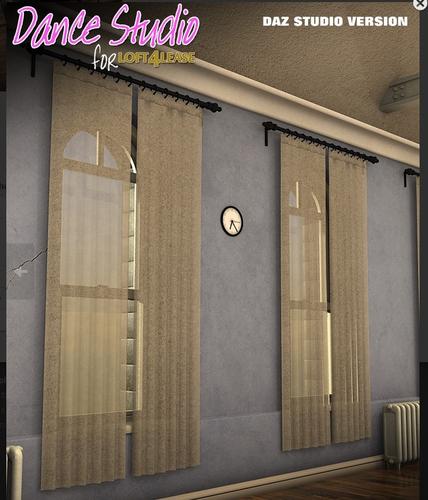
does predatron's new loft add on have a grainy appearance as appears on the promo images?
I really like most of predatron's work and already have many products. I would like to get this loft and add on next. "Loft for LEase"
THank you


pred.jpg
609 x 711 - 347K
Post edited by Aristoc on


Comments
I just took a look at the file in DS. It appears the graininess you are talking about is in the textures. I think it may have been made grainy to give it an old worn look. The floor does not have a grain look to it but the walls and curtains do. The textures for those surfaces are basic shapes so you could use a solid color to get a new look to it.
I think the package is worth the price for the props alone.
Just get them both.
The amount of level of detail is well worth it.
In the loft you can even adjust the angle of the blinds so you have complete control over the shadows created by sunlight falling in!
A huge thanks to Predatron for creating both Loft 4 Lease and the Dance Studio Add On!