A Salute to our Heroes (one of my first renders) - for critique
 DMax
Posts: 637
First of, apologies for the simple render which clearly lacks any complicated DAZ skill; it's been a month that I have really gotten into learning DAZ even thought I purchased my first Michael back in 2006! But I am ready to put myself out here (in my hazmat suite haha), hoping to learn from professional hobbyists and bettering myself! This render has taken me almost two full days as I think that I got overly picky with tiny details and kept having to redo the renders. Open to all constructive critique, thank you all!
Some thoughts...
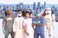
(1) I feel that the characters do not look sufficiently "real"... what can I do to improve the realism? The only character that I am satisfied with is the doctor in grey whereas the nurse looks really plastiky... I love my stormtrooper :P
(2) How is the overall lighting? How does it compare with the lighting on the real people in the background
(3) The clothing materials look fake...
(4) Do the characters blend in well with the background (which is an actual photo of mine)?
(5) Anything makes you think "ewwwww too fake"?
All ideas to improve this are much appreciated!


Comments
Looks good! My suggestion to make the characters look more real and alive is to give them facial expressions. Even some subtle, asymmetrical facial poses suddenly give a character a personality. Also the figures are all posed kind of stiff. Especially the hands. Personally the doctor in blue is the one I find the most believable.
Nice render. The part played by Imperial Stormtroopers in combatting COVID-19 is often overlooked, so kudos for that.
The whole thing is a little over exposed - the nurse's dress and the trooper's armour are burnt out in places, so maybe adjust the lighting or the tone mapping slightly.
Some of the hand poses look a little awkward. The nurse's right hand is disappearing into her dress, the guy in blue's right hand is cut into by his left arm and by his top. Crossed arms is a difficult pose to pull off, particularly if the character is wearing a loose top. You might need to do two renders of him, one with the top, the other topless, so you can combine the two in post, painting out any bits where the top conforms itself over the hands.
WIth that in mind, be aware that you can use the spot render tool to re-render small imperfections without having to re-do the whole thing. Just make sure you have "New Window" selected in the tool options.
Great idea! I haven't adjusted any expressions because I find that terribly difficult! The "stiff" characters bothered me as well, somehow this whole thing just comes across as being rather "robotic" which was supposed to be just Mister Stormtrooper himself!
Thank you kind sir!
I will definitely try to reduce the burn-out through some post-production work. Will google "tone-mapping" as well to learn what it is.
Yeah I do definitely agree that the characters look stiff and robotic, I really really want to improve my skills to render realistic characters - I know that at some point renders will never be 100% realistic but there's much room to improve.
Hmmm... a big good tip about "spot render"... didn't know that it existed! See, I am learning already!
I will post back a later version once I have it, incorporating all the feedback collected so far. Back to the studio (as long as the never-ending Daz sales do not drag me back here!) :P
Tone mapping is a set of rendering options that control how the camera deals with light, it includes stuff like shutter speed, aperture, film ISO, etc. You find them on the Render Settings tab, but there's a better way to adjust them...
Get your render running, then take a careful look at the Render window. Halfway down on the left hand side is a little triangle. Click on it, and a menu panel pops out allowing you to change some render settings, including the tone mapping ones, in mid-render. My suggestion would be to increase the Exposure Value slightly (higher numbers give darker renders) and/or reduce the Burn Highlights value. The changes you make will be reflected in the rendering image, giving you a chance to explore the effects you get.
Good grief! It's like a whole new world opened up to me! I never knew that the render window could be expanded to offer alllllll these options! That entire panel was hidden to me until now, your wise words have set me free!