Case Study: Sahira 9 Promo Shot
 Haddixx
Posts: 88
Hi all-
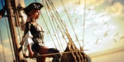
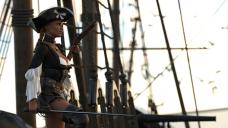
I was really inspired by one of the Sahira promo shots. It should be obvious which was the promo shot. Here are the products I used to create my image
- Tristana for Sahira 8 (The original was for Sahira 8 but I wanted to give Tristana a try - I really love this character)
- dForce Seven Seas Outfit
- Marigold Hair by outoftouch. I don't know what hair was used in the original. It looks like it was thined out to fit under the hat to me. Does anyone know what hair that is?
- Blackdawn Sword from the Blackdawn Outfit
- Gun 2 from Pirate Weapons for Genesis 3 and 8 Male(s) and Female(s) - This wasn't in the original but I like the addition
- I used the San Buenaventura as the boat in the background. It's the only sailing ship I have. Anyone recognize the ship used in the background of the promo image? It looks like a much smaller sailing vessel than the San Buenaventura
- Gulls04 from "The Flock of Gulls and Crows"
- Calm Ocean from "Ocean Wide"
- The the HDR I used "IBL Skies - Thunderhead 08" from "IBL Skies - Thunderhead"
I had quiet a few issues trying to match the original promo shot and not all of them were resolved in this version of the image. First, and most obvious, is the lighting. The promo shot has really dramatic lighting and is what originally attacted me to this image and my desire to see if I could undersand how it was created. I'm definitely going to need to try other HDRs because as loaded the "IBL Skies - Thunderhead 08" resulted in a really dark image. I played with dome rotation, environment intensity and Film ISO under Tone Mapping to boost the lighting but I don't get the dramatic lights/shadows of the original.
I think the placement of the charcter and the angle of the camera also makes my image look more cluttered. Part of that is the limitations of the San Buenaventura prop. In the promo shot the figure is more visible relative to the background.
I also encounted a lot of problems with the Seven Seas outfit in trying to match the promo. First, there were numerous poke-throughs on the corset but I was able to resolve those with the addition of a Push Modifier applied to the Corset and using the built in adjustment morphs. But, this approach amkes the corset not look as "tight" against the bust as in the original image. I'm also having trouble getting the skirt to lay properly agains the right leg. When I simulate, either with "Start Bones from Memorized" ON or OFF, the skirt curls up on the right leg. Watching the simulation its like the skirt rebounds and folds under itself and then never flattens out again. There must have been some dForce magic used to create the promo image. If anyone has suggestions on how to correct that I'd love to hear them.
Anyway, I'd love to hear your thoughts on the image and how I can improve it. As mentioned I want to try a different HDR and see if I can boost the lighting, I think that will help alot. I'm also going to try different figure placements on the boat prop and different camera angles, play with the dForce settings to see if I can get the skirt to lay flat on the right leg, and fix the hat. I think I made it too large to fit over the Marigold hair. I'm pretty sure I can tighten that up a bit.
Thanks and looking forward to any feedback on how to improve the image.



Comments
I don't know that it's HDR. It can be a flat image or rendered on nothing (and layered on in GIMP). The sunlight looks like a different direction from the background. So that's immediately one issue for your image... get your Distant Light source pointing in a similar way. And dial up the light. To have strong and suggestive shadow, you need light.
Tweaking it in GIMP is something that would improve your image. Figuring out how to do tone, color balancing like the sample image is a trick.
Anyway, that's my $0.02.
I don't have a lot of tips, but the hair looks like it's https://www.daz3d.com/arion-braid-for-genesis-3-and-genesis-8-females
The boat could be https://www.daz3d.com/marmara-boat, but I'm not 100% sure.
Thanks, I hadn't thought of that (that the background could be a flat image) but I had noticed that the background bright spot and the foreground shadows on the character didn't match up. Was having a hell of time trying to figure out how to reconcile that with an HDRI. I'll give the distant light a try.
Thank you @mori_mann. I think you are right on both the hair and the boat. Both are added to my wishlist for when they go on sale.
Here is the updated version. I've added a distant light and swapped out the HDRI. I tweaked it a bit post-render in photoshop. The background is an improvement over the my original render. I think I just need to be a bit more agressive with the distant light brightness to make the main character pop a bit more.