room corner prop - walls with crowns and baseboards
========> https://sites.google.com/site/mcasualsdazscripts4/mcjcornerroom
a starting point for a render !
less boring then a simple room corner
The construction is modular so moving the ceiling up is easy
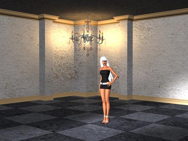

cornerroompromo.jpg
960 x 720 - 458K
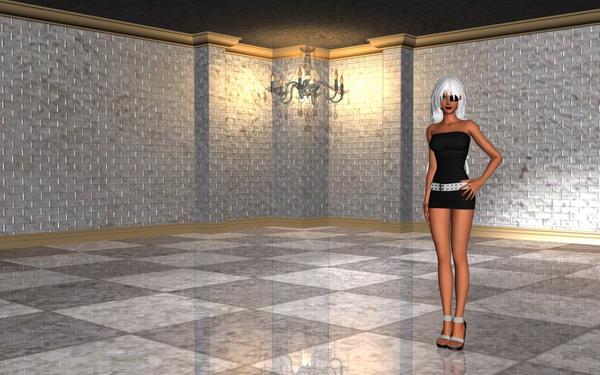

cornerroompromo2.jpg
1000 x 625 - 141K


cornerroompromo3.jpg
1000 x 625 - 128K
Post edited by mCasual on



Comments
Thank you, just grabbed it.
Will have a play later :)
note : the chandelier is a separate free prop posted recently at https://sites.google.com/site/mcasualsdazscripts3/mcjlustre
Beautiful corner prop. Thanks!
One can always use another place to pose one's figures. Thanks!
Oh this is very kewl. Thank you sir. :coolsmile:
- update - poser - - update - poser - - update - poser - - update - poser - - update - poser -
the new version will let Poser ( tested in Poser9 ) users to select and move the wall crowns, move the ceiling up and down and stretch the walls taller
technically speaking
for some reason, the prop file only had one "addActor" statement in the "doc" section
so using wordpad i added the floor ceiling walls and crown props
figure 2 "Pond AO" lighting , notice the bump map which carved bricks in the walls
figure3 - dont worry the ceiling didnt get lower
Nice, thanks for the prop. dropped in a Buddha for quick test in Octane.
OK, I played with the stone texture and the bump texture, and I liked the bump texture better, so I used it for the Diffuse channel, and here's what I came up with. Not crazy about the lighting, but I did the best I could. Vicky looks lost in the room. :coolsmile:
Be sure to click to see it unsquished.