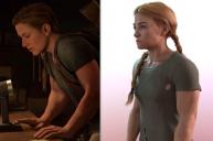
Trying to recreate character, need pointers...
in Art Studio
I've been fooling around with daz studio for at least a decade, but never tried to create a character that looks exactly like someone. So I'm basically a complete noob to this.
I'm trying to re-create Abby from The Last of Us 2. Got this far pretty easily, but from this point on whatever I touch it seems to only get worse.
Try harder I guess?


abs.jpg
2005 x 1330 - 205K


Comments
That looks pretty good! The photo looks like the nose tip is not as pointed or tipped up as the model. Also the ear on the photo is rounder (deeper and shorter) than the model.
Wow - that's pretty darn close! I would say you've almost nailed it. :)
As barbult said, the nose maybe could use some very slight tweaks - but you are VERY close! NICE work!
Looks awesome to me too.
Did you sculpt that yourself or is that all morphs from morph packages being combined?!
All I see that's noticable is the cheek bone on the picture seem to be high and go all the way back to the hair while on your model it seems to stop and in stopping that makes her back of jaw muscularity more noticable.
Thanks for the tips. I'm only using morph packages I've accumulated over the years. I've tried hand crafted morphs some time ago with blender, but the results were awful, I gave up on that.
I actually wouldn't even have ventured to try this if not for noticing that the recently released Angharad model offered a pretty good baseline.
Here's round two, can I improve it further?
I just finished binge playing this game, like 3 sessions, totalling 36 straight hours. And that final fight sequence was brutal cause you cared more for Abbey at that point then you did for Elli. You're pretty darn close, she might need a stronger jaw and a bit more chin, and if you can find a decent backpack you'll be there. Finding a single braid Hair could help too. Abbey had serious body bulk as well so you dial that up a bit. Shes a great character.
Yeah I finished the game within 3 days of release as well. I played the last stint with Ellie with nothing else on my mind but: Please let me somehow save Abby.
I haven't found a better hair than this yet, any product suggestions?
Meanwhile I further refined the face, and started to match the body more closely as well. I know a bit too ripped, but that's my artistic freedom kicking in :D
In this one it looks like her entire length of nose needs to be a smidgen higher and either the middle bit of flesh between her two nostrils (philtrum is it called???) needs to be up higher or the tip of her nose bulb lower. That's noticible in your prior render too, the nose doesn't look 'long enough'.
The backpack in this set isnt the same but has some prepper type props included on it.
https://www.daz3d.com/the-divide-outfit-and-props-for-genesis-8-females
This set has the basic backpack but will need some grunged texturing and props.
https://www.daz3d.com/book-smart-outfit-for-genesis-8-females
I think this one shows that the muscle definition might be dialled in a bit too much. Maybe try dialling back the muscles but adding a little bit of weight/thickness - if that makes sense? Her arms appear to be pretty thick, but there's also a bit more softness there and a little less muscle definition. With your version she looks a little too "ripped".
It's strange that after someone points it out I can also see it, but not before. I tweaked literally every dial, absolutely nothing left untouched:
https://www.daz3d.com/gallery/#galleries/7844651/
I'm starting to feel that this is going to be a never ending endaveur. I'll never be able to say it's done.
That was intentional, as I've mentioned.
The philtrum is the groove between the top lip and the nose. The flesh between the nostrils is the septum.
based on your recent gallery post: Jaw line needs to be higher, chin should protrude much more, move eyes closer together, move the outer corners of the eyes up, move the part of the eyebrows closer to the nose down, cheekbones more prominent and lower, forehead protruding more, thinner neck. Not sure if you have the rarestone morphs, but those should be able to make all these adjustments.
Thanks, I couldn't remember at the time.
I don't have that morph set. I'm just about to throw in the towel for today.
With the gun and backpack your character is certainly taking shape.
Looks really good to me. I think for a match, the nose and chin need to protrude more, but I would be satisfied with it as is, if it were me :)
First... I don't know anything about the game... never played it... so I am kind of just going by the pictures you posted with no "game knowledge" to influence what I see... (sorry)
Uhhhmmm I actually like yours better... as "just a character", I'd choose yours.
But if you are trying to re-recreate that game one... My eyes see the orginal face shape as more... upside down triangle like... but longer. Yours is almost heart shaped. rounder through the cheaks.... I'd say Slavic in background (yours is).
Regarldess, best of luck!
Here we go again. Round two.
Now you just need A touch of Dirt!
Improved a bit on that.
Your version of Elli is very good. including the hint of the tattoo on her arm too hiding the bite mark. All you need is some blood stains and grime to grunge her up. There may be a bit of grunge texture work in your future.
bit more form on the breasts for Elli, looks like you just diealed them down. I would rather take all the "implants" out completely and diial in natural and then go for breasts small.
But you are really good with this!
Tip for tattoos, I usually find them too full colour to look like real tattoos, so if they are applied with LIE reduce the intensity of the layer map to maybe 80% and it looks much more like its in the skin
Thanks for the tips, I can't post topless pictures due to the rules here, but trust me the breasts only look like that due to the top. It's originally a G8M clothing, so it just sits a bit weird. II maybe I could improve it by playing around with dforce settings, but I don't really have the patience.
Plus what I found out in this experiment is that iray renders really play havoc with how things look from different angles. I don't know if it's the lighting or what. But I struggled for hours with the face. When it looked right from the front it seemed too long from the side, and when it looked allright from the sides it looked way too round from the front. But this goes for other body parts as well. Like when the arms look good from one angle they look extremely bulky from another and vica versa. I since accepted this and decided just to apply corrective morphs depending on the camera angle. I could never make a baseline character that looks right from every angle.
Perhaps you have selected an inappropriate camera focal length. A wide angle (small focal length) will exagerate features, like make a big nose and bulging face. A telephoto (large focal length) will flatten features. Maybe as you change views you are using the mouse wheel or viewport controls to zoom the camera in and out, changing focal length.
Good idea, I'll look into that. I know focal length can exaggerate features but have not noticed in on micro scale features, perhaps becasue I wasn't paying that much attention.
I've been playing around.
I know, it's still not perfect, but this is too funny.
Progress
If anyone's interested, someone created a much better Ellie character for Genesis8. Note, the site is NSFW!