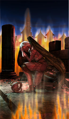
Defeated Angel - Project concept
 krickerd
Posts: 188
This idea emerged from just playing with some items. I'd like to make an iPhone case design for Zazzle. I'm not totally happy with the composition, effect quality and lighting, but am unsure where to go with it. If you have any suggestions I'd appreciate it. Thanks.
DS renders with uber disc lights, fire created in filter forge, post in gimp.


Defeated_Angel_Test.jpg
702 x 1199 - 197K


Comments
I don't know much about iphone cases, but one thing I pointed out to my public speaking students about their visual aids is this- can you easily see each component? If your character has their head in their hands, is that going to be seen at a reasonable distance- say if the phone is in their hand in their lap, with the distance to their eyes? You might need a pose that keeps the body parts easy to see. That's the first thing that came to mind- not that it's a correct thing :)
That's a good point. If I want to keep the pose, I may want to bring the character closer to the camera. I don't want to end up cropping out her wing by getting closer so it could also be that the image may lend better to more of a square aspect ratio and thus a different product such as an iPad case or a poster.
I took the time to rework this image, formatted for iPad size. I'm reasonably happy with it now. And I learned I can clone from layer to another in gimp. I suspected as much but never tried it before. Outfit is Heaven Armor for V3 but figure is Genesis. Garibaldi hair on figure and wings.
Work flow: Background - Vue 8. Foreground D|S - three light renders (uber disc lights). Fire created in Filter Forge and PhotoImpact. Post - multiple layers in Gimp.
MUCH better- really like it. You're very talented!
Thanks! I've been very influenced by the Dreamlight training.