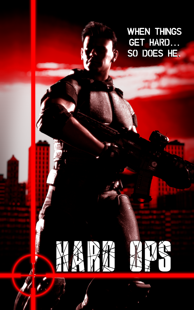
Thinking About Making Premade Covers...

Would you want to buy this?
Feedback and critique welcome.
Products Used
https://www.daz3d.com/dforce-corporate-hair-for-genesis-8-male-and-females
https://www.daz3d.com/tactical-assault-outfit-for-genesis-8-males-and-females
https://www.daz3d.com/military-weapons-03
https://www.daz3d.com/urban-living_KindredArts


hardops_cover.png
800 x 1280 - 641K
Post edited by margrave on


Comments
Sometimes its good to check out the actual sites that sell bookcovers and submit for feedback. This particular site has a rather strict gatekeeper who generally doesn't like 3D but if you get accepted then you can find out how the market will react. https://thebookcoverdesigner.com/
It looks fine and I can indeed see a pulpy low-budget novel using this as its cover. The image doesn't really excite me, though. I think you could get a little more out of this render with more dramatic cropping/framing.
And I know that's not the question but that tagline is hilarious... and I can't tell if it's intentional?
Either way, the tagline says cheesy erotica so the character should probably have his shirt off, just to match that energy ;)
I was actually eyeing SelfPubBookCovers. They seem more accepting of 3D covers. In fact, I chose those two fonts because they're on their "acceptable fonts" list.
However, for reasons, I can't offer anything for sale yet, so I'm just looking for feedback.
The tagline was very much intentional. The premade cover site I checked out says to just put "Tagline goes here", so I had a bit of fun with this mockup.
I tried to emulate the cover art for various Call of Duty games, which all have the exact same composition. Though I do agree some more exciting framing could help spice things up. And the shirtless erotica version could spice it up even more. ;)
You might reconsider the wording of the tag line - unless the intended audience is into "adult reading". lol
The composition isn't bad, though you have the gun cut-off on the side, I probably would keep the entire gun in the frame. The highlights got a bit "blown out" and jaggy - that needs to be addressed.
Overall though, with a few tweaks and improvements, I think that this could be a decent cover.
I would recommend looking at other novel covers ("straight novel covers" as well those that have been done successfully with 3D assets) and studying them a bit.
This person uses 3D assets and many of the covers look pretty good, imo: https://bookcoverforyou.com/#coverdesign
It looks like they use a lot of post-work to stylize the images.
There's a thread for book covers and you might get some good critique and feedback there: https://www.daz3d.com/forums/discussion/57390/book-covers/p1
Trust me, I've looked at plenty of covers. The problem is knowing how to do the postwork, which I do not, haha.
Thanks for the thread rec!