Death and Taxes
 ragtatter
Posts: 20
in Art Studio
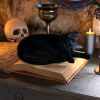
A piece I made inspired by the game "Death and Taxes". It's a little grainier than I'd like, but overall I'm pretty happy with it.


Comments
It's a neat little scene!
It's hard to see much though, you've uploaded a rather small picture.
Also, Death disappears into the background. Because they're not particularly well lit their robe looks like a black hole in your composition. Perhaps that's done on purpose... I can't quite tell.
That's a good point. I might have to play around with the lighting a bit to see if I can highlight death a bit more. There's a desk lamp behind him that's mostly lighting up the cat. I bet fiddling with it might give some useful results.
Looks nice!
But, agreeing on highlighting death figure, as well. Also maybe make sickle more metallic?
I'm having trouble highlighting Death in a way that doesn't wash out the robe, or look really out of place for the scene. I'll keep experimenting with it, but no real luck so far.
The sickle is actually really shiny metal, so I think that's also just a lighting issue. I might see about putting a light below the camera to catch and reflect off of it.
Is the robe using IRAY materials? Some 3DL materials don't render in IRAY.
I believe it is using IRAY. The problem is that it tends to look more grey and washed-out, I'm having trouble lighting it enough to stand out from the background without lighting it so intensely that it makes him look too light, if that makes sense.
I might try lighting the bookcase behind him. He'll still be more of a silhouette, but he'll at least stand out from the background more.