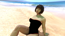
A sunny day
in Art Studio
Its my third render any suggestion and idea is welcomed.
ps question: iterations of renders is always below 1000 how can i get it higher?


woman6.png
2560 x 1440 - 5M


Comments
Good start! There's definitely room for improvement!
- Her facial expression needs work. She looks like she's having a stroke!
- She appears to be lit with several light sources, one of which is green. This doesn't make sense for a outdoor scene during the day. In the real world the sun would be the only light source. It's possible to light such a scene with more than one light source, but you should try and fudge it so it's less obvious, and definitely not use coloured lights
- Her bathing suit looks like a black hole in the middle of your scene. Give it more gloss, probably by increasing Glossy Layered Weight and decreasing Glossy Roughness.
- Decide what the focus of your image is. If it's the character then I wouldn't crop her off like that. I would try and frame her better and devote less space to the background. If the image is supposed to be more about the landscape and overall mood - I do like that wide lens you're using! - then your character shouldn't pull this much focus. Maybe place her further away and a little off center, admiring the scenery and inviting the viewer to do the same.
actually i also did not understand that i mean i did not use any light it was just the environment and thanks i will try to learn about glossy layered weight i have not heard of it yet and yeah i wanted her and the scene at the same time. thanks a lot for suggestions i will come up with new stuff