Need some lighting ideas from the pro's
 Frequenz5
Posts: 0
Hi guys n gurls,
I'm kind of new to the 3d stuff and to DAZ and lighting is killing me atm.
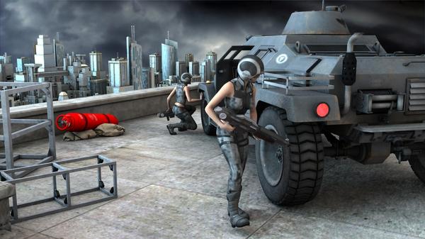
I made this scene and now am trying to figure out how to set up a few more lights to get the skin on the actors a bit more realistic.. or better should I discard all my lighting and rebuild that?
Its trying to recreat a smoggy feeling well the big one is.... so a slight haze would be neat (prolly a job for CS5)... I dont have lux or reality (yet) sooooooooo...... heeeeeeeeeelllllp meeeeeeee!!!!11111!!
(plzyunnothatwouldbegreatofyouguys)
ok back to being serious... the city in the background hopefully will blend in with the skydome i you use the fokalpoint on the camera althought its really close by.....
any other ideas, suggestions, input will be gladly read by moi personally :D
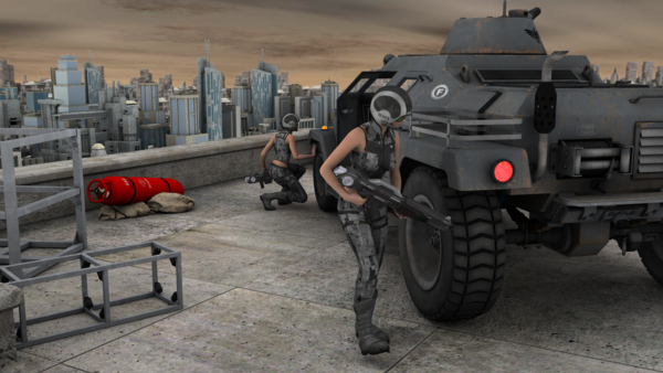
(second render is only a draft to show the color range, still undecided which one I like better)
p.s. how can I change my name from my real name to something different??


Comments
A specular-only spotlight (no shadows, turned down low) on each figure helps somewhat with making skin more realistic; depending on the scene you may also want a diffuse-only low-level spot on each of them as well. You'd need to turn down the diffuse lights that are on them in the second scene to avoid glare.
PM Richard Haseltine to change your username
thanks.. feels kind of stupid with this rl nick
ok other scene.. still owrking on grasping lights.... 8and typing)
working...
so
heres the pic.... I`m overall more than happy with the loks but on here thigh theres a highlight from the backlight it doesnt render properly somehow..... I tried all I could think of... repositioning.... tweeking all the dials.... even putting a secondare spotlight on the leg hoping it would blur the whole situation.....
anyone got an idea?
btw I stuck her in a bikini... seems we have a boob problem here (although ppl watching death and gore in rl close-up/HD news is no problem)... one thing I`ll never understand... guess I prefer boobs over dead corpses..... :P
Since you're new to DAZ, do you know that if you select the light out in the viewport (where you probably have Perspective view selected) your view becomes the light? It's no longer just a view. So select the light out in the viewport area and turn all the others off over in the Scene tab (shut the eye next to the name of the light) so you can see JUST the light you want to work with. Start with that one, then gradually add each light and see how they interact with each other. Just add each one, one by one, so you get a better feel of what's doing what. Two may be intersecting and creating more light in one area or spot.
the setup
ok will try that (after a break tho) thx
omg ok I found out the problem.....
the lights where to close... I shoved blue and brown behind my camera and did a few tweeks till I was happy and here it is :D
That is definitely an improvement! Nice work.
thanks... helps me alot hearing that... now I know I`m on the right path (better not lose my torchlight)...
ok so while I had that pose I got carried away (again)....
isnt photoshopped yet but that wont happen today either....
called the scene:
"truce?"