Grainy Blender WIPs
 j cade
Posts: 2,310
So I do a proverbial shit-ton of test renders, and have a tendency to stop projects in the middle and forget to complete them. Such as it is, this thread will hopefully serve as a repository and reminder of my unfinished projects, and give me a sense of accomplishment that I am, indeed, doing something.
Also If anyone wants to give me some feedback and constructive criticism, that would be grand.
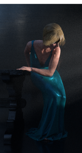
My current project is based/stolen on the Metropolitan Opera's poster for their upcoming production of Bluebeard's Castle http://www.wyotheater.com/season14-15/bluebeard.jpg
which has fits well into my usual oeuvre of women in contorted poses, but which has very dramatic lighting I haven't quite captured the spirit of yet. Any suggestions on improving the lighting would be appreciated
And now for the eponymous grainy WIP


Comments
Your not alone, I do the same. Check'd out your gallery, wonderful renders, specially windy maid.
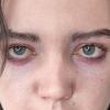
Urg... so,thing I've been working on for a while. Rendered it, then realized the hair was intersecting with the dress. Thankfully, with blender I can re-render just the problem area. Unfortunately, I think I also want to change my hair shader and lighting to bake the scalp better and the eyes less dead. On the bright side, I am very proud of the hair that's not intersecting or near the scalp, its pretty.
Also, can anyone guess the likeness?
Well, she looks suspiciously like a certain character I was working on recently... ;-) Yours looks much more like the actress though; I was aiming more for the book character.
Looking good so far!
I love Sansa, but I suspect some of my love is aesthetically based, the actress somehow manages to always look like a painting. I think she might be magic, its the only way to explain how she manages to be better lit in screen-caps than the other actors are in promotional stills.
Anyway here's a wip so early its still being rendered in Studio. The pose is one I made a while ago, using one of the Kneeling Youth statues by George Minne as reference. In case anyone was wondering: yes, those arms were an absolute terror to pose. I may have to attempt to sculpt the hair myself, in which case this will be a very long term WIP, but I want to keep it as a statue, and, as such, any flat strand like model will not look good.
Here's the (NSFW I guess) reference link removed though the lighting and surroundings will be based on the fantastic setup I saw at the Leopold Museum in Vienna, where another copy resides.
All that time on the pose has paid off, it looks realistic even without a texture.
I also love the work on the hair up above. Did you create it in Blender? That reminds me, I need to get that long hair tutorial downloaded from Blender Cookie before my membership runs out. If it helped me get results half as good as yours I'd be happy!
A glint in those eyes would bring her to life, I agree. The hair looks very natural as it falls around the shoulders though. Congratulations on such a great result.
Yes, Hair is in Blender. One of these days I will splurge on a blender cookie subscription, I do love their tutorials. Blender in general really seems to have a plethora of great tutorial makers, Its made learning stuff so much quicker than I imagined.
So, I love the lighting of this set http://www.daz3d.com/shimuzu/shimuzu-s-proportional-poses-for-david-5 and wanted to recreate it. I need to smooth out the stomach and ribs, and something weird is going on at the wrist (It's not the material, I quadruple checked). The most fantastic thing is that the scene only has one light, sometimes blender can make things so simple.