Interpretation Challenge
 NGartplay
Posts: 3,145

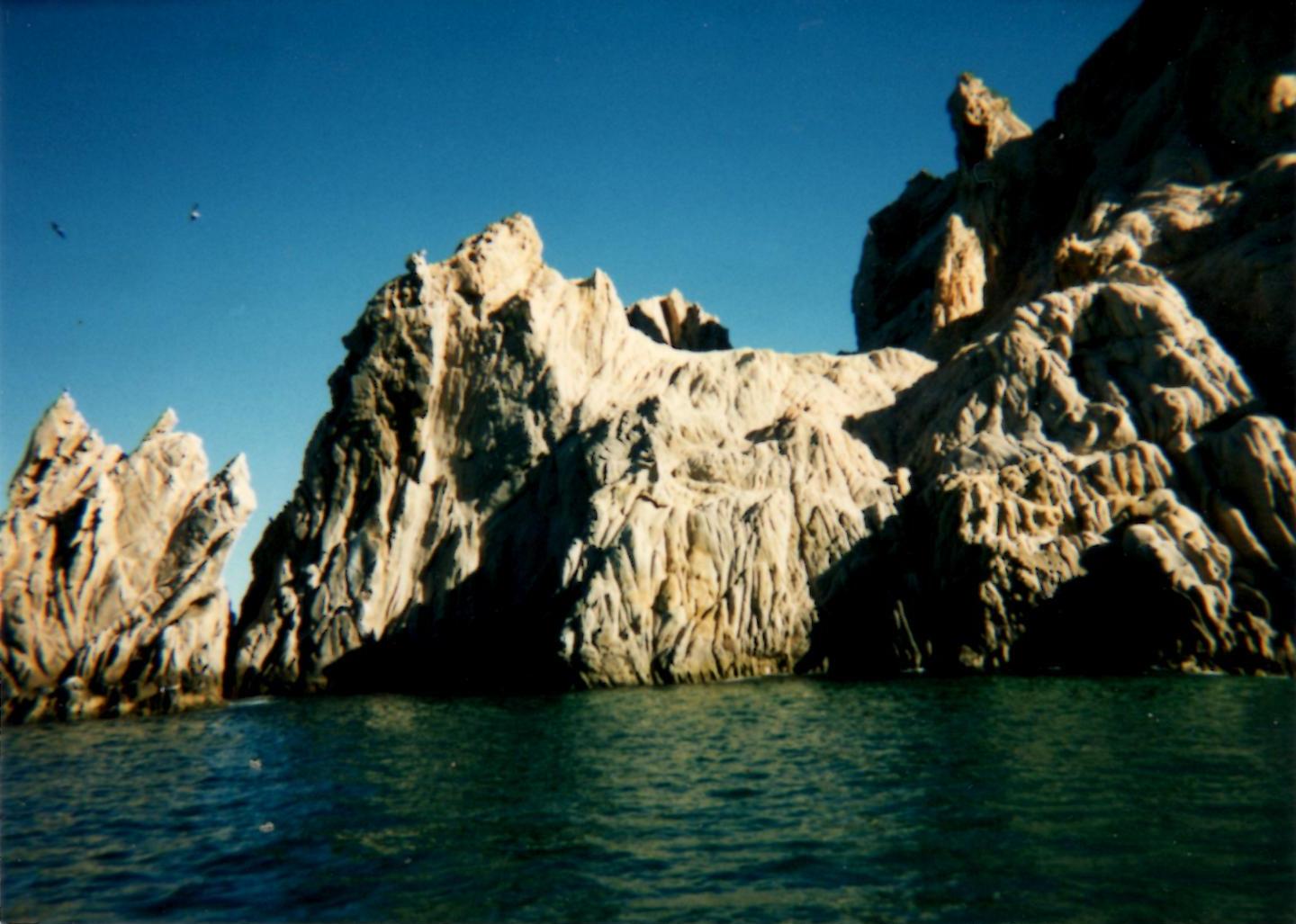
This may go over like a lead balloon but I'm going to if anyone wants to try this. I have a photograph that my mother took and it has a very interesting rock in it. The picture is boring, imo, as it lacks a subject or object of interest. I tried making these rocks but I wasn't satisfied.
I want to pose a challenge to you to use this image to create your own interpretation. If you choose to try and duplicate the effect on the rocks, please share with me how you did it. It's not necessary to create the same effect. There's birds in the left, water, rocks, sky. Add whatever subject you want or any genre you'd like it to be. It can be abstract to realistic to surreal. Whatever floats your boat :)
If no one gives this a try I won't be hurt. Only do this if you want to. If you only want to try recreating the rocks to let me know how you did it, that's good too, doesn't have to be a scene.
Sorry that it's blurry


Comments
I tried this since it was my challenge. I didn't get a result like the image but erosion seems to be the closest to this effect. I had to have the obligatory birds and added a bunch of crabs scuttling around. They are hard to see because I made them small again.
How can I see what sky I have loaded in a scene? How can I see the name of a material once I've applied it?
NGartplay: I might try your challenge later. But on your questions: I guess there is no way to see, unless you keep your scene as such. Then you can check the sky by clicking on the sky changing option and going through the skies you have until you found the one you used. Same for the materials. A better option, of course, would be to write these things down for each scene. Unfortunately, I never do that, so I have the same issues as you with forgetting what settings, materials, etc. I used.
I like your beach very much. Great sky as well.
Thanks Hansmar. It would have been nice if they had thought to add the names. I guess because people edit their mats that it was not feasible.
I had a different sky and material on this to begin with and it looked more like the rocks in the origin image but I like having shadows in my images so the sun is off the left.
I call the picture Storm Brewing
NGartplay : Awesome image, the beach with the crabs is a great idea and very well done.
NGartplay - I think you made a great job with that work. Copying an existing photo into a Bryce scene is quite difficult if you don't allow your own interpretation.
Very nice scene, NGartplay. I thought I posted earlier but apparently I didnt. The rocks look nice, so does the sand.
adbc, Horo and mermaid010, thank you all for looking and commenting. Happy Valentine's Day!
had a quick go ....very hard to mimic the rock formation but tried to set the scene roughly the same. ..complex .hand painted terrain eroded and mounds added then navigated around to find suitable formation ...not very good I'm afraid but hey I had a go
Hid Spuddy, that's fabulous. The challenge wasn't to be exact (unless you wanted to be) but your own interpretation of the rocks. I think that your scene is beautiful. Love the water and the rocks look so good. Thank you for sharing the settings and having a go at this.
NGartplay ...Thanks ..I know I just wanted it to be near to the original scene as a challenge to myself
Great work, Spuddy!
Indeed great work, spuddy.
Yes, indeed great work Spuddy
spuddy : I agree with everyone else, this is a great job.
Hansmar..Horo...mermaid010..adbc...Thank you all very much
interpretation this time.......... can mess with your head a bit the rocks look like they are perhaps mountainous but the turtle etc say's otherwise
another take
another take....... sorry to keep posting
I really like the hills in the second one and the whole construction of the scene. The turtle closeup is excellent. The reflections and the turtle make for such a beautiful scene.
Are these all the same terrain?
Spuddy: Another set of fantastic renders. Love the last one with the reflection.
Thanks NGartplay yes they are all from the terrian canvas view I posted.....; that's the beauty of making a large complex terrain you can navigate around it and find juicy views saves so much time
spuddy - very nice examples.
Spuddy - wow very nice renders, my fav will also be the last one, beautiful reflections
spuddy : wow, these are excellent renders, the last one is also my fav.
Thanks everyone...I must say I 'm fond of the last one as a composition as well .i like the intamacy with the Turtle the viewing angle gives
@NGartplay: I think your approach came out quite well, much better than mine.
@spuddy: Great images, the last one is my favourite, too.
Here my approach. I am not so happy with the rock terrain. I started with a hand painted terrain, added the terrain "Crystalline" and Mounds and Erosion. However it was fun. Thanks NGartplay.
Very nicely done Electro-Elvis, I like the splashes.
Electro-Elvis, I think that your terrain is great. Like the color of your water and really nice gulls. What model is that? Lovely render.
Nevertheless nicely done, Electro-Elvis, the spray looks great.
Very well done, Electro-Elvis, I really like it.