The ZDG Test Chamber v2.0 – UE2
 ZarconDeeGrissom
Posts: 5,412
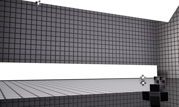
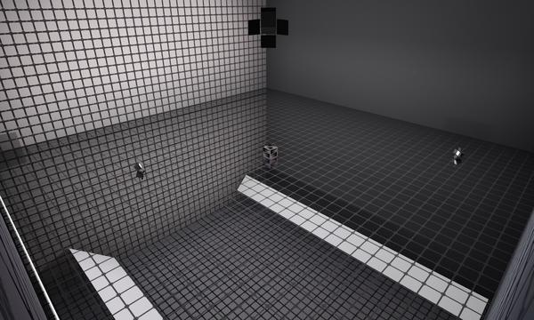
I have been asked to share this thing, so others could test an issue I was having with one figure. I will do my best to describe how to build this Test Chamber as I have using Daz Studio 4.6 primitives.
It is now at Sharecg and Deviant Art. links at the bottom of this post
I will do my best in the first few posts to describe how to make the room, set up the lights, and then open this up for questions comments etc.
The biggest deal for me when I was setting this up, was that the textures rendered really quick, and they were Photo-neutral to an extent. So I went with simple maps, tiled on to the surfaces, where I did use them
I have a single thread I stick all my cool maps in, I will provide direct links to the exact post with the needed file to make my current test room. Lights and cams in a second post, or more. Lots of XYZ stuff to jot down.
Shame I don’t know how to do a Scene subset save and share the DUF for this, it would be easier. Tho the room is not that complex. And it will help some to just make it from scratch, to learn how these kinds of things are done.
6 planes, and a outside cube, with a color-scale cube, some lights, and preliminary cams (Optional).
I am very tempted to recreate this room from scratch again, and make it 80 x 80 ft with a 40 ft ceiling, instead of 40 x 40 ft room with a 20 ft ceiling. It has served incredibly useful over the past several months, and even with a bigger one, I'll still be using this one.
3Delight, using the Daz Default shaders on the walls floor, color cube, etc. I am looking at possible settings for Iray, however they must both be really close if not exactly the same as far as brightness goes at world center. It is a test chamber, after all.
3delight version of the Test Chamber is at Sharecg. V2.2 UE2 for 3delight.
http://www.sharecg.com/v/81375/browse/21/DAZ-Studio/ZdgTestChamber-v2.2-UE2-for-Daz-Studio
and the same file is also at Deviant Art
http://zarcondeegrissom.deviantart.com/art/ZdgTestChamber-v2-2-UE2-for-Daz-Studio-543097364
Post 1 of 9
Some rights reserved, NOT. No one owns exclusive usage rights to the Inch, Centimeter, or the Lumen. I feel the same regarding this test chamber. It is a tool for measurement. Feel free to use and share this chamber in part or whole as you wish, without any restrictions imposed by me for commercial or private use.




Comments
Note for beginners, or others unaware.
I'm giving lots of examples with exact numbers, you don’t need to fuss with trying to drag the parts to there exact positions. In the properties tab, click the number next to the gear for that parameter, and you can type in a number there manually (for scale, rotate, translate, etc).
The same is possible for setting RGB colors in the surface tab. Click between the displayed numbers in that box, and a color selector pops up, and the exact values can be entered bottom right in that window. Again, click the number, and type in a new one.
Changing maps can be easy if there are a few of them, and it is already in the scene. Sometimes it is quicker to just click "brows" and select the file again, rather then scrolling down pages of maps to find the one already listed in the scene. If you just hover the mouse courser over the box next to the color numbers thing for a second, a balloon will pop up showing what map is currently there. Left-click instead of hover, opens that menu.
Also, I made a sub-folder in my "Scene Subsets" folder, specifically for lights that I create. so there all right there in one place. Right-click the "Scene Subsets" text in the Upper part of the Content Library tab, and select "Create a Sub-Folder...". Where you right-click is important, as the new folder will go in that folder once you have selected a name for it. Be careful where you right-click.
Post 2 of 9
First the floor, walls, and ceiling.
Floor, 40ft x 40ft primitive plane. (There all that size, for now)
The "Tile01002spec1" Specular Map [ CC0 (Public Domain) ].
http://www.daz3d.com/forums/viewreply/685452/
The "Hematite2" diffuse map floor tile [ CC0 (Public Domain) ].
http://www.daz3d.com/forums/viewreply/685503/
Diffuse color White (255 red, 255 green, 255 blue) and the "Hematite2" map, Specular color White (255 red, 255 green, 255 blue) and the "Tile01002spec1" map, Reflection Strength 50%, Tile 40 Horizontal & Vertical, Smoothing OFF.
Leave at world center, no bump or any other maps.
"O" and click that little check-mark in the scene tab, to keep the floor from glowing every time the mouse courser hovers over it. The floor isn't going any where, so we don't need to select it from the view-filed, it's there in the scene tab If we have to select it.
Walls;
Each wall is the same (40ft x 40ft primitive plane), just tilted 90 degrees, and “translate” out to the edge of the floor. Ignore the half below the floor, just tilt it, and slide it out to the edge of the floor (+/- 609.45 X or Z). One minor note, I made sure the 'Face' of each panel was facing into the room. That's the side that is facing up when the panel is first created. That is kind of critical for some things, like visibility in the view-field.
Just set the diffuse color to 128 red, 128 green, 128 blue, for now, and leave tiling up the walls for later. The front wall is still this, in the current set of testing, I'm doing.
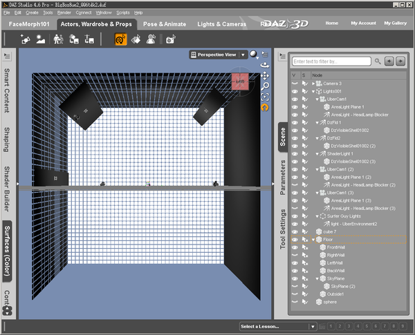
I named the walls, the same as what is on that rotate-my-view cube thing as I'm looking at them from inside the room. I also turned off the select-ability in the scene tab to make life easier while working in the room.
After making the walls, I parent them to the floor, for the sake of organizing the scene tab a tad.
Looking up;
The ceiling ("SkyPlane") is also a 40ft plane primitive, filliped upside-down, and pushed up to the tops of the walls.
X Y Z coordinates;
Floor (All zero translate and rotations)
FrontWall (Z translate -609.45, X rotate +90)
LeftWall (X translate -609.45, Y rotate +90)
RightWall (X translate +609.45, Z rotate -90)
BackWall (Z translate +609.45, X rotate +90)
SkyPlane (Y translate +609.40, Z rotate +180)
* Ignore that "SkyPlane (2)" in the first screen-cap. That was used while I was trying out the cool opacity walls on the ceiling first. The outside box has replaced that.
Post 3 of 9
Tiling up the walls. and stuff
There simple square surfaces, so tiling 1ft tiles is simple. Because I'm working with small maps, and I don't want fuzzy edges on stuff, I've turned OFF smoothing on all the walls floor and ceiling “SkyPlane”. It keeps ram requirements at a minimum, and simplifies a lot of stuff. The walls don't flex and stretch like clothing, so smoothing is not needed here.
I was experimenting with an on/off opacity map on the walls, to create a TDK test chamber look.
http://www.daz3d.com/forums/viewreply/697745/
I did this to the Back, Left, Right walls, and the "SkyPlane". I left the wall behind the world center as seen from the 'Front' the plane gray.
To reiterate that post, this is a non-gray on/off opacity map on the walls to turn them into floating panels, with a cube outside the room as a backing.
I have also played with the other tiles in that thread on the walls in the past.
The color scale cube, simple thing (FREE!!!!).
http://www.daz3d.com/forums/viewreply/697733/
It's all there, and it is not that complex.
Post 4 of 9
The Dz Light cover.(Optional)
This is so it is visible in renders, instead of having unrealistic invisible lights.
Save the test room in progress, and go to a new scene, this is critical for making obj things.
Its a Cube, and a set of flattened cubes as the shades. Five cubes in total, renamed in the scene tab, parented accordingly, and exported as a OBJ. This object and the map images are at sharcg now. Grab it, and make some lights.
http://www.sharecg.com/v/78068/view/21/DAZ-Studio/Simple-Cover-for-spotlights-ZDG-test-Chamber-Part
Import the OBJ (100% scale) into Daz Studio, then loaded a “dzSpotLight.duf” from the content library. Rotated the spotlight so it lines up with the obj, parent the obj to the spotlight. Tilted the light back to zero rotation. And saved it as a “scene subset”.
Now you can load the dzSpotLights without them wiping out all the other lights in the scene, and a single eye in the scene tab can make the visible cover vanish from view, if you must have invisible light sources.
To add to the effect of the covers, I made a set of Diffuse, and Ambient maps. Just so they would look more real in renders. The "Default" is the body of the light, and each side shade has it's own surface in the surface tab. The "Default Shade #" surfaces are all the same.
If you are lost, and can't find the supposed “dzSpotLight.duf” in Daz Studio 4.6, there is a short and still lacking walk threw here.
DzLights 101, More then just the Menu Lights.
http://www.daz3d.com/forums/discussion/43303/
I had hoped to go more in-depth with them like Szark had with the Uber lights, tho there isn't much to them I guess.
By the way, It dose not need to be a “dzSpotLight.duf” exclusively. Have fun with the light cover.
Post 5 of 9
The Over-sized Uber Panels.
Extensive Credit goes to Szark for these.
http://www.daz3d.com/forums/discussion/14536/
I renamed the camera part to “UberCam1”, and saved the thing as a “Scene Subset”, to make life easier.
These lights are set up for 3Delight rendering with the default "No gamma correction" settings. That is what I am using, and if your a "Gamma must be on" person, the intensities of all the lights will have to be changed for your individual methods. That is all there is to that note.
The Uber panels are there to give a room lighting ambiance, and to act as insane sized soft boxes. I have not fussed with the intensity levels of these lights now for over a month, and am fairly sure there just about set for good.
*I don't know why two of the Uber panels are set to "high priority", it's probably best to leave them at 'Normal' for the time being. I have set these back to 'Normal' render priority, with no ill effects as of yet.
(EDIT 2015 Feb 17), it appears an update has been made (Studio 4.7), and the Uber Panels are now locked at "Highest" render Priority, just leave it and ignore it, it's fine as is.
Post 6 of 9
The preliminary dzSpotLight placement and settings.
This is for the current test scene, and I do move them around as needed. Some times you get that nasty shadow on the cheek, or under the chin, and moving the lights is a good way to fix that. Like moving a desk-lamp to get a better view of something.
I have three of them in the current scene for specific purposes each. One is a key light of sorts, one is a halo light of sorts, and the last to act as a pseudo sun in the sky. With UE2 going, and the three soft boxes, it dose not take much intensity to add the subtitle effects.
Screen-caps of there settings, sorry about the cropping there on the longer list ones, there is nothing below the last property in the tab. That's correct, no color settings. White lights, black shadows. It's a testing room.
Post 7 of #
Getting a simple UE2 up and going.
It may be best to Save the Scene Before doing this. I don't remember if a 'Right-Click' -> 'Merge into scene' wipes out the other lights or not.
Use one already set up from a tutorial. I'm using the Surfer Guy Tutorial scene lights, removing everything except the “light – UberEnvironment2”. Some tweaks were needed to get this looking a tad better, tho I'm not an expert on UE2 by any means.
I didn't mess with the XYZ translate, or that map in the “Color” box. Just the Intensity, and the sample things for slightly better quality renders. The settings not shown, are at 'Reset' value in the 'Gear thing' menu for the parameter.
If it wiped out the other lights, no biggie. Save the UE2 as a scene subset, go back to that saved version of the box with all the other lights, and call that UE2 scene subset back up, and presto. UE2 for beginners to figure out what all the settings actually do.
For a far more extensive explanation of UE2, I defer to adamr001.
http://www.daz3d.com/forums/discussion/5320/
Post 8 of 9.
The preliminary Camera setup. (Optional).
I set up Eleven cameras, solely for making my work quicker. The exact placements may not be ideal for your work, as you probably don’t make things with primitives. 8 full shot angles, and a face closeup cam. Front view, 15off left side, 15off right side, left 45, right 45, looking 45 down, 15off straight down, straight down, etc.
Tho two of the cams are set up front and side of the average figure head height, so I can select them for the side-by-side “View-port” while fussing with face morphs. Again, it is best if you set these cams up, for your work. You will find that they tend to move around over time, as you work as well.
Post 9 of #.
O.K. I think I got most of it noted at this point. No doubt the first 9 posts will have amendments to clarify things I missed.
I open to discussion, and questions. And on that note a test render with the lights all the same, and the room doubled in size, as a test. That is FW Yasmin and FW Eve gawking at the Uber Panel just hovering in mid air. "What's holding that thing up there?", lol.
I just decided I wanted to put the camera placement in a render, and thus a sidetrack. Mackup cameras.
http://www.sharecg.com/v/78138/view/5/3D-Model/ZDG-Mackup-Cam-Cover-test-chamber-part.
Back to what I was going to do here with my latest render in this room.
I've been put-zing around during the snow storms with the lights, to try to get that cube more evenly light up. The settings outlined in the first few posts have a tendency to over expose the top of the cube, while excellent for that nice gloss sheen effect with hair, not so good for testing. My goal was to get the front, top, and right side of the cube more accurately lit, instead of just the front, and still have the light somewhat resemble an actual room.
The changes included moving the two front spotlights (key and WhiteSun) a tad, and minor adjustments to the light intensity of them, along with the large Uber Panels. I will try to get some screen-caps going shortly, as I am very happy with the light layout now.
"O" and I labeled them, no longer just "Light 1", "Light 2", etc. I found myself getting the front lower and front upper Uber-panels mixed up allot.
I do have plans to add settings for Luxus, as MN-150374 showed me that the room texture maps work perfectly fine with Luxus. I don't know how much work was involved with that, as I am yet to dive into Luxus, yet
Example here is Sandra (from Renderosity).
Daz3d stuff; She is sporting the "G suit 2 HD" (By Flipmode), and "Time For School" skirt (By Dogz), tiled up with the "DG Shader Essentials 3". It was what I was testing at the time. Also that is Filosofy Hair, I forgot where the color presets went after getting the V4-to-G2F auto-fit duf thing made months ago.
:coolsmile: Enjoy, I'm off to make some screen-caps.
Light Shadow Bias, after a few months of using the chamber without moving any lights.
I have found that settings between 0.1 and 0.025 work really good for most things. However, the lower that number, the longer it takes to run a render with 3delight. So I have gone with whatever I can get away with, without going to extremes or just not having real looking skin.
The large Uber panels are equivalent to "over-sized Soft Boxes" of sorts. So I rarely if ever set them to anything other then 0.1, unless I need that pinch of extra surface detail in a render. I've never had to set them below 0.05, especially with the spot-lights around to give that fine detail of the surfaces.
UE2. I've found that the render time usually is effected by the one light with the lowest Shadow Bias, regardless of how many are set that low. So setting a few lights to 0.05 is still faster then having just one at 0.025. Thus, I got into the habit of setting UE2 to the same Shadow Bias as the Dz-Spot-Lights.
And on that note, Dz lights. 0.1 works best for distant renders of groups of Figures and stuff. 0.05 seams to be best for most head-to-toe renders of a single figure, and 0.025 reserved for the handful of Shader Texture renders, and closer then full body renders (IF it is needed).
As for an example, and an insider note. The Promo I did for the AElflaed's Fancy Shaders was done using this chamber. I ditched the walls, floor, and ceiling. Dropped in "GIS Project" and a "Dawn to Dusk Lighting 2" sky-dome, disabled the sky-dome sun light, and set the Spot-and-UE2 Shadow Bias to 0.025 on the chamber's lights, Uber Panels kept at 0.1 Shadow Bias. I did move the Spot lights around a tad, to get rid of nasty shadows on Wachiwi's face, and making sure to keeping them from over-exposing the test color cube (Intensity not changed, just moved and aimed). I felt it was the most Honest way to show just how good the shader can look with Daz Studio and 3delight.
http://zarcondeegrissom.deviantart.com/art/AElflaed-s-Fancy-Shaders-Promo-507654338
ZDG chamber light adjustments. V2.1
Here is the new DzSpot light placements and intensities.
"O" No change to UE2 at all, same as above.
All panels are still in the Same location as befor.
Uber Panel 1. "Front Upper", unchanged, still 200% intensity.
Uber Panel 2. "Front Lower", 150% instead of 180%.
Uber Panel 3. "Back Upper", unchanged, still 300% intensity.
Not much of a change at all actually :coolsmile:
OK here is a slightly revised test scene, nothing changed except the figures. Daz Studio 4.7 with 3delight. Sandra swapped out with FW Eve (Alternate shader, aka "MATs not "MATs SSS"). 1950's dress on Olympia6 returned back to it's default mats and shaders. Olympia6 is dialed back to 50% body and head shape, and using her Smart Tab default skin shader.
The test cube here is at;
X transit +15.10, Y transit +143.40, Y transit +26.20.
X rotate -0.80, Y rotate -2.86, Z rotate -0.93.
Scale 30.7%
FW Eve is blocking the upper back uber area light panel from illuminating the top of the cube. Still it gives something to start with, and I would not expect that back soft-box to directly illuminate the front of things anyway. FW Eve is at world-center X 0, Y+1.12(shoes), Z 0. The jpg file is straight out of the Studio render cache folder, no post processing at all.
I'm off to find matching Photometric light levels in 4.8 with 3delight now...
(EDIT)
Well, it looks like the "intensity" (not the Lumens) value in the Photometric lights are really close to the DzLights. I did end up dropping the front lower omni uber area light from 150% down to 125%. (EDIT, I only replaced the three spotlights with Photometric here, the soft boxes are still Omni uber area lights)
(EDIT2)
That cute little shader-test-vase that is being stacked on the color-scale-cube, was shrunk down a tad for that. The original shader test vase is now here.
http://www.sharecg.com/v/80246/view/21/DAZ-Studio/Zdg-Worped-Can-Open-Shader-test-vase
ZdgTestChamber v2dot2 UE2 for Daz Studio.
So the big change from v2.1, is not anything with the lights, lol. The 100x100 pixel maps on the floor got overhauled. There now 256x256 pixel maps with a tad bit more detail. There all even the same color, just a bit more detail.
http://www.daz3d.com/forums/viewreply/809649/
All that, so test renders of small things would not have such fuzzy edges on the floor tiles. :coolsmile:
this is an awesome tool.. for beginners or for veteran users! thanks so much!
Thanks Wraith3D. The chamber is the most useful thing I managed to create as a beginner, and I'm trying to address some shortcomings of the original.
The Test Chamber v3.0 is in the works. Complete with Photo-neutral UE2 map and adjusted lights. That's right, a completely new UE2 that allows me to get rid of the lower soft box light all together, lol. It's in the works at least, and it will still take some time to finish it off and pack it up.
Because the former posts were from the old forum, I will probably need to make a new thread for the updated Test Chamber. I'll keep the old chamber around for reference, and I'll post links here when the new chamber is ready.
Much to be doings, not much time. Chat later y'all.