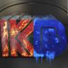
Which Album Cover do you think is better
 Kode of Bliss
Posts: 36
You currently have no notifications.
 Kode of Bliss
Posts: 36

Licensing Agreement | Terms of Service | Privacy Policy | EULA
© 2025 Daz Productions Inc. All Rights Reserved.


Comments
top one, with skull, no doubt, however for the inner part of the lettering could I suggest you apply a uncut gem deep ruby shader material? Or a cut ruby shader material, rather than the blue lettering. If deep red is too dark, go for a lighter red.
The lettering at the bottom, same style as top.
My first reaction was, the 1st one is better, it looks more professional.
But the more I think about it the more I like the 2nd one better, it´s more memorable. the 1st one is a little on the generic side.