Scifi Story in the works
 Gemini Queen
Posts: 263
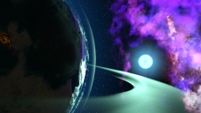
This is the first image in the scifi story that I'm working on. I'd like some feedback from time to time about what I could do better to the images as well as what I could be doing in post work. But I'll point out what I want to change about it as well.
The product that I used for this is Aeridian Heavenly Bodies, Planets and Asteroids by E-Arkham.
It was rendered at HD for 6 hours (OML)
- The clouds in this image seem to almost be reflective. I tried turnign down their glossiness, and it's still coming up like that.
- I'd also like to add some spaceships to the planet showcasing like a "defence force"
- As far as post work goes, I have no idea on what I should be doing if anything at all. I know a lot of people talk about how important post work is, but I really like this the way it is for the most part (80%).
Any thoughts are appreciated!


Comments
I'm afraid I can't off any constructive criticism until I see more, I can only say that I like it. It has a slightly-stylized feel that I think removes some of the 3D-computer-rendered look that a full-on iRay rendre might have, slightly more hand-crafted to my eye.Very pleasant.
I'm looking forward to seeing more.
-- Walt Sterdan
I like it a lot
Just an observation (as a cameraman/film teacher for a decade and a bit): I tell my classes that every element seen must serve a purpose and if they have to explain something for it to be understood then they're doing it wrong because films and TV shows do not have the director standing in front of the screen/ appearing in a PIP explaining things; the audience must get it right away.
That said, the composition is pleasing and draws the eye to the star/clouds (good use of the rule of thirds). What I do find distracting is the lit city (?) on the left side of the screen/frame , however because in sequential art (whether in comics or cinema) every frame must be taken in the context of its preceeding and succeeding frames, that's not necessarily a problem if the succeeding frames show more of the lit cities/area, whether the camera tracks left or the planet rotates.
Hope this makes sense and looking forward to seeing more of your work
-- Jaime
wsterdan
Thanks for that! It's my first time working with space props, and I was really liking the look that it had!
3dLux
It's really funny that you bring this up, because I was just talking to my supervisor today about this (he's also a 3D artist). He made a comment about some of my other renders, about learning how to frame. I don't know much about it, but I'm sure Youtube has some informational videos on it. Also, thank you for the rule of thirds comment. I've actually only heard about that rule a couple of times and never took the time to study it to see what it meant, so thanks! And honestly, you're not wrong; I don't like the city too much either. The thing is though, I can't figure out how to get rid of it. I did find it in the surfaces tab, and turned down the emission so that it's not lit up, but then you can just barely see the outline of where it's supposed to be in the dark and I was like ehhhhhhhhhhh.
The one thing my supervisor suggested is that I change the way the sun looks. Cause he said that most suns out in space look like this sparkle type deal that I've got in the images, and that what I have looks more like an illuminated moon. I kind of see where he's coming from, but I'm not sure how I could change that,so I'm gonna be messing around with the settings, might have to just do it in post work.
And upon trying a couple things in GIMP, trying to edit in a sparke just ain't gonna cut it. Though I did find the product that I think I'm looking for to make it happen - https://www.daz3d.com/epic-props-dynamic-lens-flare-starburst-for-iray
This looks exactly like what I'm looking for. Cause of the cose, I'm not buying this right away, I'll try to wait for it to go on sale or something. Although, if anyone has this and would like to tell me how it is, I'd appreciate it.
All pretty cool shots so far. The opening one is amazing. I really like the space station shot too, pretty interesting. Your sun always seems to be in the centerline on the horizon shots. Try moving it to the left or right more and see if you like that? Just a thot.
It looks really good!
Agree that the city is unnecessary. Isn't that something you can easily stamp out in post? Speaking of...
I always add a little bloom and some haze in post, I find it makes everything look better!
Re the sun: I feel like I've achieved effects like that in the past by simply layering on a flare in post; what do you find difficult about it?
So update, I found out what the problem was. In the sun prop, there is a light effect prop that you can pull and make super large, and then it creates the glare that everyone was referring to. It does look a lot nicer, and I'm happy with it. The issue arises when I made it large, it brought it close to the camera, increasing the amount of light that comes off of it. So now, the ring, the clouds, and the planet have a much brighter look to them that I'm not entirely happy with. I'm gonna take them over to post to see if there's a way that I can fix it, otherwise, I'll have to decide which one I want to use. Image one is the original, image 2 is the redo with the lighting effect This is from left to right. Also, I did try to edit out the city in post work and then try to overlay the one with the lighting effect over it, and I've come to realize that because I moved the camera over slightly, I'm not gonna be able to overlay it without some mad GIMP skills, that I do not have. So for now, I'm happy with both.
Hylas
I'm using GIMP for post, and I'm still learning how to do things on it. I know that it's not always possible, but I always strive to make the render as nice as possible to make as little room for post work as possible. I'm also not aware of all the things that can be done in post, so it's a little mind boggling.
Like Aeridian Heavenly Bodies, Planets and Asteroids, Have you looked into these products?
Sci-Fi HDRI | Daz 3D
Iray HDRI Space | Daz 3D
I made this in photoshop anyone can use it.
Update - As of right now, the products that I need for the city aren't on sale. So I'm waiting on that and am currently working on a different story for the moment until they are on sale.